Atlas for the End of the World
Précis On May 20, 1570, Abraham Ortelius, book collector and engraver from Antwerp, published the Theatrum Orbis Terrarum (Epitome of the Theater of the World), the world's first atlas… Read more Essay: Atlas for the End? Whereas Ortelius marked out modernity's territorial beginnings, this atlas — by focusing on the remaining habitat in the world's 36 biodiversity hotspots — rakes over its remains.
We Love Infographics
Rockmap™ by Ernesto Lago behance.net Here’s Looking at Euclid by Helen Friel
Flooding
<div class="crappy-browser-warning-box"><p>You seem to have disabled JavaScript. You should really enable it for this site but <i>most</i> things should work without it.</p></div> Flooding occurs when a river’s discharge exceeds its channel’s volume causing the river to overflow onto the area surrounding the channel known as the floodplain. The increase in discharge can be triggered by several events.
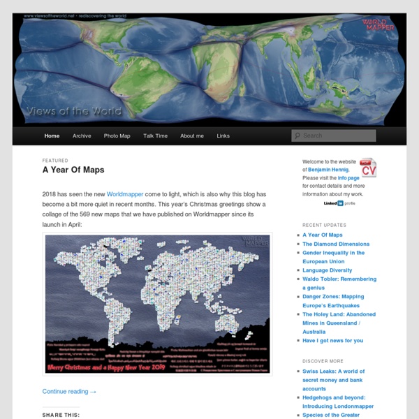
How We Share the World
This interactive graphic shows how the world is divided according to six different socioeconomic variables. The land area of each country represents its share of the worldwide total. Click on a circle to reshape the map For attribution and data sources, scroll to the bottom. I have been having fun experimenting with cartograms lately. As maps go, they have their shortcomings.
See the world differently with these minimalist maps
This is what the world like if national borders were ignored and only one type of topographical feature was mapped. Airports Lakes
National Geographic
Balancing Limited Supply With Increasing Demand The Colorado River Basin is a critical component of North American water supply, providing H2O to 30 million people and thousands of acres of farmland. When Colorado River withdrawals were first allocated among the river basin’s seven states, in 1922, the river held 17.5 million acre-feet (5.7 trillion gallons) of water. However, new science has shown that 1922 was part of an especially wet period.
Map Projections & What They Say About You
Comic by Randall Munroe at XKCD Most people go through life perfectly happy in the knowledge that the real earth looks like it does on a standard Mercator projection map. Cartographers, map nerds and those that have seen this scene from the West Wing know that this is not really the case.
This map will change how you see the world
Calling all geography nerds: The US Geological Survey has published a global ecosystems map which it says is the most detailed in the world. The map is an interactive mosaic of 3.5 billion cells, detailing more than 40,000 unique ecological areas based on four different factors that determine the make-up of an ecosystem – bioclimate, landforms, rock type and land cover. Cartography nuts can use the browser to click on any spot of the map to be given a description of the ecosystem in that exact location as well as scroll through a selection of places the USGS has picked out for special mention (see examples below).
'Parched' Chinese city plans to pump water from Russian lake via 1,000km pipeline
China is reportedly considering plans to build a 1,000km (620 mile) pipeline to pump water all the way from Siberia to its drought-stricken northwest. According to reports in the Chinese media, urban planners in Lanzhou, the capital of Gansu province, have drawn up proposals to pipe water into the chronically parched region from Russia’s Lake Baikal, the deepest freshwater lake on earth. Li Luoli, an academic who is one of the plan’s cheerleaders, claimed the mega-project - roughly the equivalent of pumping water from Lake Como to London - was both theoretically feasible and “certainly beneficial” to China. “Once the technical issues are resolved, diplomats should sit down and talk to each other about how each party would benefit from such international cooperation,” said Li, the vice president of the China Society of Economic Reform, a state-run think tank. The drastic plan underscores the severity of the water crisis facing Beijing. Additional reporting by Wang Zhen
Trainspotting: Europe's railway lines - Views of the World
Passenger transport in Europe is largely dominated by cars. In the past decade, cars kept a consistent share of around 83 per cent of the modal split within the European Union, followed by buses and coaches (around nine per cent in most recent statistics) and trains (between seven and eight per cent). The modal split describes these modes of transport as ‘transport kilometres travelled by all inland passengers’. In the debate about sustainable development, this is an important measure to monitor the environmental and social impacts of the specific modes of transport. Cars are generating the most emissions and pollution per passenger kilometre and also have significantly higher accident rates. Mass transit and public transport, including buses and coaches as well as trains, are therefore regarded as the more sustainable alternatives and have regained importance in urban and regional planning.
Ternary plot
Approximate colours of Ag–Au–Cu alloys in jewellery making Reading values on the ternary plot[edit] The advantage of using a ternary plot for depicting compositions is that three variables can be conveniently plotted in a two-dimensional graph. Ternary plots can also be used to create phase diagrams by outlining the composition regions on the plot where different phases exist. Every point on a ternary plot represents a different composition of the three components.