
Une infographie fascinante sur la répartition des langues parlées à travers le monde - Sciences. Carte des naissances et des morts dans le monde en temps réel par Brad Lyon. @comeetie : carte données carroyées. 9 cartes originales qui vont changer votre regard sur la France et sur le monde. Loin des planisphères classiques que tout le monde a eu l’occasion d’étudier au cours de son parcours scolaire, certaines cartes valent mieux que de longues explications.

DGS vous fait découvrir la France et le monde sous un angle inédit à travers 9 cartes originales que vous n’avez probablement pas étudié à l’école. Les noms les plus courants en France par région Les marques les plus connues de chaque région française Les pays aussi riches que nos régions La concentration de 40% du PIB français Le pourcentage de personnes buvant de la bière chaque semaine par région Les 3 pays que l’Europe n’a jamais envahis Le ratio Homme/Femme par pays La satisfaction sexuelle par pays (de 15 à 75 ans) Les projections démographiques pour 2100 Infographies : Merci Alfred C’est une leçon de géographie originale et amusante qui ne manque pas de nous étonner !
Worldmapper: The world as you've never seen it before. Migrations Map: Where are migrants coming from? Where have migrants left? Bio.Diaspora: Visualising interactions between populations and travel. I want to share some impressive work I’ve recently come across from a Toronto-based project/group called Bio.Diaspora.
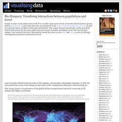
Last week the team was featured in the Lancet Infectious Disease Journal as part of a special report on Mass Gatherings and Health. The report focused specifically on the potential health risks posed by the mass gathering and transit of people attending events like the Olympic Games. You can find out more information about this story on the BBC and CBC, as well as through watching the animated visualisation below. I got in touch with David Kossowsky, a GIS mapper, cartographer and graphic designer, to find out more about the work of Bio.Diaspora and some of the visualisations they have been working on. This image shows a visualisation of the global airline transportation network consisting of all commercial flights worldwide. Global Migration Patterns: the Flows of People to and from Countries.
Global Migration Patterns [mpg.de] by the German Max Planck Institute for the Study of Religious and Ethnic Diversity contains a set of interactive instruments that visualize the latest global migration data.
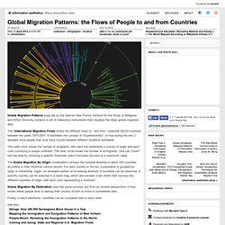
The "International Migration Flows shows the different flows to - and from - selected OECD-countries between the years 1970-2007. It illustrates the concept of "Superdiversity", or how during the last 2 decades more people than ever have moved between different locations worldwide. Dencity. Dencity maps population density using circles of various size and hue.
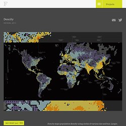
Larger, darker circles show areas with fewer people, while smaller, brighter circles highlight crowded cities. Representing denser areas with smaller circles results in additional geographic detail where there are more people, while sparsely populated areas are more vaguely defined. Read more about how Dencity was made. American Migration [Interactive Map] American migration map. Overhauling his migration map from last year, Jon Bruner uses five year's worth of IRS data to map county migration in America: Each move had its own motivations, but in aggregate they reflect the geographical marketplace during the boom and bust of the last decade: Migrants flock to Las Vegas in 2005 in search of cheap, luxurious housing, then flee in 2009 as the city’s economy collapses; Miami beckons retirees from the North but offers little to its working-age residents, who leave for the West.
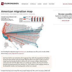
Even fast-growing boomtowns like Charlotte, N.C., lose residents to their outlying counties as the demand for exurban tract-housing pushes workers ever outward. Compared to last year's map, this one is much improved. The colors are more subtle and more meaningful, and you can turn off the lines so that it's easier to see highlighted counties when the selected county had a lot of traffic during a selected year. Refugee Migration Flow Map. CK6aONG.jpg (Image JPEG, 2048x1252 pixels) - Redimensionnée (60. Des données sur Paris et les Parisiens localisées par le biais du réseau métropolitain.
Interactive - NatGeoMag Population. The World of Seven Billion The map shows population density; the brightest points are the highest densities.
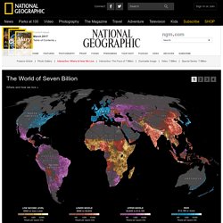
Each country is colored according to its average annual gross national income per capita, using categories established by the World Bank (see key below). Some nations— like economic powerhouses China and India—have an especially wide range of incomes. But as the two most populous countries, both are lower middle class when income is averaged per capita.
How Did We Get to 7 Billion People So Fast? I love the cool infographic video from NPR. 7 Billion: How Did We Get So Big So Fast?
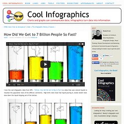
Is a video that uses colored liquids to visualize the population rates of the differen continents. High birth rates mean fast liquid pouring in, slower death rates slow down the liquid dripping out of the bottom. The U.N. estimates that the world’s population will pass the 7 billion mark on Monday. [Oct 31st]As NPR’s Adam Cole reports, it was just over two centuries ago that the global population was 1 billion — in 1804. But better medicine and improved agriculture resulted in higher life expectancy for children, dramatically increasing the world population. Found on FlowingData.
7B people & you: What's your number? Australia Bureau of Stats - Population. France Population - Estimates - Pyramids. Netherlands - population stats.