
Recording the Layers of London's Rich Heritage. Sketch the city. Top 10 Business Analyst Infographic Features. The best Business Analyst (BA) Web’s infographics are self-contained summaries of what the reader needs or values.
They should be designed to display content in clear ways, so everyone can understand complex relationships, cause and effect or patterns quickly.BA Web has an extensive library of charts, tables, interactive maps and easy to customize templates to help you to present information and convey insights in impactful ways that communicate the most important facts quickly and clearly. Here’s my Top 10 List of key features to make your infographics better: 1 – Floating Panels 2 – Conditional Images 3 – Copy Element from Another Template 4 – Share an Infographic Template 5 – Multi-Area Comparison Table 6 – Comparison Geographies 7 – Nearby Tables 8 – Conditional Style Lists 9 – Background/Overlay Images 10 – Copy Cell Style or Conditions.
Identity in English places. The true true size of Africa - Cartography. Getting Started with Google Tour Creator. Visit Tour Creator and press “Get Started” – as this new service rolls out Tour Creator may not yet be available to all accounts and it may require admin to tun on Poly and Tour Creator – while you are waiting you sign in with your GMail Account.Press “+ New Tour” Give your tour a Title, Description and Cover Image and press Create.

Press Add Scene to add additional images to your tour. You can now either select 360 Panorama’s from Google Maps (including content added by other users) or upload your own images. How To Download free shapefile maps by region. Explore urban open data. World trade system in danger of being torn apart, warns IMF. The postwar global trading system risks being torn apart, the International Monetary Fund has warned, amid concern over the tariff showdown between the US and China.
Explore Data Sets — Resource Watch. TRON 2.0 — GERALDINE. Mapping that changes lives – UCL Antenna. “It is not just women and men in Latin American cities but dwellers living in informal settlements across African and Asian cities that face similar avoidable and often invisible risk traps that deny their right to the city.”
Risk traps Between 2012 and 2017, a new wave of students studying the UCL/DPU MSc in Environment and Sustainable Development spent several weeks in Lima, having prepared themselves in London with in-depth research that builds upon previous year’s results and contributions. Draw On Maps and Make Them Easily. Geology of Britain. Functionality to search for a borehole can be found under the Menu button, when the Boreholes data mode is selected: In this mode, boreholes are displayed on the map.
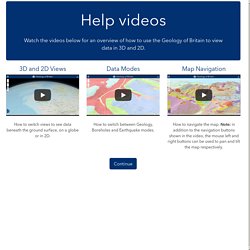
In ‘3D Below ground’ mode boreholes sticks are displayed below the Earth’s surface. Boreholes are coloured according to whether they have depth information as indicated in the key. Click on a borehole of interest to view some basic information about that borehole and to access a link to view a scan of the borehole record. Where boreholes are coloured black, we are unable to provide a direct link to the associated scanned borehole record. In Boreholes mode, surface Geology layers are visible and can be changed as described in the Geology mode section. GIS - FSC Geography Fieldwork. Geology of Britain. #?borders=1~!MTc1MzE0ODk.OTA2ODA2*MzYwMDAwMDA(MA~!CONTIGUOUS_US*MTAwMjQwNzU.MjUwMjM1MTc(MTc1)MA~!IN*NTI2NDA1MQ.Nzg2MzQyMQ)MQ~!CN*OTkyMTY5Nw.
Living Atlas of the World. The ArcGIS Book. Antipodes Map - Tunnel to the other side of the world. Interactive shows map projections with a face. Trainspotting: Europe's railway lines - Views of the World. Passenger transport in Europe is largely dominated by cars.
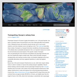
In the past decade, cars kept a consistent share of around 83 per cent of the modal split within the European Union, followed by buses and coaches (around nine per cent in most recent statistics) and trains (between seven and eight per cent). Map Projections & What They Say About You. How We Share the World.
This interactive graphic shows how the world is divided according to six different socioeconomic variables.
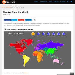
The land area of each country represents its share of the worldwide total. Click on a circle to reshape the map For attribution and data sources, scroll to the bottom. I have been having fun experimenting with cartograms lately. As maps go, they have their shortcomings. For more information about what a cartogram is, have a look at my last two posts, The Housing Value of Every County in the U.S. and A Striking Perspective on New York City Property Values. For this map, I looked at several different socioeconomic variables to include. The GDP-scaled map makes it clear how dominant the U.S. economy is. Government Debt Looking at the world scaled by government debt, the first thing that jumps out is Japan. Survey123.arcgis.com. Esri: GIS Mapping Software, Spatial Data Analytics & Location Platform. Ordnance Survey: Britain's mapping agency. NatGeo Mapmaker Interactive.
ArcGIS. ChartsBin.com - Visualize your data. Views of the World - rediscovering the world. Worldmapper: The world as you've never seen it before.
Atlas for the End of the World. Kmlfactbook.org. Maps. Survey123 for ArcGIS.