
BOLIDES - Visualizing meteorites Sverige är unikt – här är 25 världskartor som visar hur Ibland pratar vi om Sverige som landet lagom, mellanmjölkens land, där allt är lite sådär mittemellan. Varken plus eller minus, vi är lite neutrala i allmänhet. Men tittar vi på Sverige i relation till resten av världen så kan man sluta sig till att inom vissa områden så är vi världens mest extrema land. Nedan finner du 25 stycken världskartor där Sverige är rankat etta eller ligger i toppen inom olika kategorier. 1. Bland länder med högst konsumtion av mjölk per capita Via Foodbeast 2. Via GlobalAgeWatch 3. Via the Atlantic 4. Via the Atlantic Cities 5. Via SPI 6. Källa 7. Källa 8. Källa 9. 10. Via the Telegraph 11. Källa 12. Via Slate.com 13. Källa 14. Källa 15. Via Washington Post 16. Källa 17. Via World Bank 18. Källa 19. Källa 20. Källa 21. Källa 22. Källa 23. Källa 24. Via World Bank 25. Via World Bank Slutligen en bonus. Via World Values Survey Fotnot: Inspriration från 40 Maps That Will Help You Make Sense of the World Tips: läs även ”Svenskarna med flest följare på Instagram”
The Internet map A closer look at communities thriving in unexpected places In Caracas, the capital of Venezuela, nearly 70 percent of the population lives in slums that appear to drape like silk over every hill of the city. Iwan Baan: Ingenious homes in unexpected placesIwan Baan is not as interested in what architects build as he is in the beautiful ways that people appropriate the spaces once the planners are gone. In today’s talk, Baan — whose breathtaking image of lower Manhattan after Hurricane Sandy hangs on at least one of our walls — shows incredible images from communities thriving in ways that seem quite opposite to the uniformity of suburbs. Baan’s talk will have you marveling at human ingenuity. In the center of Caracas is the Torre David, a 45-story unfinished office tower that was in the midst of construction until the developer died in 1993, followed by the crash of the Venezuelan economy the following year. With no lifts or escalators, the tower is essentially a forty-five-story walk up. In Makoko, forced evictions are a daily reality.
Watch_Dogs WeareData The World's Population Might Not Be About Numbers After All In a world with limited resources, we have to conserve what we have and reduce the number of people on the planet—at least, that’s what most of us believe. But is this true? That’s the provocative question raised by the new documentary Misconception. The film, which premieres at the Tribeca Film Festival on April 20, gives us a personal look at the social and political ramifications of population growth. Oscar-winning director Jessica Yu (best documentary short subject) began exploring the issue of population growth while making her previous documentary, Last Call at the Oasis, which is about the global water crisis. Misconception challenges our assumptions through the stories of three everyday people: Bao, a Chinese bachelor who’s facing pressure from his family to marry; Denise, a Canadian pro-life activist; and Gladys, a Kampala, Uganda–based journalist who works with abandoned children. At 29, Bao is under the gun to tie the knot.
User-Centered Data Visualization. Part 4 – The Experiment - D3 Visualizing data instead of presenting them as ASCII in lists or tables makes sense because we’re much better in processing graphical than numerical data (the so-called pictorial superiority effect). Also, graphical visualizations are considered to be more attractive. While most people agree on this, there is a war out there between folks saying that data visualizations have to become more attractive and creative because that’s what the market wants and folks that insist that any visualization that is not according to ergonomic standards is a bad visualization. So the question seems to be: are principles of good data visualization timeless or do they go with the zeitgeist? Take pie charts, for example. In my humble opinion, data visualization obeys to the same rules than any other UX design challenge: there are best practices and well-founded generic rules, but what’s best in any specific case depends on the concrete circumstance. We did a little experiment. Alternative 1 Alternative 2
Human Population Predicted To Reach 12 Billion By 2100 At 7.2 billion, the human population is already a serious burden on resources and a threat to the environment and species. Imagine, then, how dire the global situation would be if we were to reach 12 billion, because if the current rate continues, that is what our planet may be facing at the turn of the next century. According to a new study by the United Nations (UN) and the University of Washington, there is an 80% probability that the world population will reach between 9.6 and 12.3 billion in 2100. That’s around 2 billion higher than previous estimates. “The consensus over the past 20 years or so was that world population, which is currently around 7 billion, would go up to 9 billion and level off or probably decline,” study author and statistician Adrian Raftery said in a news release. They anticipate that a large proportion of the increase will occur in Africa because of high fertility and birth rates. Read this next: Keychain First Aid Kit Might Help Save The Bees
Foursquare Time Machine turns your trips into pretty infographics Given the recent concerns in the media regarding personal privacy, services designed to make your private life more transparent and shareable will likely have to work harder than ever to convince new users to willingly give up their data. Foursquare, a company that has been facing this challenge for years, has just unveiled a new tool that could make the process of sharing your private information a bit more fun. Foursquare Time Machine is a data visualization tool that takes your check-ins and colorfully animates them on an interactive map. Each check-in on the map is represented by a color-coded pulse circle and connected by a line that leads to the next check-in. And while the timeline plays back, a music soundtrack helps make the graphics appear even more adventurous, even if your specific timeline is just a bunch of trips to the local Starbucks and back. Via Foursquare
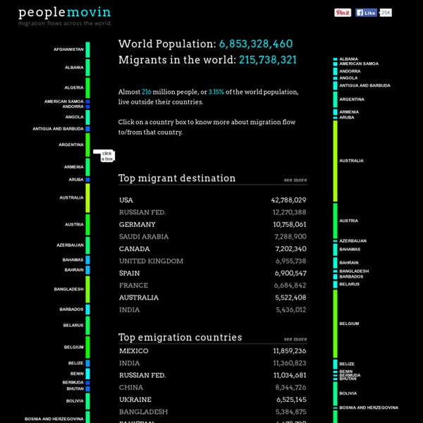
Earth Population as Village of 100 Claim: List summarizes what proportions of common traits would be like if we could shrink the earth's population to a village of precisely 100 people. Example:[Collected on the Internet, 2001] If we could shrink the earth's population to a village of precisely with all the existing human ratios remaining the same, it would look something like the following. There would be: 57 Asians 21 Europeans 14 from the Western Hemisphere, both north and south 8 Africans 52 would be female 48 would be male 70 would be non-white 30 would be white 70 would be non-Christian 30 would be Christian 89 would be heterosexual 11 would be homosexual 6 people would possess 59% of the entire world's wealth and all 6 would be from the United States. 80 would live in substandard housing 70 would be unable to read 50 would suffer from malnutrition 1 would be near death; 1 would be near birth 1 (yes, only 1) would have a college education 1 would own a computer 52 would be female 48 would be male
Appsterdam InnoViz 85 rikare än halva jordens befolkning tillsammans Publicerad 2014-01-20 10:19 Världens 85 rikaste personer har mer pengar än jordens fattigaste hälft, 3,5 miljarder människor, tillsammans. De ekonomiska orättvisorna fortsätter öka globalt, enligt välgörenhetsorganisationen Oxfam. – Det är skakande att halva jordens befolkning på 2000-talet inte äger mer än en liten elit vars antal bekvämt skulle få plats i en dubbeldäckare, säger Oxfams vd Winnie Byanyima under det pågående Världsekonomiskt forum i schweiziska Davos. Oxfams rapport ”Working for the few” ger svindlande perspektiv om fördelningen av världens ekonomiska tillgångar som totalt uppskattas till 1.560 biljoner kronor (en biljon har tolv nollor, reds anm). • De 85 rikaste personerna har lika mycket pengar som de 3.500.000.000 fattigaste. • Världens rikaste procent äger hälften av världens rikedom – 712 biljoner kronor – och 65 gånger så mycket som den fattigaste hälften. • 70 procent av världens befolkning bor i länder där inkomstklyftorna ökat de senaste 30 åren.
Interactive Visualizations I. Introduction We learn from out failure in order to maximize success …. It sounds good especially if you think what is most important in characterizing an entrepreneurship mindset is. I started a couple of months ago to focus on incubators and start-ups with a picture in my mind to identify and thus grasp the network of entrepreneurs in France. So i decided to scan the social realm to identify French start-ups mainly in the technology business and I had the idea of looking for in places where organizations, people communicate to gain visibility: Twitter. So basically I launched a crawl on this network to collect accounts with key terms in their profile (start-up, innovation, incubator and entrepreneur) and i harvested their followings on 2 levels with the same filters: the expected outcomes should be a network of Twitter‘s accounts interested in entrepreneurship. Let’s start to focus on localization. Continue reading