
Comment éviter les « vanity metrics », ces indicateurs trompeurs. Par essence, les « vanity metrics » sont inconstantes, faussement encourageantes et toujours séduisantes.
Elles sont bien connues des analystes de la data, qui, pour la plupart, les réprouvent secrètement. En plus de comprendre ce que sont ces indicateurs, il est important de bien comprendre pourquoi ils ne sont pas efficaces. Dans cet article, nous allons définir le concept des « vanity metrics », vous aider à les identifier, en proposer quelques exemples et nommer les indicateurs alternatifs à privilégier. TAGSExplorer: Interactive archive of twitter conversations from a Google Spreadsheet for. Machine learning : les principes et applications pratiques dans l’AEC - Village BIM.
Le « Machine Learning » (ML) ou en français « Apprentissage Automatique » est l’une des disciplines que les laboratoires de recherches Autodesk ont déjà investi.
C’est pendant l’évènement annuel Autodesk University 2017 que Mehdi Nourbakhsh, Sr. Research Scientist, Autodesk Research, nous a présenté le « Machine Learning » ainsi quelques applications pratiques mis en place chez Autodesk. C’est au travers d’exercices qu’il nous a fait toucher du doigt ce qu’est cette technologie et surtout ce qu’elle peut nous apporter. Je vous propose de vous faire un résumé de cette présentation. Le « Machine Learning » est une branche de l'intelligence artificielle (IA), concerne la conception, l'analyse, le développement et l'implémentation de méthodes permettant à une machine (au sens large) d'évoluer par un processus systématique, et ainsi de remplir des tâches difficiles ou problématiques par des moyens algorithmiques plus classiques (définition Wikipédia).
A Brief History of Big Data. The history of Big Data as a term may be brief – but many of the foundations it is built on were laid long ago.
Long before computers (as we know them today) were commonplace, the idea that we were creating an ever-expanding body of knowledge ripe for analysis was popular in academia. Although it might be easy to forget, our increasing ability to store and analyze information has been a gradual evolution – although things certainly sped up at the end of the last century, with the invention of digital storage and the internet. With Big Data poised to go mainstream this year, here’s a brief(ish) look at the long history of thought and innovation which have led us to the dawn of the data age. Big Data : Big Culture ? Le pouvoir grandissant de la data et ses perspectives pour l'économie de la culture. AWARDS - www.lucasinfografia.com. Open Source Alternative to InDesign. Adobe InDesign is a versatile desktop publishing application produced by Adobe Systems.
It can be used to create works such as posters, flyers, brochures, magazines, newspapers and books. InDesign can also publish content suitable for tablet devices in conjunction with Adobe Digital Publishing Suite. Graphic designers and production artists are the principal users, creating and laying out periodical publications, posters, and print media. Publications. 7 most common data visualization mistakes. In my last article, I mentioned some of the best tools for data visualization.
While all of them were powerful tools, they are only as useful as the hands they are in. Selection of the right tool is just the first step, the bigger job is to create an easy-to-understand visualization that makes data interesting and unambiguous. In dataviz, as in any other field, there are rules, best practices, guidelines and then there is common sense. And contrary to what we might believe, common sense gets ignored quite often, as we’ll see in the examples below.
New Challenges for Data Design. Infographic: What Do European Architects Actually Do? Créer des infographies. Www.designresearchsociety.org/docs-procs/DRS2010/PDF/120.pdf. Data visualization. Data vizualization. DensityDesign on Vimeo. Category: Atriums & Courtyards. BigData.pdf. 30 Simple Tools For Data Visualization.
There have never been more technologies available to collect, examine, and render data.
Here are 30 different notable pieces of data visualization software good for any designer's repertoire. They're not just powerful; they're easy to use. In fact, most of these tools feature simple, point-and-click interfaces, and don’t require that you possess any particular coding knowledge or invest in any significant training. Let the software do the hard work for you.
Your client will never know. 1. iCharts 2. FusionCharts Suite XT is a professional and premium JavaScript chart library that enables us to create any type of chart. 3. Modest Maps is a small, extensible, and free library for designers and developers who want to use interactive maps in their own projects. Visualising topography.
Here is the topography slideshow, otherwise read on..
Over the past few years I’ve been looking at lots of relief maps – i.e. those showing geographical topography, specifically land elevation, and I’m generally struck by two things. Firstly how the colour schemes commonly used seem too dominant, which seems to reduce the brain’s capacity for interpreting the geographical features being depicted. The R Project for Statistical Computing.
Data. Data Flow - Book Review. Brief Review Data Flow is nicely produced and shows Information/ Data Visualisation from the more decorative part of the spectrum.
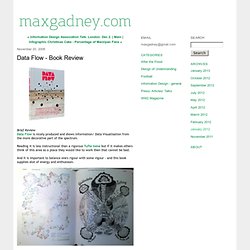
Reading it is less instructional than a rigorous Tufte tome but if it makes others think of this area as a place they would like to work then that cannot be bad. And It is important to balance one's rigour with some vigour - and this book supplies alot of energy and enthusiasm. Let me tell you why - Longer Review Initially was a bit unsure of this book but I have come round to it. My past was at BBC News, where we had a definite purpose and the brand values called for a no-nonsense approach to the interaction and information design problems at hand.