
Data Visualization. Data Visualization: Modern Approaches. About The Author Vitaly Friedman loves beautiful content and doesn’t like to give in easily. When he is not writing or speaking at a conference, he’s most probably running … More about Vitaly Friedman … Data presentation can be beautiful, elegant and descriptive. There is a variety of conventional ways to visualize data - tables, histograms, pie charts and bar graphs are being used every day, in every project and on every possible occasion. However, to convey a message to your readers effectively, sometimes you need more than just a simple pie chart of your results. Data presentation can be beautiful, elegant and descriptive. So what can we expect? Let’s take a look at the most interesting modern approaches to data visualization as well as related articles, resources and tools. 1. Trendmap 2007 Informationarchitects.jp presents the 200 most successful websites on the web, ordered by category, proximity, success, popularity and perspective in a mindmap. 2. 3. 4. 5. 6.
Visualcomplexity.com. The Functional Art: An introduction to information graphics and visualization (Voices That Matter): 9780321834737: Computer Science Books @ Amazon.com. The Functional Art: An Introduction to Information Graphics and Visualization. Data Visualization: Modern Approaches.
Visualizing Cultural Data.
Uk.sagepub. Resources. Maps. Why Are Data-Viz Designers So Obsessed With Circles? In 1726, Filippo Juvarra put the finishing touches on the dome of the Basilica of Superga, an intricately designed church in Turin, Italy.
The artist painted the interior roof of the building with a kaleidoscopic pattern that when paired with the dome’s ring of windows creates the effect of ornate, concentric circles. Nearly 300 years later, in the French town of Cessy, engineers finished building the Compact Muon Solenoid, a massive particle detector that, when viewed in cross-section, bears a striking resemblance to Juvarra’s circular basilica dome. “These things look so similar, and yet they’re separated by 300 years,” says Manuel Lima.
“One is all about religion and spirituality and the other is about science.” Lima, a design lead at Google and creator of the website Visual Complexity, was intrigued by the circle’s ubiquity. In his new book, Lima attempts to find out.
The art of Pi (`pi`), Phi (`phi`) and `e` // Martin Krzywinski / Genome Sciences Center. ▲ 2013 day ▲ 2014 day ▲ 2015 day ▲ 2014 approx day ▲ Circular art This section contains various art work based on , and that I created over the years. day art and approximation day art is kept separate.
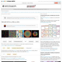
All of the posters are listed in the posters section. Circular and spiral art based on the digits of , and . Read about how they were made and browse through the posters. Some of the art shown here has been featured in a Numberphile video. Data Visualization, Design and Information Munging // Martin Krzywinski / Genome Sciences Center. Hive Plots - Linear Layout for Network Visualization - Visually Interpreting Network Structure and Content Made Possible. Data Visualisation Examples.
Data visualisation tools. 40 must-see vídeos about data visualization and infographics. Our selection of keynotes, TED Talks and interviews by some of the top names in the field (The Joy of Stats, by Hans Rolling, one of the must-see videos)
Designing Data with Data. Data visualization books: How to start your personal library The Excel Charts Blog. There are many approaches to data visualization.
Take well-know authors like Tufte, Cleveland, Ware, Few, Bertin or McCandless. There is some overlap, but they all approach data visualization from a different angle. That’s great news for you: this means that you can come up with a unique point of view that reflects your interests and needs. I suppose the books you buy are consistent with that view. Let me give you my own example. So, after reading Enrico’s last post, The Data Visualization Beginner’s Toolkit I decided to follow Andy Kirk’s suggestion (“as many people as possibly should share what helped them”) and list my entire data visualization library.
Italicized titles are books I have access to, but I should buy them anyway. Theory Other Authors: Presentations. Weave (Web-based Analysis and Visualization Environment) Pictures of Numbers. Looking 4 data visualization. Diagrams & charts tools. Diagram Software - The Best Choice for Diagramming. All-in-one diagram software that makes it perfect for the following diagram software types.
What's the diagram solution? Buy one diagram software that suits one group but forces the other to compromise and make do? Or purchase some separate diagram software for each department's special needs and hope that your company approves the purchase? What about none of the above? Online Diagram Software and Flowchart Software - Gliffy. "Generative Design" – A Computational Design Guidebook - Review. “The main change in the design process achieved by using generative design is that traditional craftsmanship recedes into the background, and abstraction and information become the new principal elements.”
Thus reads a rather pertinent nugget of wisdom tucked into the concluding notes of Generative Design: Visualize, Program and Create with Processing, an epic computational design text by Hartmut Bohnacker, Benedikt Groß, Julia Laub and editor Claudius Lazzeroni. With that point, the authors are describing how the syntax of code and data are intrinsically tied to new modes of composition and production. This statement also speaks to the organizational logic of the book, which weighs-in at a whopping 470 pages of thoughtfully categorized generative strategies that have been broken down into bite-sized thematic walkthroughs. Purchase on Amazon. We have an extra copy for our members to give away. (Video of the german edition of the book below) Generative Gestaltung from onformative on Vimeo. Looking 4 data visualization. Tree Visualization. Data Visualization, Infographics, and Statistics.
Data Visualization. Datavisualization.ch. Visualising Data. 37 Data-ish Blogs. What is Visualization? A Definition. What is a visualization?
The word is problematic, and there have been very few definitions that try to define this field we are working in. More importantly: what is not a visualization? It is easy to argue that anything visual is a visualization in some way – but does that mean anything? Here is a definition of visualization and a few examples to illustrate the different criteria. The Visual Display of Quantitative Information. Visual Explanations: Quantities, Evidence.
Information Is Beautiful. Information Aesthetics. Visualizing Music. Envisioning Information.