
Practical Reporting Inc. Home - Visualising Data. Home - Visualising Data. Home - Visualising Data. Saying it with Charts. Follow this set of tips to ensure all your powerpoint presentations have an impact There are some great resources on the web for improving your chart quality: Extreme Presentations site by Andrew Abela, dedicated to designing presentations of complex or controversial information in ways that drive people to action.
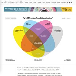
Storytelling with data. Cole Nussbaumer. Tools. What Makes A Good Data Visualization? Hi there.
Visual Thinking. What is Visual Thinking?
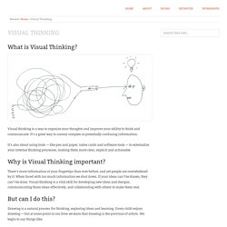
Visual thinking is a way to organize your thoughts and improve your ability to think and communicate. It’s a great way to convey complex or potentially confusing information. It’s also about using tools — like pen and paper, index cards and software tools — to externalize your internal thinking processes, making them more clear, explicit and actionable. Why is Visual Thinking important? There’s more information at your fingertips than ever before, and yet people are overwhelmed by it. But can I do this? Drawing is a natural process for thinking, exploring ideas and learning. “I’m no artist” “I can’t draw a straight line” “I can’t draw a stick figure” A visual exploration on mapping complex networks.
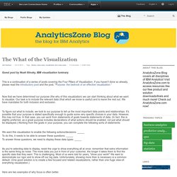
Properties and Best Uses of Visual Encodings « Complex Diagrams. Properties and Best Uses of Visual Encodings « Complex Diagrams. AnalyticsZone Blog. Guest post by Noah Iliinsky, IBM visualization luminary.
This is a continuation of a series of posts covering the Four Pillars of Visualization. If you haven't done so already, please read the introductory post and the post, "Purpose: the bedrock of an effective visualization. " Now that we have determined our purpose (the why of this visualization) we can start thinking about what we want to visualize. Our task is to include the relevant data (that which we know is useful) and to leave the rest out. We have mandates for both inclusion and exclusion. AnalyticsZone Blog. Guest post by Noah Iliinsky, IBM visualization luminary.
This is a continuation of a series of posts covering the Four Pillars of Visualization. Please read my previous article , which describes these pillars as: purpose, content, structure and formatting. This post focuses on the first of these. AnalyticsZone Blog. Guest post from Noah Iliinsky, Advanced Visualization Expert, IBM Center for Advanced Visualization This is the first of a series of five posts discussing the four pillars of successful visualizations.
In this article I’ll introduce the four pillars and discuss why they’re in the order they’re in; and then in subsequent posts I’ll examine each pillar in depth and explain how to think about and use the concepts when building an effective data visualization. AnalyticsZone Presents: Creating Effective Visualization Series with Noah Iliinsky. The world produces more than 2.5 exabytes of data every day.
Perceptual Edge. X-bar and range chart formulas. A Guide to Control Charts. Control charts have two general uses in an improvement project.

The most common application is as a tool to monitor process stability and control. A less common, although some might argue more powerful, use of control charts is as an analysis tool. The descriptions below provide an overview of the different types of control charts to help practitioners identify the best chart for any monitoring situation, followed by a description of the method for using control charts for analysis.
Identifying Variation When a process is stable and in control, it displays common cause variation, variation that is inherent to the process. Control charts are simple, robust tools for understanding process variability. The Four Process States. Types of Control Charts. Last year I wrote an Introduction to Control Charts (Run Charts).
I referenced a favorite book of mine, Understanding Variation: The Key to Managing Chaos, by Donald Wheeler of SPC Press, an expert in Statistical Process Control. This book is a quick read, and it’s a great introduction to control charts, written clearly using layman’s terms, with a number of very good examples to illustrate their use. In fact, in my last engineering job before becoming a full-time Excel jockey, I was frustrated by many operational features in the manufacturing facility where I worked. As I reread Wheeler’s book, I could relate many observed behaviors in the plant with examples in the book. Barnstable County Septic System Database: Posts. The Data Visualisation Catalogue. 30 Simple Tools For Data Visualization. There have never been more technologies available to collect, examine, and render data.
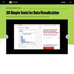
Here are 30 different notable pieces of data visualization software good for any designer's repertoire. They're not just powerful; they're easy to use. In fact, most of these tools feature simple, point-and-click interfaces, and don’t require that you possess any particular coding knowledge or invest in any significant training. Let the software do the hard work for you. Your client will never know. 1. iCharts 2. InfoGraphic Designs: Overview, Examples and Best Practices. Information graphics or infographics are visual representations of information, data or knowledge. These graphics are used where complex information needs to be explained quickly and clearly, such as in signs, maps, journalism, technical writing, and education.
They are also used extensively as tools by computer scientists, mathematicians, and statisticians to ease the process of developing and communicating conceptual information. They can present a rich amount of information without intimidating you. Or sometimes they intimidate you, but make the digesting of the information much more bearable. Here in this article below, we are going to discuss best practices for designing infographics followed by some examples which might help you learn a thing or two. You may be interested in the following related articles as well. Feel free to join us and you are always welcome to share your thoughts that our readers may find helpful. Chart Porn. FlowingData. A Periodic Table of Visualization Methods.