
#VizzingAg - Lindsey Poulter. Dashboards. False Peak Ventures LLC. Hashtag #voronoi sur Twitter. George Gorczynski — Profile. Dashboards and Analytics with Tableau. Tableau Picasso » Blog. The Analytics Tool You Don't Learn At School: Listening. Build Network Graphs in Tableau. What is a Network Graph?
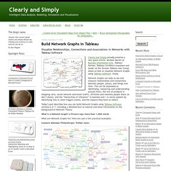
A Picture says more than 1,000 words What are Network Graphs for? Here are just a few practical examples: Contacts Between Philanthropic Twitter Users The Organization of Hierarchical Communities The Path to Products People Buy Last, but not least a Network Graph built in Tableau: Association of Food Groups, Brands and Flavors Tableau’s Out of the Box Network Graphs Tableau Desktop is one of my favorite data analysis and reporting tools. Build Network Graphs with Tableau – The How to My implementation of network graphs in Tableau leverages features that have been around since version 1, the circle and the line mark types, and support for scatter plots – and ability to draw double axis graphs (hackable for years before being officially supported as “combo charts” in version 6).
Data Preparation Key to my implementation is data preparation given the requirement to connect elements in the form of a transaction and lay out the design of the network graph in the Tableau view: Vizzing In Public Gets Attention. I’m not sure I can adequately express how much love I have for Tableau Public, but I’m going to give it a go.
I published my first viz to Tableau Public on 12th September, 2016. I’d fiddled around with Tableau a little to that point, connecting to my own MySQL database, but not really vizzing in anger at all to that point. The week before, Pablo and I went along to the Tableau 10 Roadshow event in London, and one of the speakers (Andy Cotgreave?) Referenced Makeover Monday. We’d not heard of it before that, but thought it sounded like something we could have a go at. Looking back, my first contribution was overwhelmingly amateur. Quite rightly, those first few visualisations I published garnered very little attention.
The Scrollytelling Scourge. Scrollytelling is a common way of interacting with stories these days.
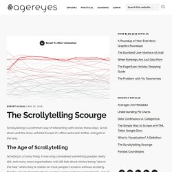
Scroll down and the story unfolds! Except it’s often awkward, brittle, and gets in the way. The Age of Scrollytelling Scrolling is a funny thing. It was long considered something people rarely did, and many news organizations will still talk about stories being “above the fold” when they’re visible on most people’s screens without scrolling. Scrollytelling takes this a bit further by assuming that people would rather scroll (or swipe) through a story – hence the term – than hit buttons to advance through a story. Except it doesn’t work. Why choose? Scrollytelling & Steppers – Zan – Medium. “Scrollytelling” is an online storytelling technique in which more and more content is revealed as the user scrolls down the page.
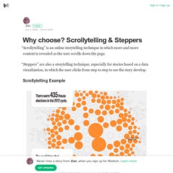
“Steppers” are also a storytelling technique, especially for stories based on a data visualization, in which the user clicks from step to step to see the story develop. Scrollytelling Example Stepper Example I’ve been hearing a lot of people talking about “scrollytelling vs steppers” recently, sparked in part by Robert Kosara’s blog post “The Scrollyteling Scourge.” Like the “which visualization is best” and the “are pie charts really evil” debates, these types of questions don’t really make sense to me. Affordances and Signifiers: applying design theory to your dashboards – Gravy Anecdote. When designing objects, be they hotel room taps/faucets, iPhones, or cars, the creators grapple with the concepts of affordances and signifiers.
These terms were introduced into design by Don Norman, author of The Design of Everyday Things, based on earlier work by JJ Gibson. What are these and how can we apply them to our dashboard design? An affordance is something an object (or dashboard) can do. A tap/faucet can run hot or cold water, for example.A signifier is an indicator of some sort.
In our tap example, this might be red/blue dots signifying which way to turn the tap to get hot or cold water. Data Visualization “Versus” UI and Data Science – Lynn Cherny – Medium. I want to talk about the wealth of opportunities I see for data visualization specialists visiting in and borrowing from the “adjacent” fields of UI design and data science.
I prefer to imagine this post will be about more than a tempest in a twitter teapot — or a teenier splash of soy milk in a Silicon Valley macchiato. But it did start with a tweet from there: Since then, we’ve seen a flurry of posts (see references) about data visualization as a profession, and what if anything might be wrong with it. I’m going to ignore some of the raised issues about the role definition itself and focus more on the relationships between the fields and a bit about the jobs and therein. UX/UI and Vis Design My position: I’m someone who went from UI design to data vis and data science, many years ago. I was a UX designer or manager for nearly 18 years. Those facts about the world then are still true. PolicyViz. Eagereyes – Visualization and Visual Communication.
Twitter. Tableau.