
Information design Information design is the practice of presenting information in a way that fosters efficient and effective understanding of it. The term has come to be used specifically for graphic design for displaying information effectively, rather than just attractively or for artistic expression. Information design is closely related to the field of data visualization and is often taught as part of graphic design courses.[1] Etymology[edit] The term 'information design' emerged as a multidisciplinary area of study in the 1970s. In 1982, Edward Tufte produced a book on information design called The Visual Display of Quantitative Information. The term information graphics tends to be used by those primarily concerned with diagramming and display of quantitative information. In technical communication, information design refers to creating an information structure for a set of information aimed at specified audiences. Early examples[edit] Applications[edit] See also[edit] References[edit]
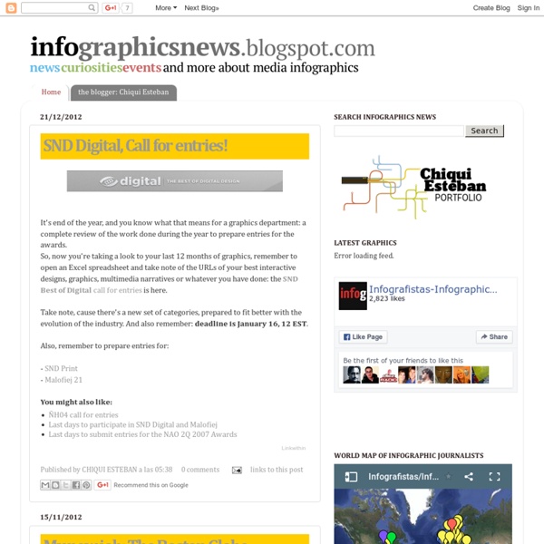
Chad Hagen’s ‘Nonsensical Infographics’ « Man Make Home June 3, 2009 by manmakehome I stumbled on these fantastic ‘Nonsense Info Graphics’ from Chad Hagen on flickr today. Spend the rest of the afternoon trying to figure out what they’re actually charting! More on his flickr page. Like this: Like Loading... Gapminder: Unveiling the beauty of statistics for a fact based world view. Statistics and Design - By the Numbers Blog - NYTimes.com Matthew Ericson – ericson.net The winners of the 34th Edition of the Best of News Design contest were released today, so I’ve updated my interactive crosstab of SND winners that lets you see at a glance which publications won awards in which categories. One particularly interesting thing to me: There were only 19 awards give in the information graphics categories — 17 for individual works and 2 for portfolios. That’s down from 97 just three years ago. I’d be curious to know how much of the decline comes from fewer print graphics being produced in general in newspapers — and probably also fewer entries in the contest — and how much is from a different, and much tougher, set of judges than in past years. Just pushed out an update to the Adobe Illustrator MultiExporter script that lets you specify if you want to export PNGs and JPGs at a different scale factor so that you can generate versions of the images at double resolution for iPhone retina displays. I’ve posted the slides from my presentation as a PDF.
Information graphics Information graphics or infographics are graphic visual representations of information, data or knowledge intended to present complex information quickly and clearly.[1][2] They can improve cognition by utilizing graphics to enhance the human visual system’s ability to see patterns and trends.[3][4] The process of creating infographics can be referred to as data visualization, information design, or information architecture.[2] Overview[edit] Infographics have been around for many years and recently the proliferation of a number of easy-to-use, free tools have made the creation of infographics available to a large segment of the population. Social media sites such as Facebook and Twitter have also allowed for individual infographics to be spread among many people around the world. In newspapers, infographics are commonly used to show the weather, as well as maps, site plans, and graphs for statistical data. "Graphical displays should: Graphics reveal data. History[edit] Early[edit]
Paul Laffoley's psychotronic schematic diagrams of metaphysical knowledge systems 'Paul Laffoley was born into an Irish Catholic family in Cambridge, Massachusetts in 1940. He spoke his first word, “Constantinople,” at six months, then remained silent until the age of four (having been diagnosed as slightly autistic), when he began to draw and paint. In his senior year at Brown University, he was given eight electric-shock treatments. He was dismissed from the Harvard Graduate School of Design, but managed to apprentice with the sculptor Mirko Baseldella, before going to New York to apprentice with the visionary architect Frederick Kiesler. 'Laffoley supports himself with a job at the Boston Museum of Science, returning to the BVC not only to eat and sleep but to work on multimedia renderings of his visions of alternative futures and complex realities. 'During a routine CAT-scan of his head in 1992, a miniature metallic implant, 3/8 of an inch long, was discovered in the occipital lobe of his brain, near the pineal gland. Elsewhere Lafolley's Odyssey (6:09) Works p.s.
FlowingData | Data Visualization, Infographics, and Statistics Flip Flop Fly Ball April 10, 2014: Catching up It's been a while. Off-season came and went, I spent a couple of months in London, lived in a hotel for a while, and now have a new apartment a stone's throw from the stadium of my Mexican soccer team of choice, Cruz Azul. I've not done any infographics about baseball in that time. Weird. November 1, 2013: Day of the Dead Baseball Teams Walking around my neighbourhood (Coyoacán) the other day, I was thinking about the Expos, and seeing people setting up stuff for the Day of the Dead, I put those two things together and drew an ofrenda for the teams that relocated. October 28, 2013: Árbol de Béisbol This is something I've been working on (slowly) for over two years. October 18, 2013: Switching the -stons There was a moment in last night's Tigers-Red Sox game, when the camera showed David Ortiz from a three-quarter-ish view, and I saw just a few letters on his road jersey: STON. October 16, 2013: Balls in logos Fourteen major league teams have balls in their logos.
chartsnthings 19 Sketches of Quarterback Timelines On Sunday Eli Manning started his 150th consecutive game for the Giants, the highest active streak in the NFL and the third-longest streak in NFL history. (One of the other two people above him is his brother, Peyton.) The graphics department published an interactive graphic that put Eli’s streak in the context of about 2,000 streaks from about 500 pro quarterbacks. The graphic lets you explore the qbs and search for any quarterback or explore a team to go down memory lane for your team. It’s not particularly important news, but the data provided by pro-football-reference is incredibly detailed and the concept lended itself to a variety of sketches. A couple bar charts in R. And percent of games started (the people are 100% are players like Andrew Luck or RGIII who just haven’t played a lot of seasons.) Ported to a browser, just using total starts: And share of total possible starts …or all the way back to 1970