
Our World in Data. KAUST High-Performance Visualization Group. Data visualization handbook: the website. JPL Ops Lab. NASA JPL computer graphics lab. JBWC - Home.
Workshop Findings. By workshop conveners: Kim Kastens, Tim Shipley, and Martin Storksdieck (last updated 1 May 2018) Introduction Visualizations can be a powerful tool for both thinking and communicating.

This website is the product of a workshop designed to gather, organize, and disseminate good ideas for how educators can help learners extract insights from visualizations and express their own ideas via visualizations, and can assess learners' progress towards visualization mastery. By "visualizations," we include both data-driven visualizations (graphs, maps, and other images built from quantitative data) and concept-driven visualizations (diagrams, flow charts, concept maps and other images generated from a concept or theory).
Learning Goals for skillful visualizers We agreed upon a shared set of learning goals that span across disciplines, ages, and visualization types. Overarching takeaways from the workshop Educating Skillful Visualizers workshop. PDB-101: Goodsell Gallery: Coronavirus. Coronavirus, 2020 This painting depicts a coronavirus just entering the lungs, surrounded by mucus secreted by respiratory cells, secreted antibodies, and several small immune systems proteins.
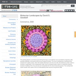
The virus is enclosed by a membrane that includes the S (spike) protein, which will mediate attachment and entry into cells, M (membrane) protein, which is involved in organization of the nucleoprotein inside, and E (envelope) protein, which is a membrane channel involved in budding of the virus and may be incorporated into the virion during that process. NodeXL Graph Gallery. VisGuides. Data Visualisation & Storytelling. Create charts and maps with Datawrapper.
Adioma Blog - Infographics, Design, and Content Marketing. Adioma Blog - Infographics, Design, and Content Marketing. Dataviz.toolsdataviz.tools - a curated guide to the best tools, resources and technologies for data visualization. NetStories. Cameron Hummels. Seán O'Donoghue. VizbiPlus - Visualising the Future of Biomedicine. The VizbiPlus project aims to improve how life science is communicated by creating exemplary scientifically-accurate animations designed to inspire and educate the public about cutting-edge biomedical research.
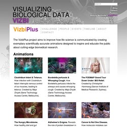
Animations Clostridium tetani & Tetanus. VIZBI - Visualizing Biological Data. Data Visualization, Design and Information Munging // Martin Krzywinski / Genome Sciences Center. Neuroimaging: Visualizing Brain Structure and Function. 2.
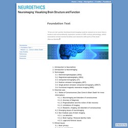
Introduction to Neuroimaging Few advances have transformed the fields of neuroscience and medicine like brain imaging technology. VIS. (We are very thankful that Dr.
Steffen Oeltze from the University of Magdeburg Visualization Group could write this short report on the medical visualization-related papers at IEEE VIS 2013 for us.) I was very happy to see that in 2013, the IEEE Vis conference hosted again a separate session on biomedical visualization. On top of the five talks given in this session, five more interesting talks, also related to MedVis, were distributed over the conference program.
Before the event started, I considered it a good omen that the inwards of the conference hotel looked like a gigantic corpus with the conference attendees accommodated along the costal arches. Images are courtesy of Helwig Hauser ©2013. OGC® Standards and Supporting Documents. OGC(R) standards are technical documents that detail interfaces or encodings.

Software developers use these documents to build open interfaces and encodings into their products and services. These standards are the main "products" of the Open Geospatial Consortium and have been developed by the membership to address specific interoperability challenges. The 100 Best Infographics of the Last Decade. GIP 58: The Geologic Time Spiral, A Path to the Past. The Earth is very old—4.5 billion years or more according to scientific estimates.
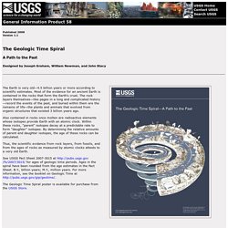
Most of the evidence for an ancient Earth is contained in the rocks that form the Earth's crust. The rock layers themselves—like pages in a long and complicated history—record the events of the past, and buried within them are the remains of life—the plants and animals that evolved from organic structures that existed 3 billion years ago. Also contained in rocks once molten are radioactive elements whose isotopes provide Earth with an atomic clock. Within these rocks, "parent" isotopes decay at a predictable rate to form "daughter" isotopes. TULP interactive. C82: Works of Nicholas Rougeux. Chandra Sky Map. This is what the entire known Universe looks like in a single image. Isn’t it beautiful?
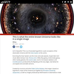
This is an illustrated logarithmic scale conception of the observable Universe with the Solar System at the centre. Encircling the Solar System are the inner and outer planets, Kuiper belt, Oort cloud, Alpha Centauri star, Perseus Arm, Milky Way galaxy, Andromeda galaxy, other nearby galaxies, the cosmic web, cosmic microwave radiation, and invisible plasma produced by the Big Bang at the very edges. This 1-minute animation will change your perception of life in the Universe. If extraterrestrial life is anything like what we see on Earth, then chances are it's living on Earth-like planets thousands, or even millions, of light-years from our Solar System.
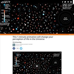
Today, astronomers have detected over 1,700 extra-solar planets, or exoplanets, with NASA's Kepler Space Telescope. While it's hard to visualise so many planets, a second-year astronomy graduate student at the University of Washington, Ethan Kruse, has found a way that is both mesmerising and oddly humbling. Check out his animation above, where every circle you see is a planet. (Our Solar System is on the far right.)
What you're seeing here is our Solar System among every exoplanet that the Kepler telescope has identified since NASA launched it into space in 2009. In total, the animation reveals a jaw-dropping 1,705 exoplanets in 685 planetary systems - just like our Solar System, many other star systems contain more than one planet. Many exoplanets observed to date are larger than Earth and scorching hot. The Fallen of World War II - Data-driven documentary about war & peace. Why do we visualize data? Why do we visualize data?
Do data visualizations aim to inform audiences effectively? Or do they simply aim to catch people’s eye, providing the just gist of the data? This is a question which has been hotly debated by some of the leading authors in the field of data visualization recently. Data visualization is a spectrum, determined by your data, your objectives and your audience. Whichever visualization style you choose, it should be the most effective one for the purpose at hand. VisIt. About VisIt VisIt is an Open Source, interactive, scalable, visualization, animation and analysis tool. From Unix, Windows or Mac workstations, users can interactively visualize and analyze data ranging in scale from small (<101 core) desktop-sized projects to large (>105 core) leadership-class computing facility simulation campaigns.
Northwestern University Center for Interdisciplinary Exploration and Research in Astrophysics - Stellar Evolution. The Formation of Nuclear Star Clusters by Fabio Antonini The three simulations correspond to different initial distributions for the cluster orbits. Most galaxies, including the Milky Way, contain massive (10^7 Solar masses) star clusters at their center. Our World in Data — Visualising the Empirical Evidence on how the World is Changing. Max Roser – Economist. Globaïa. Interactive Data Visualization for the Web. Copyright © 2013 Scott Murray Printed in the United States of America. O’Reilly books may be purchased for educational, business, or sales promotional use. Online editions are also available for most titles ( For more information, contact our corporate/institutional sales department: 800-998-9938 or <corporate@oreilly.com>.
VISUALIZING MATHS & PHYSICS. Dashboards by Keen IO. An Error Occurred Setting Your User Cookie. An Error Occurred Setting Your User Cookie. Bendis-Stereoscopy.pdf. Tableau Picasso » Blog. Subtleties of Color (Part 1 of 6) : Elegant Figures : Blogs. Introduction The use of color to display data is a solved problem, right? Just pick a palette from a drop-down menu (probably either a grayscale ramp or a rainbow), set start and end points, press “apply,” and you’re done. Although we all know it’s not that simple, that’s often how colors are chosen in the real world. Recommendations: Charting a Faster Course to Analytic Insights.
Causation vs Correlation: Visualization, Statistics, and Intuition. Visualizations of correlation vs. causation and some common pitfalls and insights involving the statistics are explored in this case study involving stock price time series. 30 Simple Tools For Data Visualization. The 36 best tools for data visualization. Xiaoji Chen's Design Weblog » Sky Color of 10 Chinese Cities. The 18 Best Infographics Of 2014. Your Wild Life Releases Home Microbiome Data Set for Visualization. Nice article on the Your Wild Life blog: Your Wild Life – A Whole New Way of Doing Citizen Science, Maybe. It discusses a collaobration between Your Wild Life and Holly Bik on visuliazation data from the citizen science – microbiome work that has been a part of the Your Wild Life project. Your Wild Life – A Whole New Way of Doing Citizen Science, Maybe.
Some parts of science are boring. Some are tedious. The Best Data Visualization Projects of 2014. It's always tough to pick my favorite visualization projects. I mean, it's a challenge to pick and rank your favorite anything really. Real-Time Photorealism. Yellowstone's Thermal Springs. Printer friendly version Share. The true colors of Yellowstone’s Thermal Springs unveiled by scientists. Published time: December 21, 2014 22:38. Can You Guess The Drunkest Day Of 2014? The Big Triangle. Franco Moretti: L'objet des humanités numériques, entre perspectives micro et macro. Le problème de la visualisation de données. Visualization and infographics programs at the University of Miami.
Visualized 2014 Roundup. An Interactive 3D Visualization of Photographs Taken From the International Space Station. Molecular clouds show off potential, beauty of data visualization. 15 Charts, Graphs, And Maps That Will Shape The Future Of Information. The Soaring U.S. Outbreak of Vaccine-Preventable Disease, Visualized. Data-driven Insights on the California Drought (12/8/2014 8:33:13 AM) Data Visualization vs. Data Analytics. Color Properties: Hue, Tint, Shade, Saturation, Brightness, Chroma. The Next Era of Designers Will Use Data as Their Medium. APEXvj TURBO: Supercharged Music Visualization. 9 Multimedia Resources for Information Design. A size comparison of the comet 67P with popular sci-fi spaceships. A Colorful Compendium of Infographics for Understanding the World Now.
Ten Simple Rules for Better Figures. A Picture is Worth a Thousand Words. Hadoop World: The executive dashboard is on the way out. Indiemapper - Free yourself from GIS. STAR WARS EPISODE VII Concept Art Leaks onto the Web. 5 Infographics That Actually Say Something. Infographic Designers' Sketchbooks by Steven Heller and Rick Landers reveals the process behind the art and science of infographics. Mapping UK Airspace. Publishing. ProPublica's latest multimedia visualization is simply beautiful. The Oculus Rift Made Me Believe I Could Fly. Aesthetics of Data Presentation: Piers A-B-C Graphs. A Typographical History of NASA Data artists and... Spotting Bad Data Visualizations.
5 Rules For Making Graphs. Excellent Periodic Table of Visualizations for Teachers. A Gorgeous Visualization Of Kepler's Discoveries. Lyra: An Interactive Visualization Design Environment. Color Survey Results. Hans Rosling's 200 Countries, 200 Years, 4 Minutes - The Joy of Stats - BBC Four. Three Ways to Tell Stories with Data. Remixing Data Visualization, by Alessio Macrì.