
Data visualisation tools. Data Visualization. 3-Visualizations & mapping. Visualisation et dataviz. Intelligence visuelle. Visual Thinking. Visual thinking. Visual thinking, also called visual/spatial learning or picture thinking is the phenomenon of thinking through visual processing.
Visual thinking has been described as seeing words as a series of pictures. Our World In Data. Visualization Universe - The Most Searched for Visualization Types, Tools, and Books. Explore Featured Maps. Enter Topic (radial) View: Click on a Topic result from Search, or click the synapse.

A Periodic Table of Visualization Methods. The Data Visualisation Catalogue. Collection of data visualizations to get inspired and finding the right type. Great Diagrams in Anthropology , Linguistics, and Social Theory - an album on Flickr. Seeing Theory - Probability and statistics. Information Is Beautiful. David Byrne’s Hand-Drawn Pencil Diagrams of the Human Condition. By Maria Popova “Science’s job is to map our ignorance.”
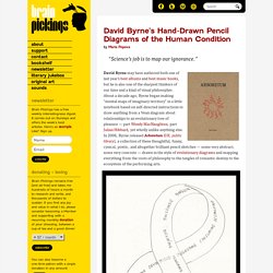
David Byrne may have authored both one of last year’s best albums and best music books, but he is also one of the sharpest thinkers of our time and a kind of visual philosopher. About a decade ago, Byrne began making “mental maps of imaginary territory” in a little notebook based on self-directed instructions to draw anything from a Venn diagram about relationships to an evolutionary tree of pleasure — part Wendy MacNaughton, part Julian Hibbard, yet wholly unlike anything else. In 2006, Byrne released Arboretum (UK; public library), a collection of these thoughtful, funny, cynical, poetic, and altogether brilliant pencil sketches — some very abstract, some very concrete — drawn in the style of evolutionary diagrams and mapping everything from the roots of philosophy to the tangles of romantic destiny to the ecosystem of the performing arts.
No difference in knowledge obtained from infographic or plain language summary of a Cochrane systematic review: three randomized controlled trials - Journal of Clinical Epidemiology. Organization. 100 Diagrams That Changed the World. Since the dawn of recorded history, we’ve been using visual depictions to map the Earth, order the heavens, make sense of time, dissect the human body, organize the natural world, perform music, and even concretize abstract concepts like consciousness and love. 100 Diagrams That Changed the World (public library) by investigative journalist and documentarian Scott Christianson chronicles the history of our evolving understanding of the world through humanity’s most groundbreaking sketches, illustrations, and drawings, ranging from cave paintings to The Rosetta Stone to Moses Harris’s color wheel to Tim Berners-Lee’s flowchart for a “mesh” information management system, the original blueprint for the world wide web.
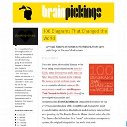
It appears that no great diagram is solely authored by its creator. Most of those described here were the culmination of centuries of accumulated knowledge. Exploratree - Exploratree by FutureLab.
Mind Mapping. Infografica. Timelines. Data Visualization (Charts) Plans, cartes. Teoria e teorie. Diagrammi. LOOPY: a tool for thinking in systems. Visme. Création de graphiques, présentations et infographies – Les Outils Tice. Visme est un studio graphique en ligne qui permet de créer relativement facilement des présentations, des infographies, des rapports ou des graphiques.
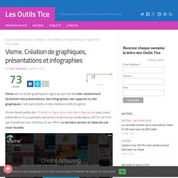
C’est sans doute un des meilleurs outils du genre. Visme faisait partie des 10 outils en ligne pour créer des infographies que j’avais présentés ici il y a quelques semaines.Ce service qui existe depuis 2013 n’en finit pas d’améliorer son interface et son offre. La dernière version en date est une vraie réussite. Visme propose des milliers de modèles que vous allez pouvoir adapter en un tour de main à vos besoins spécifiques pour donner forme graphique à vos idées ou… vos cours. Que ce soit pour créer une infographie ou une présentation avec des slides, Visme va vous faciliter la tâche et vous permettre de vous concentrer sur le contenu tout en vous assurant une forme moderne et attractive. Créer une infographie avec Visme est ainsi très simple.
Visme fait aussi des merveilles pour créer une série de slides pour une présentation. Mind tools. Infographics, Charting and Mapping Tools & Apps #stats #statistics #graphics #infographics #infographic #graphs #in #imagesinformation #datavisualization #maps #bigdata #mapping #charts #charting #datamapping. Infographics | Mind Mapping | Charts | Graphs. Christopheviau.com/d3list/gallery.html. Gallery · mbostock/d3 Wiki. Wiki ▸ Gallery Welcome to the D3 gallery!
More examples are available for forking on Observable; see D3’s profile and the visualization collection. Please share your work on Observable, or tweet us a link!
LOOPY: a tool for thinking in systems. Organiser. Graphic organizers. Organizzatori visuali. Zen Flowchart. The Simplest Tool to Create Flowcharts. Zen Flowchart. L'outil le plus simple pour créer des diagrammes. Article mis à jour le 9 mai 2019 par Fidel Navamuel Zen Flowchart est incontestablement l’outil le plus simple au monde pour créer des diagrammes et des organigrammes en ligne.
Un modèle de simplicité qui permet de se concentrer sur l’essentiel: le contenu. Le bon outil reste pour moi celui qui sait se faire oublier. ProcessOn - Create diagrams online in real-time! SpicyNodes. Graphing tools. Graphics (Illustration, Drawing, Photo,...) Management visuel. DrawExpress. Haiku Deck. Data visualisation (Info. graphics) Professional Tools. Data Visualization. Dataviz.toolsdataviz.tools - a curated guide to the best tools, resources and technologies for data visualization. FoamTree: addictively interactive Voronoi treemap. What are the requirements of FoamTree?
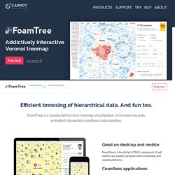
FoamTree requires JavaScript and HTML5 canvas support. It will work on any major browser, including Chrome, Firefox, IE10+, Edge and Safari. Will FoamTree run on mobile devices? Yes, FoamTree will run on Android and iOS phones and tablets. Touch-enabled laptops are also supported. Does FoamTree require Lingo3G or Lingo4G to run? No, FoamTree can be used independently of Lingo3G or Lingo4G. RAWGraphs. Datawrapper. Shanti & VisualEyes. Guide du datajournalisme. La boite à outils. The top 20 data visualisation tools.
30 Simple Tools For Data Visualization. There have never been more technologies available to collect, examine, and render data.
Here are 30 different notable pieces of data visualization software good for any designer's repertoire. They're not just powerful; they're easy to use. In fact, most of these tools feature simple, point-and-click interfaces, and don’t require that you possess any particular coding knowledge or invest in any significant training. Let the software do the hard work for you. Your client will never know. 1. iCharts 2. FusionCharts Suite XT is a professional and premium JavaScript chart library that enables us to create any type of chart. Visualising Data » Resources. Here is a collection of some of the most important, effective, useful and practical data visualisation tools.
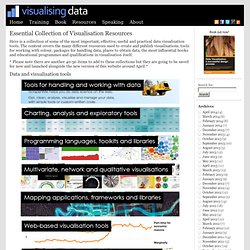
The content covers the many different resources used to create and publish visualisations, tools for working with colour, packages for handling data, places to obtain data, the most influential books and educational programmes and qualifications in visualisation itself. Les outils de dataviz. Vive la data visualization dans votre navigateur ! DATA visualisation. The Best Data Visualization Projects of 2014. It's always tough to pick my favorite visualization projects. I mean, it's a challenge to pick and rank your favorite anything really. So much depends on what you feel like at the time, and there's a lot of good work out there. Nevertheless, I gave it a go. 50 Great Examples of Data Visualization. Wrapping your brain around data online can be challenging, especially when dealing with huge volumes of information. And trying to find related content can also be difficult, depending on what data you’re looking for.
But data visualizations can make all of that much easier, allowing you to see the concepts that you’re learning about in a more interesting, and often more useful manner. Below are 50 of the best data visualizations and tools for creating your own visualizations out there, covering everything from Digg activity to network connectivity to what’s currently happening on Twitter. Music, Movies and Other Media Narratives 2.0 visualizes music. Grafici. Selected Tools. Create a pie chart online. Free Sankey Diagrams. <svg id="sankey_svg" height="600" width="600" xmlns=" version="1.1"><title>Your Diagram Title</title><! Copy the code above to embed your diagram. Save it in a “.svg” file to edit it in another application. Every Flow will have a tooltip when hovering. Charts. ChartTool.
Chart Chooser. Create and design your own charts and diagrams online. Online Chart Maker. Online Diagram Software and Flowchart Software - Gliffy. Graphviz. Gephi. Organizadores Graficos - Descargar Gratis, Diagramas Venn, Mapas Conceptuales, Lineas de Tiempo, Mentefactos... Visualisation (textes, données, diagrammes...) Story map creating tools. Data visualization. Information Visualization Manifesto. Posted: August 30th, 2009 | Author: Manuel Lima | Filed under: Uncategorized | – “The purpose of visualization is insight, not pictures” Ben Shneiderman (1999) – Over the past few months I’ve been talking with many people passionate about Information Visualization who share a sense of saturation over a growing number of frivolous projects.
Many Eyes. Easily create, share and embed interactive charts. Network Visualization. Things made thinkable. Clean Up Your Mess - A Guide to Visual Design for Everyone. Design Inspiration. Iconscrabble. TheFWA. 50 Viral Images (and how they spread) Viral videos are ubiquitous – they have spread into both mainstream pop culture and corporate America. Everyone talks about developing viral videos, and there are plenty of techniques you can use to give your video the best chance of success. But, something not talked about as frequently are viral images. 50 Viral Images Part Two. My original 50 viral images (and how they spread) post turned out to be extremely successful and was read quite a few times to say the least.
I was surprised so many people were interested as the images in there had already been passed around social media to death. With that said, I failed to consider most people don’t spend nearly as much time on the web as I do. Seeing as the first viral images post was published June 15, 2008 we’re passed due for a fresh one. Again, as I said in the previous post: Visualcomplexity.com. Ideas, issues, knowledge, data - visualized! A Collection of Printable Sketch Templates and Sketch Books for Wireframing. At the beginning of a web (or application) development project I always create the sketches first.
While sketching can be done on a blank paper, it’s much better to use a sketch template. For me that is the best and most productive way to work on and improve my ideas before application development begins (and things get more complicated :-)). Pictogram rock posters. Sketchnotes and Visual Thinking.