
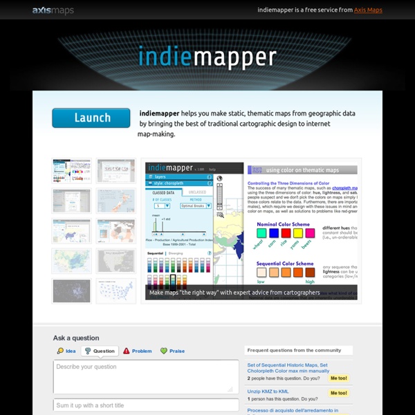
indiemapper is free - Axis Maps Blog by David Heyman on January 5, 2012 With the start of 2012, we’ve decided to make indiemapper free to use. Since indiemapper launched in 2010, our business has grown and changed to where supporting and maintaining indiemapper is no longer a major part of what we do at Axis Maps every day. We’re making indiemapper free so that it can continue to exist as a useful tool for map-makers while freeing us up to be as awesome as possible at our custom cartography business. To allow us to give it away for free, we’re scaling back what indiemapper does.
Hacks and hackers gather to write the first Data Journalism Handbook The following post is from Federica Cocco, a freelance journalist and the former editor of Owni.eu, a data-driven investigative journalism site based in Paris. She has also worked with Wired, Channel 4 and the Guardian. It is cross posted on DataDrivenJournalism.net and on the Data Journalism Blog. Ravensbourne College is an ultramodern cubist design school which abuts the O2 arena on the Greenwich peninsula. It is perhaps an unusual and yet apt setting for journalists to meet.
Contents Cartography is the science of map-making. It comprises many problems and techniques, including: measuring the Earth's shape and features collecting and storing information about terrain, places and people representing the three-dimensional planet as flat maps (my main concern) devising and designing conventions for graphical representation of data printing and publishing information. There is an endless variety of geographic maps for every kind of purpose. Mapping Stereotypes Get your copy on: Amazon US / Amazon UK / Amazon DE / Amazon FR / Amazon IT / Amazon ES / Amazon Canada / Amazon Japan / Amazon India / Amazon Brazil Atlas of Prejudice: The Complete Stereotype Map Collection
The true colors of Yellowstone’s Thermal Springs unveiled by scientists Published time: December 21, 2014 22:38 Yellowstone National Park, Wyoming (Reuters) Researchers have created a simple mathematical model that reveals the stunning colors of the hot springs at Yellowstone National Park by visually recreating what they looked like years ago before decades of tourists ruined them with rubbish. Scientists have long understood the basic physical phenomena that create the colors of the hot springs. They exists because of an interplay between underwater vents and lawns of bacteria, and now the research team have created a mathematical model that empirically shows how the chemical and physical variables in the pools relate to the optical colors.
Statistical Visualization For his book The Visual Miscellaneum, David McCandless, along with Lee Byron, had a look at breakups on Facebook, according to status updates. They looked for the phrase "we broke up because" in status updates, and then graphed the frequencies over time. Why they couldn't just look at updates to relationship status, I'm not sure. Notice the peak leading up to the holiday season and spring cleaning.
10 tools that can help data journalists do better work, be more efficient It’s hard to be equally good at all of the tasks that fall under data journalism. To make matters worse (or better, really), data journalists are discovering and applying new methods and tools all the time. As a beginning data journalist, you’ll want to develop a sense of the tools others are using to do the work you admire. You won’t be able to learn them all at once, and you shouldn’t try. You should, however, develop a sort of ambient awareness of the tools in use (something like the knowledge Facebook gives you about the lives of your high-school classmates). Keep a list of tools to check out.
OpenGeo Community Suite - Wind Energy Certificate Program - UIowa Wiki Table of Contents The OpenGeo Community Suite (OCS) is free version of the OpenGeo Suite from OpenPlans, a 501c3 not for profit. Find more information about OpenPlans here. Since this version is free, you can download it and install on your personal computer running Windows, Linux or Mac OS X. Yellowstone's Thermal Springs Printer friendly version Share 19 December 2014 American Institute of Physics (AIP) WASHINGTON D.C., December 19, 2014 – Researchers at Montana State University and Brandenburg University of Applied Sciences in Germany have created a simple mathematical model based on optical measurements that explains the stunning colors of Yellowstone National Park’s hot springs and can visually recreate how they appeared years ago, before decades of tourists contaminated the pools with make-a-wish coins and other detritus. The model, and stunning pictures of the springs, appear today in the journal Applied Optics, which is published by The Optical Society (OSA).
Infosthetics: the beauty of data visualization The beauty of information aesthetics: Visual Poetry 06 by Boris Müller. " Boris Müller's newest 'visual theme' for a annual international German literature festival. 2006 the theme consisted of beautiful visualizations of the poetry texts themselves. Each word corresponded to a numerical code by adding the alphabetical values of its letters together. This number was mapped onto the position on a circle, and marked by a red dot. Gray lines connect the dots in the sequence the words appear in the poem. The diameter of the circle on which the dots are placed is decided by the length of the poem," Andrew explains .