
Atlas for the End of the World Précis On May 20, 1570, Abraham Ortelius, book collector and engraver from Antwerp, published the Theatrum Orbis Terrarum (Epitome of the Theater of the World), the world's first atlas… Read more Essay: Atlas for the End? Whereas Ortelius marked out modernity's territorial beginnings, this atlas — by focusing on the remaining habitat in the world's 36 biodiversity hotspots — rakes over its remains. Read more World Maps This section offers 44 thematic world maps related to the general issue of global biodiversity and the epoch of the anthropocene more broadly. Read more Datascapes The Datascapes are 11 visualizations designed to make quantities such as carbon emissions, urban growth and food production which are otherwise hard to comprehend, intelligible… Read more Hotspots The maps in this section audit the amount of protected areas in the world's 36 hotspots and their 391 ecoregions as well as analyze how 422 cities in the hotspots are growing… Read more Hotspot Cities Read more Facts & Data
Steven can plan – GIS and mapping tools Some of the work I do for school and my job requires that I make maps. I’ve never taken a class on how to make maps or analyze data sets featured in maps (what GIS does), so I learn as I go. There’s no one around me I can call upon when I have questions that need immediate answers. Well, there’s me! Because of this, I must quickly find a solution or workaround myself. Today I had to import a list of Chicago Transit Authority and Metra rail stations into ArcGIS so I could plot them on a map that also showed Chicago’s boundary and our bikeways. That’s okay – what follows is how I overcame this barrier: Because I know how to use PHP to instantly create Keyhole Markup Language (KML) files (the format which Google Earth and Maps speaks fluently). Other tools I used to get my map created: BatchGeocode.com – This site is indispensable for turning a list of addresses (with names, descriptions, and URLs) into the same list but with latitude and longitude coordinates!
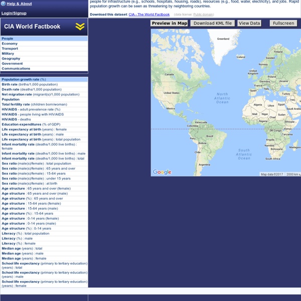
Fractal Universe FourWhere: start discovering the world around you (by sysomos) Outils et ressources cartographiques Retour à la page d'accueil de la veille Logiciels de cartographie Outils de création cartographique en ligne Ressources cartographiques Cartes et atlas thématiques La cartothèque de Sciences Po La cartothèque de la Documentation Française Cartes thématiques du Monde Diplomatique La cartothèque de l'IRD Cartographie thématique avec Géoclip (J. La carte du mois (académie de Grenoble) Cartes thématiques sur la France Cartes thématiques par communes (Géoclip) Cartographie des résultats électoraux en France Diaporamas et cartes de la Géothèque L'Atlas DELPHINE (voir description dans lettre d'information géomatique n°2) World Factbook Fonds de cartes et croquis Fonds de carte de l'académie d'Aix-Marseille Fonds de cartes de l'ONU Le croquis de géographie (J. Croquis en ligne (académie de Reims) Gapminder [haut] Gapminder est un service de visualisation de données et de leurs évolutions dans le temps, de manière dynamqiue autravers d'une animation Flash. Wincarto [haut] Cartes et Données [haut] Philcarto [haut]
Views of the World - rediscovering the world KML Reference - KML - Google Code This section contains an alphabetical reference for all KML elements defined in KML Version 2.2, as well as elements in the Google extension namespace. The class tree for KML elements is shown below. In this diagram, elements to the right on a particular branch in the tree are extensions of the elements to their left. KML is an open standard officially named the OpenGIS® KML Encoding Standard (OGC KML). The complete XML schema for KML is located at Note: Click an element name in this diagram to jump to its entry in the reference section. Note that abstract elements (shown in boxes in the diagram) are not actually used in KML files. All elements derived from Object can have an id assigned to them. Because KML is an XML grammar and file format, tag names are case-sensitive and must appear exactly as shown here. Tip: Viewing KML for Google Earth Features Here is a handy feature of Google Earth that makes it easy to view the KML file for any Feature. Syntax <!
Watch Air Traffic - LIVE! In order to save data consumption Flightradar24 web page times out after 30 minutes. Please reload the web page to get another 30 minutes. or get a Flightradar24 Premium subscription and Flightradar24.com will not time-out again! The top 20 data visualisation tools One of the most common questions I get asked is how to get started with data visualisations. Beyond following blogs, you need to practise – and to practise, you need to understand the tools available. In this article, I want to introduce you to 20 different tools for creating visualisations: from simple charts to complex graphs, maps and infographics. Almost everything here is available for free, and some you have probably installed already. Entry-level tools At the entry level, we'll be looking at unexpected uses for familiar tools. 1. You can actually do some pretty complex things with Excel, from 'heat maps' of cells to scatter plots. Excel comes as part of the commercial Microsoft Office suite, so if you don't have access to it, Google's spreadsheets – part of Google Docs and Google Drive – can do many of the same things. CSV (Comma-Separated Values) and JSON (JavaScript Object Notation) aren't actual visualisation tools, but they are common formats for data. Online visualisations 3.