
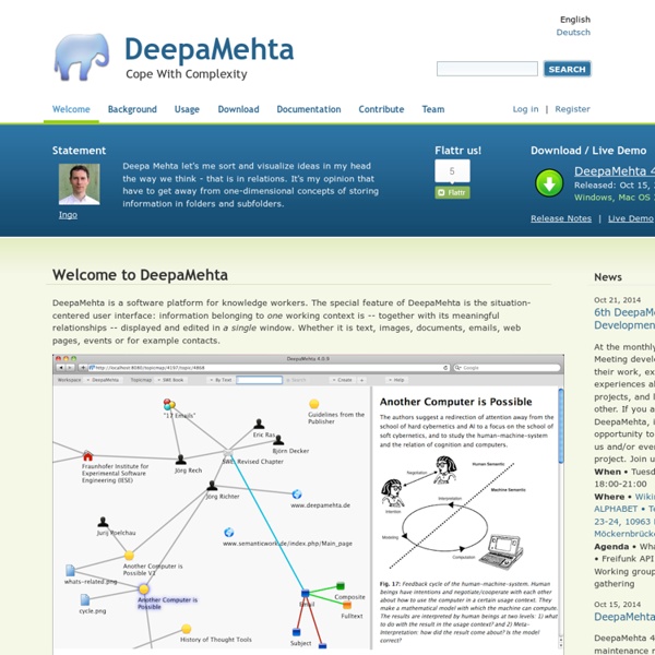
http://www.deepamehta.de/en/content/welcome-to-deepamehta
36 Excellent Data Visualization Tools Data is always useful but it is not easy to comprehend it when it is not presented understandably. This is where data visualization comes in; there are many tools and techniques of providing data in a way that helps the viewers to apprehend the given data. It is very important to draw in the user’s attention via proper data visualization so that he/she is better capable of retaining facts. It would definitely require the media, through which the data is presented, to present the information in such a way that it catches the user’s eye and still be intelligible to him at all counts and levels because representation of facts is always better shown through pictorial representation of statistics. To make it easy for all the data streaming sites to give their data in a most comprehensible way we have brought together a collection of data visualization tools.
50 Useful Mind-Mapping Tools for College Students July 27th, 2009 By Emily Thomas As a hardworking student, you’ve got a lot to organize, including essays, exams, deadlines, and class schedules, not to mention your social and personal life–plus any part-time jobs you may have taken on. In an effort to keep you more organized, we’ve generated this list of 50 useful mind-mapping tools that are designed to help you see your ideas more clearly, analyze and outline research papers, become more efficient when you study, and get inspired to be more creative in your work. Free or Open Source Online college students depend on open and free programs like these when balancing school work and a tight budget.
Tools - Cool Infographics Adioma creates information graphics out of your textual data, using timelines, grids and icons. Create impressive charts from spreadsheets. Assemble into dashboards, embed in websites, or simply share a link. A Python interactive visualization library that targets modern web browsers for presentation Cacoo is a free online drawing tool that allows you to create a variety of diagrams such as site map, flowchart, mind map, wire frame, UML diagram and network diagram. Crowdsourced Analytics Solution Marketplace - Make Sense of Big Data Free interactive charts created online in seconds ChartGo is an online graph maker tool. Brainstorming (techniques) et Remue-Méninges: Définition et exemple d'un processus d'animation et de conduite de réunion Technique du brainstorming: Quand l'utiliser? Définition de la technique du brainstorming Le brainstorming est une technique de créativité qui facilite la production d’idées d'un individu ou d'un groupe.
Links to Infographic Sites, Visual Designers and C - Cool Infographics Randy's infographic design consultancy to Visualize Business Intelligence Jacob O'Neal's site focused on designing animated GIF infographics Company that helps visualize business data Rose Zgodzinski's site to help client find visual solutions Consulting, Design and Social + PR Brian Cragin is an infographic designer in San Diego A masterfully constructed infographic campaign can work wonders for your business Dashboard Design: Data Driven helps your clients better understand and act upon your information Dejure Design provides interactive and visual design services to social justice organizations seeking to make their legal work more accessible and engaging. One of the UK’s leading providers of infographics and data visualisation for bloggers and businesses of all sizes An interactive design industry We make important data beautiful and easy to understand We specialize in transmitting messages in a clear, simple and attractive way.
MindRaider - Personal Notebook and Outliner Kuchen für alle! 15 hilfreiche Tools für die Datenvisualisierung Datenvisualisierung bietet sich immer dann an, wenn man Informationen an andere Menschen weitergeben will, die mit dem untermauernden Zahlenmaterial nicht vertraut sind. Je größer die Datensätze, desto komplizierter wird eine händische Aufbereitung. Entsprechende Tools können die Arbeit erheblich erleichtern und schicke Charts basteln – wie beispielsweise unser Artikel zur Datenvisualisierung mit Charts.js zeigt. In den vergangenen Jahren hat das Angebot an webbasierten Lösungen und Desktop-Anwendungen für das Sammeln, Analysieren und visuelle Aufbereiten von Daten erheblich zugenommen. In manchen Fällen sind die Datenvisualisierungslösungen so einfach gehalten, dass der Nutzer kaum über Coding-Kenntnisse oder Design-Skills verfügen muss.
Tools - Semantic Web Standards Overview This Wiki contains a collection of tool references that can help in developing Semantic Web applications. These include complete development environments, editors, libraries or modules for various programming languages, specialized browsers, etc. Semantic Web I have an idea that I think is very important but I haven’t yet polished to the point where I’m comfortable sharing it. I’m going to share it anyway, unpolished, because I think it’s that useful. So here I am, handing you a dull, gray stone, and I’m saying there’s a diamond inside. Maybe even a dilithium crystal. My hope is that a few experts will see what I see and help me safely extract it. Or maybe someone has already extracted it, and they can just show me.
15 Effective Tools for Visual Knowledge Management Since I started my quest a few years ago searching for the ultimate knowledge management tool, I’ve discovered a number of interesting applications that help people efficiently organize information. There certainly is no shortage of solutions for this problem domain. Many tools exist that offer the ability to discover, save, organize, search, and retrieve information. However, I’ve noticed a trend in recent years, and some newer applications are focusing more on the visual representation and relationship of knowledge. The 36 best tools for data visualization It's often said that data is the new world currency, and the web is the exchange bureau through which it's traded. As consumers, we're positively swimming in data; it's everywhere from labels on food packaging design to World Health Organisation reports. As a result, for the designer it's becoming increasingly difficult to present data in a way that stands out from the mass of competing data streams. Get Adobe Creative Cloud
An Internet and You, Me, O.S. Welcome to the Future! "UMEOS" by Xopher Dee To put your YOUniverse in your hands & pockets, or on your desk, table, or wall. We will be delivering a limited number of pocket size USB Key Drives, and All-in-One Touch Screen Desktop/Wall Computers during our marathon. A peak under the hood of the back end of UmeosSuper Powered by SuperDom 's video poster PLAY
How to Create an Awesome Infographic 46Email Share To create an awesome infographics, you need to follow the following given 7 step procedure: