
Data Visualization: Modern Approaches. About The Author Vitaly Friedman loves beautiful content and doesn’t like to give in easily. When he is not writing or speaking at a conference, he’s most probably running … More about Vitaly Friedman … Visualization Strategies: Text & Documents » Tim Showers – Web Development, Design, and Data Visualization» Blog Archive. Whether it’s a campaign speech by a presidential contender, or a 300 page bestselling novel, large bodies of text are among the most requested topics for condensing into an infographic.
The purpose can vary from highlighting specific relations to contrasting points or use of language, but all of the following methods focus on distilling a volume of text down to a visualization. Workshop on Text Analysis - Visualizations: Lexical/Text. --D.
Thiebaut 17:58, 6 March 2013 (EST) This page is maintained by Dominique Thiebaut and contains various interesting visualization examples or related material gathered on the Web, and in various publications. Editing of this page by anonymous users is not enabled, but feel free to email dthiebaut-at-smith.edu with your own discoveries, which will be promptly added!
The different visualization systems shown below are organized by application domains, and by type (borrowed and adapted from Viz4All). The application domains include: Tapor. DocuBurst. 50 Great Examples of Data Visualization. Wrapping your brain around data online can be challenging, especially when dealing with huge volumes of information.

And trying to find related content can also be difficult, depending on what data you’re looking for. The Graphic Account: 1-16-13. Part of the beauty of working with data is how many interesting things you learn.
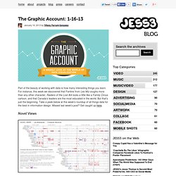
For instance, this week we discovered that Fantine from Les Miz coughs more than any other character, Raiders of the Lost Ark looks a little like a Family Circus cartoon, and that Canada’s leaders are the most educated in the world. Why D3.js is So Great for Data Visualization. When D3 came out in 2011, it became clear pretty quickly that it was going to be a powerful tool for creating data visualizations. But it’s certainly not the first — or only — tool. Why did it succeed when so many other libraries have failed? First of all, it works on the web. Data visualizations are only good if people see them, and there’s no better place to see them than on the internet, in your browser.
Cluster Dendrogram. EDC: Set Visualiser. Set Visualiser is a tool developed to visualise the way that a number of items is classified into one or more categories or sets using Euler diagrams.
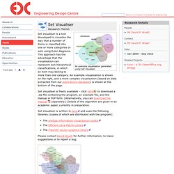
This approach has the advantage that the visualisation can represent non-hierarchical classifications, in which an item may belong to more than one category. An example visualisation is shown on the right, and a more complex visualisation (based on data extracted from our publications database) is shown at the bottom of the page. Set Visualiser is freely available - click here to download a .zip file containing the program, an example file, and the manual in PDF form. (Alternatively, you can download the manual separately.) Details of the algorithm are given in an academic paper, currently in preparation. Set Visualiser is written in Java and uses the following libraries (copies of which are distributed with the program): Please contact David Wyatt for further information, to make suggestions or to report a bug.
Hive Plots - Linear Layout for Network Visualization - Visually Interpreting Network Structure and Content Made Possible. Calendar View. Processing.js. Paper.js - Paper.js. Standing on the shoulders of Scriptographer and making use of HTML5 standards, Paper.js is a comprehensive open source vector graphics scripting framework.
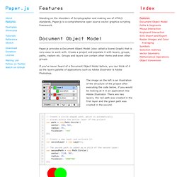
Document Object Model Paper.js provides a Document Object Model (also called a Scene Graph) that is very easy to work with. Create a project and populate it with layers, groups, paths, rasters etc. Groups and layers can contain other items and even other groups. If you've never heard of a Document Object Model before, you can think of it as the layers palette of applications such as Adobe Illustrator & Adobe Photoshop. The image on the left is an illustration of the structure of the project after executing the code below, if you would be looking at it in an application like Adobe Illustrator. Learn more about the Document Object Model in the Document Hierarchy tutorial.
Paths & Segments Paper.js makes is very easy to create paths and add segments to them. Learn more about paths and segments in the Working with Path Items tutorial. Symbols. Raphaël—JavaScript Library. Edit fiddle. Timeline for d3 - proof-of-concept. Timeline for d3 - proof-of-concept This chart shows events, that have a defined start and/or end in the time continuum in form of a timeline or timechart.
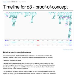
Events can be instants (one date only) or intervals (start date and end date). The timeline consists of two bands. The upper band shows the timeline items with data within the selected timeline interval. The lower band is the navigation band; it just shows the distribution of the items. Click on the brush and drag to move the interval. Swimlane Chart using d3.js. Timeline JS - Beautifully crafted timelines that are easy, and intuitive to use. Timeline.