
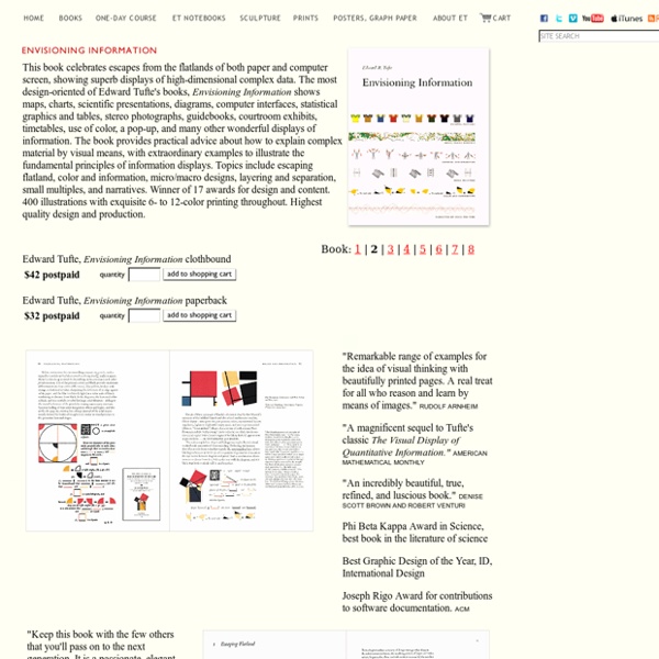
http://www.edwardtufte.com/tufte/books_ei
Related: data visualisation37 Data-ish Blogs You might not know it, but there are actually a ton of data and visualization blogs out there. I'm a bit of a feed addict subscribing to just about anything with a chart or a mention of statistics on it (and naturally have to do some feed-cleaning every now and then). In a follow up to my short list last year, here are the data-ish blogs, some old and some new, that continue to post interesting stuff. Data and Statistics By the Numbers - Column from The New York Times visual Op-ed columnist, Charles Blow, who also used to be NYT's graphics director.Data Mining - Matthew Hurst, scientist at Microsoft's MSN, also the co-creator of BlogPulse.Statistical Modeling - We might disagree on certain things, but Andrew's blog is one of the few active pure statistics blogs.The Numbers Guy - Data-minded reporting from Carl Bialik of the Wall Street Journal.Basketball Geek - Like statistical analysis and basketball?
Vision Statement (HBR) Text by Daniel McGinn; illustration by Stephanie Crowley For a big client meeting in April, Accenture senior manager Mark Papia hired a type of practitioner he’d never encountered before: a “graphic recorder.” During the session, artist Julie Stuart drew large murals depicting the participants’ discussion on 4-foot-by-8-foot sheets of paper. The goal: to help people make connections and better recall key points. “The artwork generated a tremendous amount of interaction,” Papia says. InfoGraphic Designs: Overview, Examples and Best Practices Information graphics or infographics are visual representations of information, data or knowledge. These graphics are used where complex information needs to be explained quickly and clearly, such as in signs, maps, journalism, technical writing, and education. They are also used extensively as tools by computer scientists, mathematicians, and statisticians to ease the process of developing and communicating conceptual information.
Diagram Software - The Best Choice for Diagramming All-in-one diagram software that makes it perfect for the following diagram software types. What's the diagram solution? Buy one diagram software that suits one group but forces the other to compromise and make do? Or purchase some separate diagram software for each department's special needs and hope that your company approves the purchase?
Grove Copyright Policy The Grove’s models and templates are the intellectual property of The Grove Consultants International and are based on best practices drawn from more than thirty years of fieldwork. The Grove is committed to sharing its ideas, processes, and tools in order to foster collaboration, and while we strive to make these easily accessible, only authorized licensees may use our proprietary information and materials. Such licensees must acknowledge The Grove as their source by displaying a Grove copyright notice and may reproduce such proprietary information only with our express written permission. Any unauthorized reproduction or use of our copyrighted material without The Grove’s express written permission is a violation of U.S. copyright law.
True Colors: What Brand Colors Say About A Business Studies have shown that a product’s color influences 60-80 percent of a customer’s purchasing decision, which makes choosing the wrong color a death sentence before your brand ever has a chance to get off the ground. The most recognizable labels in the world are defined by their colors. Take a second to think of some of the most popular brands that instantly come to mind: Coca-Cola, Facebook, Apple, McDonalds, and Google – to name a few. Data visualization books: How to start your personal library The Excel Charts Blog There are many approaches to data visualization. Take well-know authors like Tufte, Cleveland, Ware, Few, Bertin or McCandless. There is some overlap, but they all approach data visualization from a different angle. That’s great news for you: this means that you can come up with a unique point of view that reflects your interests and needs. I suppose the books you buy are consistent with that view. Let me give you my own example.
Visual Facilitation Graphic facilitation isn't harmed by a bit of showmanship sometimes. Depending on the needs of the client. The client in this case wanted visual facilitation within a James Bond themed evening. The key is getting a really tight brief from the client. Knowing what kind of illustrations they need.
10 Fun Tools To Easily Make Your Own Infographics People love to learn by examining visual representations of data. That’s been proven time and time again by the popularity of both infographics and Pinterest. So what if you could make your own infographics ? What would you make it of? It’s actually easier than you think… even if you have zero design skills whatsoever. Below are my two favorite infographic-making web 2.0 tools that I highly recommend.