
Chris Harrison's Visualization Projects - Namoroka (Build 200908. 15 Stunning Examples of Data Visualization. Data Visualization is a method of presenting information in a graphical form.

Good data visualization should appear as if it is a work of art. This intrigues the viewer and draws them in so that they can further investigate the data and info that the graphic represents. In this post there are 15 stunning examples of Data Visualization that are true works of art. Click on the title or image for a larger view of each visualization. The Strengths of Nations Here’s an image that discusses the variations in how different nations pursue science. Madrid.Citymurmur CityMurmur tries to understand and visualize how media attention reshapes the urban space and city. Genome Jules & Jim This visual represents the relationship between characters in the movie Jules & Jim. One Week of the Guardian This is one day in a series that takes the news from one week of the Guardian newspaper, and visually represents it as a series of static visualisations. One Week of the Guardian Leisure & Poverty Stock Data Related Posts. W. Bradford Paley: Map of science image in the journal Nature.
Update: This has now been published in many more places: the original Nature article, Discover Magazine, SEED, Geo, the Eastern European Edition and India, Brazil, etc., and more books and papers.

Since the image has proven to be popular (we still get print & publication requests, four lears later!) , I decided to rework the existing image layers, modifying only the graphical representation—no structure—to see whether I could improve the information layering and remedy some of the faults I outline at the bottom of this page. Here's the new version: I was surprised at how much clearer it could be made. I think the new one has many of the structural faults I outlined below, but improves several things: Fewer distracting lines: nodes are now a single visual element rather than an outline and a central dot. What follows is the original posting. The journal Nature chose an image that spatially lays out different areas of science in a plane. How Might We Visualize Data in More Effective and Inspiring Ways.
We have many dashboards available to us today in many contexts: finance, forecasts, consumption, demographics, etc.
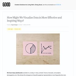
We witness the emergence of beautiful graphical representations more frequently than ever. Instead of flooding this post with examples of data visualization, I would like to put the spotlight on how we processes them, and what challenges that presents. A couple of years ago, we were tasked at IDEO to design dashboard visualizations for Ford's next generation hybrid vehicle, the Ford Fusion. Hybrid cars are efficient only if the driver maximizes the car's potential; in other words, if the driver learns to make sense of the complex mechanics of two motors and regenerative braking. If the dashboard is the interface between the driver and the car, how might it coach drivers to make sense of this complexity and to adopt efficient driving habits? This is the key question we need to address when we put people at the center of evaluation (as Jocelyn Wyatt puts it). Data Visualization and Statistics.
Ideas, issues, concepts, subjects - v. View provider. Data vizualisation – les 10 meilleurs outils gratuits. La data vizualisation ou l’art de représenter des données chiffrées de façon visuelle a connu un essor important ces dernières années, avec notamment l’omniprésence de graphiques, de #timelines, d’infographies, de cartographies et de cartes #interactives sur le web mais aussi dans les media.
De nombreux outils en ligne existent et certains proposent des offres gratuites. Voici notre sélection des 10 meilleurs outils gratuits pour créer votre #infographie : 1. Visual.ly Visual.ly est certainement un des outils les plus connus, il vous permet de créer en moins de 10 secondes une présentation visuelle de votre activité sur #Facebook et/ou #Twitter grâce à 8 templates différents. 2.Re.vu Re.vu est un outil destiné à créer votre cv de manière originale et visuelle avec des graphiques, des courbes et des représentations colorées. 6 solutions gratuites en ligne pour créer des nuages de mots-clés.
La création de nuage de mots-clés est une façon simple de cartographier des idées, des champs sémantiques, des concepts, d’évoquer des notions essentielles… Et de mettre en forme via des réglages (couleur, taille des mots, position dans l’espace, jeu de polices de caractère…) un instantané visuel qui offre une forme de représentation synthétique pour l’internaute et la personne.
Exemple DataViz. Exemple DataViz. DATA and vizualisation. Tudes. L’EBG lance en partenariat avec SAS son premier livre blanc sur la Data Visualization Nous avons interrogé plus de 30 sociétés sur leurs projets de Data Visualization* , en leur demandant quels en étaient les enjeux, pour quels utilisateurs, avec quels résultats.
Ces retours d’expérience détaillés et concrets permettent de se faire une idée plus claire des enjeux liés à ce domaine en plein essor. Entreprises participantes (liste non exhaustive) : Pour obtenir un exemplaire de l'ouvrage, vous pouvez contacter ligia.rodrigues@ebg.net. Télécharger la version iBook ici. Data Visualization, Infographics, and Statistics. DATA Visualisation. Dataviz.