
Tiki-toki. Welcome. NodeBox is a node-based software application for generative design.
It's built from the ground up by designers to be easy-to-use, efficient, and fast. Visualize Your Data Because of its unique approach, NodeBox is ideal for rapid data visualization. NodeBox can import many data formats such as Excel spreadsheets and you can write your own data importers and exporters. An Animated Partner Every parameter in NodeBox can be animated. A Friendly Face You want to explore generative design without learning the ins and outs of programming? Peek Under The Hood Using nodes doesn't have to mean giving up expressive power. Sponsors YourKit is kindly supporting open source projects with its full-featured Java Profiler. Us uses Neo4j’s graph database technology to offer you an easy solution to store, search and visualize your graphs. - Linkurious. See Graph Databases Easily. Visualize and explore graphs Neo4j user or looking for a way to visualize large scale graph data?
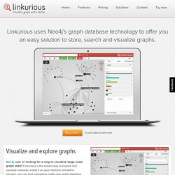
Linkurious is the easiest way to explore and visualize networks. Install it on your machine and within minutes, you can start navigating inside your graph database. Search for properties, inspect nodes, and explore their relationships visually in your web browser. Loxa - Web Site Exporter - Gephi Plugin. HTTP Graph - Gephi Marketplace. www.clementlevallois.net/gephi/tuto/fr/gephi_advanced%20functions_fr.pdf. Cartographie, information, réseaux. Mind Mapping and the Gephi Program. The task of mind mapping started with a simple set of questions designed to emphasis the meaning of 2 degrees of separation.
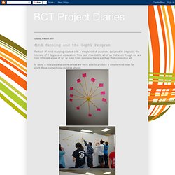
THis task revealed to all of us that even though we are from different areas of NZ or even from overseas there are tties that connect us all. By using a note pad and some thread we were able to produce a simple mind map for which these connections could be shown Our next task became that of interpreting the our collective data into a form that was easier to understand. For this we used a program called GEPHI. Gephi presented its own problems for us as with no prior experience we all managed to find some difficulties with it. At the end of the day we split up to make our own attempts at interpreting and designing around the data.
This was more difficult then it first seemed but the end outcome helped to better represent the data in a more understandable format. Once this was done we returned in the morning to share our respective outcome with each other. Citeology - Projects. Update: We have submitted a Citeology paper to alt.CHI which you can download here.
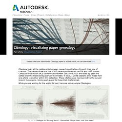
Citeology looks at the relationship between research publications through their use of citations. The names of each of the 3,502 papers published at the CHI and UIST Human Computer Interaction (HCI) conferences between 1982 and 2010 are listed by year and sorted with the most cited papers in the middle. In total, 11,699 citations were made from one article to another within this collection. These citations are represented by the curved lines in the graphic, linking each paper to those that it referenced. While you are waiting for the applet to load, here are some sample Citeologies: Citeologies for "Tracking Menus", "Generalized Fisheye Views", and "Side Views" Selecting a single paper lets you see the articles from the past that the paper referenced (in blue), and also the future articles which referenced it (in red).
Zoomed in view of a high-resolution Citeology PDF file. Basic Usage Keyboard Shortcuts. Journalisme de données ? Cartographie web. Beautiful web-based timeline software. Cartographier vos informations avec Gephi. Aujourd’hui, je vais vous présenter un outil très puissant d’analyse de l’information, le logiciel Gephi.
Cet outil va vous permettre de représenter sous forme de cartographie des données brutes et de les analyser. Les experts disent que cet outil est à l’analyse de l’information ce que Photoshop est à la retouche d’image : C’est un outil complexe, mais donnant des résultats impressionnants. Gephi est encore assez peu connu en France, et qui est utilisé par des experts en entreprise. Les informations disponibles sur son fonctionnement sont assez peu nombreuses, et j’ai eu du mal à réunir les éléments que je vais vous présenter aujourd’hui. Mon objectif est donc de vous présenter cet outil en le simplifiant au maximum et en centralisant les informations qui vous seront nécessaires pour l’utiliser. Pour avoir un exemple complet et expliqué, vous pouvez directement lire l’exemple sur Facebook J’espère que cet article va vous plaire, et je vous invite à le partager sur vos réseaux favoris.
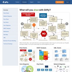
Examples of Gliffy Diagrams. Gliffy’s friendly editor, vast symbol libraries, and handy templates make it easy to communicate your thoughts and plans visually.
Two Examples of Animated Data Visualization. As market researchers pay more and more attention to the need for compelling data visualizations, Hans Rosling’s work with interactive data is becoming a catalyst for a fascinating new type of data visualization: animated statistical graphs.
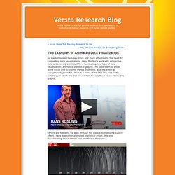
He uses them to show world social and economic trends over time, and the effect is exceptionally powerful. Here is a video of his TED talk well worth watching, in which the first eleven minutes are focused on interactive graphs: Others are following his lead, though not always to the same superb effect. Here is another animated statistical graph, this one documenting drone strikes and fatalities in Pakistan: In my view, this second one is interesting and it represents a worthy effort to explore animated presentations of data. By Joe Hopper, Ph.D. Versta Research Website.