
Logiciel de création de contenus interactifs géniaux. Online Charts Builder. Hohli Online Charts Builder New version: Try new version of Charts Builder, it based on new Google Charts API Load From Image URL: Chart Data can't equal to original, but very similar to it.
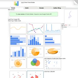
Only for images on chart.apis.google.com Chart Type: Radar charts Lines Bar charts Pie charts For Pie Charts with labels choose 1000x300 or 800x375 size Venn diagrams Scatter plots Radar charts Chart Size: 320x240 Horizontal 1000x300 800x375 600x500 320x240 Vertical 300x1000 375x800 500x600 240x320 Square 546x546 400x400 300x300 200x200. JuxtaposeJS — Northwestern University Knight Lab. Create Easy Infographics, Reports, Presentations. Datawrapper. Des outils de data visualisation. Rendre des statistiques visuellement attractives et dynamiques et ce, de manière rapide et efficace afin de les publier en ligne semble impossible? Vous trouverez ici quelques outils en ligne ainsi qu’un programme téléchargeable qui vous permettront de réaliser tout cela en un clin d’œil. A noter qu’une inscription est requise pour tous ces outils. Illustration : CanStockPhoto 1.
Datawrapper Datawrapper est sans doute l’outil de data visualisation le plus intuitif et le moins complexe, très simple d’utilisation. . → Exemple de réalisation → Site : www.datawrapper.de 2. Plus complet que Datawrapper, Infogr.am demande par conséquent un peu plus de temps à la prise en main. Une fois terminé, il suffit de publier (bouton SHARE) et de copier le code html généré dans son document. 3WDoc: Digital Storytelling in the Cloud.
PowToon, free business presentation software animated video maker and PowerPoint alternative. Tips, tricks and resources for infographics. Infographics (or Information Graphics) are graphic visual representations of data or information, presented in a way to make it easier to consume information.
Infographics gained popularity in the mid-2000′s with the advent of sites like Digg and Reddit, and have quickly become one of the most popular methods to display researched data. There are three main types of infographics – where data is presented in a timeline, where statistical data is presented in graphs or with icons, or where data is presented on a map. In order to create an infographic which will be widely shared, think about your typography, colours, and layout. Make it easy for people to understand the information that’s being provided. Sometimes it’s best to keep things simple. You can also get very creative with how you display your information, and do something completely unconventional. Infographics are among the most popular modern methods of sharing information with an audience.
Where to get visual statistics. Piktochart- Infographic & Presentation Tool. Online business presentation software to create free, cool, animated, powerpoint video alternatives. The Best Tools for Visualization. Visualization is a technique to graphically represent sets of data.
When data is large or abstract, visualization can help make the data easier to read or understand. There are visualization tools for search, music, networks, online communities, and almost anything else you can think of. Whether you want a desktop application or a web-based tool, there are many specific tools are available on the web that let you visualize all kinds of data.
Here are some of the best: Visualize Social Networks Last.Forward: Thanks to Last.fm's new widget gallery, you can now explore a wide selection of extras to extend your Last.fm experience. Last Forward Friends Sociomap: Friends Sociomap is another Last.fm tools that generates a map of the music compatibility between you and your Last.fm friends. Fidg't:Fidg't is a desktop application that gives you a way to view your networks tagging habits. Fidg't. Data-Driven Documents. Gephi, open source graph visualization and manipulation. Visual.ly. Cool Infographics. Datavisualization.ch Selected Tools. Gapminder: View world statistics.
22 free tools for data visualization and analysis. You may not think you've got much in common with an investigative journalist or an academic medical researcher.
But if you're trying to extract useful information from an ever-increasing inflow of data, you'll likely find visualization useful -- whether it's to show patterns or trends with graphics instead of mountains of text, or to try to explain complex issues to a nontechnical audience. There are many tools around to help turn data into graphics, but they can carry hefty price tags. The cost can make sense for professionals whose primary job is to find meaning in mountains of information, but you might not be able to justify such an expense if you or your users only need a graphics application from time to time, or if your budget for new tools is somewhat limited.
If one of the higher-priced options is out of your reach, there are a surprising number of highly robust tools for data visualization and analysis that are available at no charge. Diagrammer. Duarte Slidedocs - French.