
Leaflet. Data Collection | Data Analysis | Data Transformation. Data visualisation tools. Visualization. Jaret timebars - jaret timebars (gantt chart and timeline widget/control for SWT and Swing) The jaret timebars package contains a viewer for a data model containing rows of intervals.
The viewer displays the intervals in a Gantt chart fashion. The viewer is implemented for Swing and the SWT toolkit using a delegate for most of the work. Priority of the development is the SWT version! Swing mostly caught up with version 1.30. If you want to know about new versions you can follow the timebars on twitter: If you like you can comment and rate the timebars component at Eclipse Plugin Central. Features include: rendering is done by renderers allowing a complete customization (simple default renderes are supplied). Dual licensing The package is licensed under the GNU Public License (see LICENSE) allowing the usage in other free projects under the GPL. Screenshots and screen casts There are some screenshots and screencasts available here. Status and platforms The Swing version of the TimeBarViewer should run on every platform supporting Java 1.5. Bugs. Calculate the number of links a node has?
Working with Zoom behavior in D3.js and some notes. Zooming functionality is a very useful feature for working with large and complicated svg diagram.
Often for those types of graph, zoom ability allows users to have a detail view of one specific part on that graph. Fortunately, creating zoom behavior in d3js is an uncomplicated task since the library already takes care of it all for you. Everything you need to do is to apply the zoom function function on the svg element that you want.
Save/ Grab svg from website to local machine or convert to image. Pan and zoom · Issue #1672 · neo4j/neo4j. SVG Crowbar. A Chrome-specific bookmarklet that extracts SVG nodes and accompanying styles from an HTML document and downloads them as an SVG file—A file which you could open and edit in Adobe Illustrator, for instance.
Because SVGs are resolution independent, it’s great for when you want to use web technologies to create documents that are meant to be printed (like, maybe on newsprint). It was created with d3.js in mind, but it should work fine no matter how you choose to generate your SVG. The Bookmarklet.
ColorBrewer: Color Advice for Maps. Likert.pdf. The Likert Question Question » Data Revelations. Overview I’ve been looking at various examples over at Stephen Few’s Perpetual Edge web site and one example (this one) really resonates with me as it deals with how to visualize Likert Scale questions.
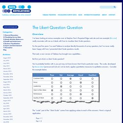
For the past five years I’ve used Tableau to analyze literally thousands of survey questions, but I’ve never really been happy with how I presented Likert Scale questions results. That said, a new version of Tableau has brought new capabilities… But first, just what is a Likert Scale question? You’re probably familiar with it, you just may not have known that it had a particular name. The “scale” part of the “Likert Scale” comes from applying values to each of the answers. Poor = 1 Fair = 2 Average = 3 Good = 4 Excellent = 5 I’ve purposely set up an example that asks ten questions of the survey taker (only six are shown above).
Note: An interactive dashboard that presents all the different approaches may be found at the bottom of this blog post. Approach One – Pie Charts. Graph Visualization for Neo4j. Gwtd3/gwt-d3. Pre-render d3.js charts at server side - part1: proof-of-concept - Mango IS. This guide explains how to use d3.js on the server to pre-render data-visualization, which will be used client-side.
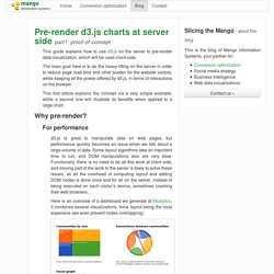
The main goal here is to do the heavy-lifting on the server in order to reduce page load time and other burden for the website visitors, while keeping all the power offered by d3.js, in terms of interactions on the browser. This first article explains the concept via a very simple example, while a second one will illustrate its benefits when applied to a large chart. Creating static data visualizations with D3.js and Node.js. D3.js is known for its great data viz capabilities for the web, including dynamic and interactive capability.

But D3.js can also be used to generate static data visualizations via the command line, including CSS styling and/or stylesheets. For example, if you want a command line solution for automated visualization creation, if you want to output an SVG into your make workflow, or if you need to prepare a visualization for print (for a research paper, journal article, a newspaper or magazine), a plain old non-interactive SVG can be very useful. The output we’re aiming for is an SVG you can load into Inkscape, Illustrator, or one that we can convert to an EPS, a PDF, render to a PNG or any other image file format you can think of.
Data Visualization Contest. Miguel Nacenta. – photo by Callum HylandLicense: CC-BY-SA.

Main page: nacenta.com Dr. Miguel Nacenta has been a University of St Andrews lecturer since May 2011, where he cofounded the SACHI group. Prior to this he was a post-doctoral fellow at the Interactions Lab, University of Calgary, Canada. He holds an electrical engineering degree from the Technical University of Madrid (Ingeniero Superior, UPM), and a doctorate from the University of Saskatchewan, Canada, under the supervision of Prof. College of Life Sciences. Mikedewar/d3py. Visualizing Facebook Friends With D3.js or “How Wolfram. A while ago, Wolfram|Alpha got the ability to generate personal analytics based on your Facebook profile.
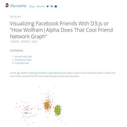
It made some cool numbers and stuff, but the friend network graph was the most impressive: Wolfram|Alpha neatly separates your various social circles into clusters, based on proximity — with freaky accuracy. With the awesome D3.js library, along with some gratuitous abuse of the Facebook API, we can make our own! If you’re impatient, skip through all this text and check out the example or the screenshot! Ggplot2. Data visualisation (Info. graphics) Data Visualization. Data visualization. D3.js - Data-Driven Documents. Lectures-trellis.pdf.