
Release v4.0.0 · d3/d3. Bl.ocks.org - mbostock. Simple animated bar charts using D3 and data-attributes. Collapsible Force Layout. Force Layout with Tooltips. Force-Directed Graph. Curved Links. Force Layout with Mouseover Labels. Let's Make a Bar Chart. A few days ago I started taking a closer look at Michael Bostock's D3.js.
D3 is an amazing JavaScript library for mapping data to HTML elements or SVG nodes. I started off making some bar charts with HTML elements and then moved onto SVG nodes and transitions. Generally, to make simple charts, all you need to do is follow these steps: Select the place you want to put your chartSelect all the chart componentsApply the data to this selectionAdd a new compononent for each piece of data that wasn't appliedPosition the new componentsApply any other attributes or styles Here's an example of a bar chart and the code that will create it below: When setting an attribute, the second argument can be a literal, variable, or a function. D3 also lets you apply transitions to selections. Transitions are simple: append a call to transition() and set the delay and/or duration with calls to delay and duration. D3 can do so much more than just displaying bar charts or line graphs. Build Your Own Graph!
Tutorials · mbostock/d3 Wiki. Wiki ▸ Tutorials Please feel free to add links to your work!!
Tutorials may not be up-to-date with the latest version 4.0 of D3; consider reading them alongside the latest release notes, the 4.0 summary, and the 4.0 changes. Introductions & Core Concepts Specific Techniques D3 v4 Blogs Books Courses D3.js in Motion (Video Course)Curran Kelleher, Manning Publications, September 2017D3 4.x: Mastering Data Visualization Nick Zhu & Matt Dionis, Packt. Talks and Videos Meetups Research Papers. Creating Animations and Transitions With D3. For the ambitious, this is a great intro to creating your own animations and transitions in d3.js.
If you get in over your head, drop by the Visually Marketplace to hire one of our talented developers. In interactive visualisation, there is the word reactive. Well, maybe not literally, but close enough. The fact is that reactivity, or the propension of a visualisation to respond to user actions, can really help engage the user in a visualisation, and help them understand its results.
Both of which are usually good things. So I’ll go ahead and state that animation, if done right, can make any interactive data visualization better. How is that? When coupled with interaction, it’s a very useful way to give feedback to the user. That said, animation can definitely ruin your visualization, too. Animation is very prominent. So we’ve seen how animation is helpful in data visualization.
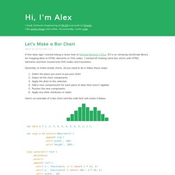
d3 with x3dom Demo. Ring Chart. Let’s Make a Bar Chart, III. In the previous parts of this tutorial we made a basic bar chart in HTML and then in SVG; now, we’ll improve the display by rotating the chart into columns and adding axes.
We’ll also switch to a real dataset, showing the relative frequency of letters in the English language. Source: Cryptological Mathematics, Robert Lewand. #Rotating into Columns Rotating a bar chart into a column chart largely involves swapping x with y. However, a number of smaller incidental changes are also required. When renaming the x scale to the y scale, the range becomes [height, 0] rather than [0, width]. We previously multiplied the var barHeight by the index of each data point (0, 1, 2, …) to produce fixed-height bars. Lastly, the bar labels must be positioned differently for columns rather than bars, centered just below the top of the column. #Encoding Ordinal Data Unlike quantitative values that can be compared numerically, subtracted or divided, ordinal values are compared by rank. #Preparing Margins. Basic d3.js Animated Bar Graph. Documentation.
Chart.js provides a number of options for changing the behaviour of created charts.
These configuration options can be changed on a per chart basis by passing in an options object when creating the chart. Alternatively, the global configuration can be changed which will be used by all charts created after that point. Chart Data To display data, the chart must be passed a data object that contains all of the information needed by the chart. The data object can contain the following parameters.