
The Best Tools for Visualization. Visualization is a technique to graphically represent sets of data.
When data is large or abstract, visualization can help make the data easier to read or understand. There are visualization tools for search, music, networks, online communities, and almost anything else you can think of. Whether you want a desktop application or a web-based tool, there are many specific tools are available on the web that let you visualize all kinds of data. Here are some of the best: Visualize Social Networks Last.Forward: Thanks to Last.fm's new widget gallery, you can now explore a wide selection of extras to extend your Last.fm experience. D3.js - Data-Driven Documents. CNN ECOSPHERE: #RIO20. Aharef: Websites as graphs.
Everyday, we look at dozens of websites.
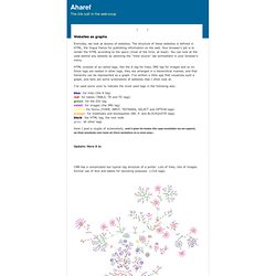
The structure of these websites is defined in HTML, the lingua franca for publishing information on the web. Your browser's job is to render the HTML according to the specs (most of the time, at least). You can look at the code behind any website by selecting the "View source" tab somewhere in your browser's menu. HTML consists of so-called tags, like the A tag for links, IMG tag for images and so on. Aharef: Websites as graphs. Network Analysis And Visualization. Welcome. Facts are Sacred: the power of data. Datasets by subject: A-F. A visual exploration on mapping complex networks. Data Visualization: Modern Approaches. About The Author. Datavisualization.ch. Home.
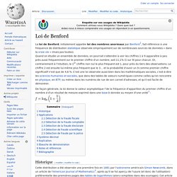
Hello, this is the Open Flash Chart project.

Get graphs like this for free: How does it work? User browses to your web site.The browser downloads the web page which contains the Open Flash Chart.Open Flash Chart downloads the data file and displays the chart. GE Data Visualization. Fishsubsidy.org. How to Visualize Data (Graph Types) Brief Overviews of Types of Graphs Representative Visualization Techniques Categorized Graphs One of the most important, general, and also powerful analytic methods involves dividing ("splitting") the data set into categories in order compare the patterns of data between the resulting subsets.
The top 20 data visualisation tools. Health InfoScape. The Best Tools for Visualization. How to Make an Interactive Network Visualization. Networks!
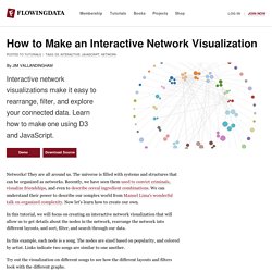
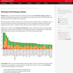
They are all around us. The universe is filled with systems and structures that can be organized as networks. Recently, we have seen them used to convict criminals, visualize friendships, and even to describe cereal ingredient combinations. D3.js - Data-Driven Documents. Raphaël—JavaScript Library. Refine, reuse and request data. Health InfoScape. When you have heartburn, do you also feel nauseous?

Or if you're experiencing insomnia, do you tend to put on a few pounds, or more? By combing through 7.2 million of our electronic medical records, we have created a disease network to help illustrate relationships between various conditions and how common those connections are. Powering the World. Graphical visualization of text similarities in essays in a book. Graphical visualization of text similarities in essays in a book. Graphical visualization of text similarities in essays in a book. The problem A collection of essays is collated for readers with visualizing graphics.
The graphics should both serve as a thematic and structural overview of each text, and pose the essay in question in relation to the other essays in the book. They should be both an abbreviation of the text and the key to decoding the complex issues under discussion. The difficulty in developing appropriate graphics arises from the level of discussion of the key themes. How To Use Simple Excel Functions for Data Analysis. In this series of video tutorials, ICIJ reporter Kate Willson demonstrates four basic yet essential Excel functions to assist with data analysis during investigative reporting.
Want to see any other video tutorials about Computer-Assisted Reporting? Please let us know either in the comments below or at contact@icij.org. Interested in viewing more of our investigative reporting video tutorials? Subscribe to ICIJ's YouTube channel to be the first to know when they are released. Auto Fill. GPU Mining on OS X Using poclbm. Loi de Benford. Un article de Wikipédia, l'encyclopédie libre.
La loi de Benford, initialement appelée loi des nombres anormaux par Benford[1], fait référence à une fréquence de distribution statistique observée empiriquement sur de nombreuses sources de données « dans la vraie vie » (mais pas toutes). Quand on étudie un ensemble de données, on pourrait s'attendre à voir les chiffres 1 à 9 apparaître à peu près aussi fréquemment sur le premier chiffre d'un nombre, soit 11,1% (1 sur 9) pour chacun. GI Files - Répertoire des informations publiques.
Explore Visualizations. Global Footprint - A story map. Wikileaks US Embassy Cables on Datavisualization.ch. Wikileaks began on Sunday November 28th publishing 251,287 leaked United States embassy cables, the largest set of confidential documents ever to be released into the public domain.
Here’s how media outlets strive to make the data more accessible than its original form. While the data will be released in stages over the next few months to the general public, five publications around the world have had prior access to the material. New York Times, The Guardian, Le Monde, El País and Der Spiegel were given access on condition that they observed common deadlines over the timings of release. « Ras-le-bol fiscal » : le grand matraquage. Tout commence par une interview du ministre de l’économie le 20 août sur France Inter : « Je suis très sensible à ce ras-le-bol fiscal que je ressens de la part de nos concitoyens » explique Pierre Moscovici. Wikileaks data visualisations: what you did with our Iraq and Afghanistan spreadsheets. Turn autoplay off Edition: WikiLeaks Cable Gate: the Visualizations and the Infographics.
CorpWatch : Index. Google transparency report 2013: find out what the world's governments want to know about you. More and more governments around the world are either asking Google to remove content - or tell them who its users are. Google's transparency report is the guide to how the governments of the world are interacting with the web giant in 2012. And it's an alarming picture. The report covers two types of requests: • Government requests to remove content from Google• Government requests from around the world to hand over user data.
10 Years of Touts. We just pushed out a quiet little update to our homepage. Nothing world-changing, just a nice refresh to help establish what Panic is all about for first-time visitors. (I had far more elaborate plans for the homepage — at one point involving building actual sets, no joke — but after so many years of “I’m sure we can get to it next week!” , and after building up so much internal pressure that everything we do has to be earth-shattering, it felt great for me to sit down and do something quick, simple, and fun. Lesson learned.) La Libre Pensée reçue au Ministère de l’Enseignement supérieur et de la Recherche le 3 mai 2011. Visual journalism. Visual journalism is the practice of strategically combining words and images to convey information. Universal[edit] Visual journalism is premised upon the idea that at a time of accelerating change, often words cannot keep pace with concepts. Visual journalism incorporates ancient symbols that resonate with humans across cultures and time and conveys meaning instantaneously at a deep level.
Visual journalism is an outgrowth of the practice of graphic facilitation and recording that began entering corporate board rooms, conferences, and think tank meetings in the 1970s with the leadership of David Sibbet, founder of The Grove Consultants International. VisualJournalism. Visual journalism - Journawiki. Visual journalism includes: Editorial cartoons Edit External links: Visual Journalism. What is visual journalism? Tim Holman. HTML5 Canvas Interactive Scatter Plot with 20,000 Nodes using KineticJS. Gilad Lotan » HTML5 Interactive Directed Graph. 20 Eye-Popping Interactive Experiences That Show Off What HTML5 Can Do. Nod... Anchor Modeler. 30 Superb Examples of Infographic Maps. As you search the web you’ll come across a wide range of interactive and graphical maps.
Interactive Globe: Small Arms Imports & Exports. 50 Great Examples of Data Visualization.
Visual Journalism. Companiesopen » 2012 » July. Revues. Data Bureaux. Government. Dette. Network. ScienceDirect.com - Neurocomputing - Intelligent data analysis. Multinationale.