
5 of the Best Free and Open Source Data Mining Software The process of extracting patterns from data is called data mining. It is recognized as an essential tool by modern business since it is able to convert data into business intelligence thus giving an informational edge. At present, it is widely used in profiling practices, like surveillance, marketing, scientific discovery, and fraud detection. There are four kinds of tasks that are normally involve in Data mining: * Classification - the task of generalizing familiar structure to employ to new data* Clustering - the task of finding groups and structures in the data that are in some way or another the same, without using noted structures in the data.* Association rule learning - Looks for relationships between variables.* Regression - Aims to find a function that models the data with the slightest error.
Case study: A brief review of online visualisation tools that can help There is a growing range of online tools to help users their data. This brief review highlights four online visualisation tools that can help. The links page also links to lots more useful resources. Online tools that can help visualise data (these tools are free to use, but any data uploaded is typically then available on the system for other users) highlighted below include: On the resources and links page, we also link to free software applications and libraries for visualising data, and development languages for more sophisticated data visualisation.
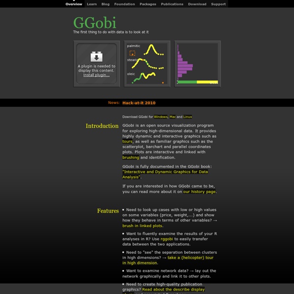
Chart and image gallery: 30+ free tools for data visualization and analysis November 7, 2013 03:21 PM ET The chart below originally accompanied our story 22 free tools for data visualization and analysis (April 20, 2011). We're updating it as we cover additional tools, including 8 cool tools for data analysis, visualization and presentation (March 27, 2012) and Six useful JavaScript libraries for maps, charts and other data visualizations (March 6, 2013). Data Mining Image: Detail of sliced visualization of thirty video samples of Downfall remixes. See actual visualization below. As part of my post doctoral research for The Department of Information Science and Media Studies at the University of Bergen, Norway, I am using cultural analytics techniques to analyze YouTube video remixes.
Gallery "Spike" map Interactive United States population density map. Average rating: 7.5 (23 votes) 2D histogram An extension of the concept of histogram to display the colour image content. Average rating: 4.8 (5 votes) Making Data Visualizations: A Survival Guide And Other Resources As part of my work as Visiting Scholar at the Packard Foundation this year, I’m facilitating a peer learning group based on “Measuring the Networked Nonprofit” and the next session we are focusing on the sense-making step of measurement. This part of the measurement process is most the fun because it covers visualization, pattern recognition, and reflection. I wanted to take a deeper dive into resources out there that provide useful tips about how to do this step for folks who were not data scientists or data nerds. I did a quick scan of data visualization resources to look for practical advice on the process of thinking visually and some technical information on what chart to select and data storytelling. Here’s what I discovered.
Eureqa Eureqa is a breakthrough technology that uncovers the intrinsic relationships hidden within complex data. Traditional machine learning techniques like neural networks and regression trees are capable tools for prediction, but become impractical when "solving the problem" involves understanding how you arrive at the answer. Eureqa uses a breakthrough machine learning technique called Symbolic Regression to unravel the intrinsic relationships in data and explain them as simple math. Using Symbolic Regression, Eureqa can create incredibly accurate predictions that are easily explained and shared with others.
Protovis Protovis composes custom views of data with simple marks such as bars and dots. Unlike low-level graphics libraries that quickly become tedious for visualization, Protovis defines marks through dynamic properties that encode data, allowing inheritance, scales and layouts to simplify construction. Protovis is free and open-source, provided under the BSD License. It uses JavaScript and SVG for web-native visualizations; no plugin required (though you will need a modern web browser)!
How to Use FF Chartwell Primarily suitable for Adobe Creative Suite, FF Chartwell for print uses OpenType ligatures to transform strings of numbers automatically into charts. The data remains in a text box, allowing for easy updates and styling. It’s really simple to use; you just type a series of numbers like: ‘10+13+37+40’, turn on Stylistic Alternates or Stylistic Set 1 and a graph is automatically created. To help get you started using FF Chartwell we’ve created this video tutorial and here are some simple steps: ONE — Firstly always make sure the letter spacing is set to “0” (zero) TWO — Using the values 0-100, type the values, then use “+” to combine them into one chart. FlowStone FlowStone uses a combination of graphical and text based programming. Applications are programmed by linking together functional building blocks called components. Events and data then flow between the links as the application executes.
Desktop This software has been renamed to Gapminder World Offline Because of technical problems the software on this page is no longer being maintained! Please visit Gapminder World Offline (Beta) instead. Dataviz Challenge #1: How to Make a Circle Chart in Excel Two weeks ago, I challenged readers to reproduce a circle chart from Innovation Network’s State of Evaluation 2012 report — using only Microsoft Excel or R. You can read the full blog post here. And the winners are… Tony Fujs, Andrea Hutson, Prince Rajan, and Bernadette Wright! Tony re-created the chart in R, and Andrea, Prince, and Bernadette re-created the chart in Excel. Here’s my how-to guide. At the bottom of this blog post, you can download an Excel file that contains each of the submissions.