
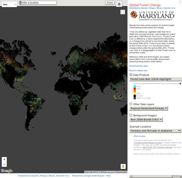
http://earthenginepartners.appspot.com/science-2013-global-forest
Related: Déforestation / ReforestationMore than 44,000 people came together to set the Guinness World Record for reforestation. A group in Ecuador set a world record over the weekend by planting nearly 650,000 trees in a single day. Agence France-Presse reports that on May 16, 2015, nearly 45,000 people took part in the largest single-day reforestation project ever. In total, 647,250 trees (and more than 220 species of plants) were planted on roughly 5,000 acres of land, marking a new Guinness World Record. Woo! Volunteers begin reforesting an area near Catequilla, Ecuador. Photo by Rodrigo Buendia/AFP/Getty Images. 40 more maps that explain the world Maps seemed to be everywhere in 2013, a trend I like to think we encouraged along with August's 40 maps that explain the world. Maps can be a remarkably powerful tool for understanding the world and how it works, but they show only what you ask them to. You might consider this, then, a collection of maps meant to inspire your inner map nerd.
Setting a country alight: Indonesia's devastating forest fires are manmade We are witnessing the worst manmade environmental disaster since the BP gulf oil spill. Huge, out-of-control fires rage through the forests of Indonesia – and the source of many is the practice of deliberately burning the land to clear it for palm oil and paper products. Thousands of fires have been lit to clear land simply because it is 75% cheaper than other methods. By burning down forests companies can get access to the land and can commence industrial pulp and palm oil plantations. The blazes are occurring in the peatland forests of Kalimantan and Sumatra, which is a unique wetland ecosystem home to threatened species.
40 maps that explain the internet The internet increasingly pervades our lives, delivering information to us no matter where we are. It takes a complex system of cables, servers, towers, and other infrastructure, developed over decades, to allow us to stay in touch with our friends and family so effortlessly. Here are 40 maps that will help you better understand the internet — where it came from, how it works, and how it's used by people around the world. How the internet was created Before the internet, there was the ARPANET Before the internet, there was the ARPANETARPANET, the precursor to the modern internet, was an academic research project funded by the Advanced Research Projects Agency, a branch of the military known for funding ambitious research projects without immediate commercial or military applications.
The Eco-Apocalypse in Indonesia That No One is Talking About Alex Pietrowski, StaffWaking Times Some of the most devastating fires the world has ever seen are happening right now in Indonesia, and this unfolding disaster is getting little attention. Annual fires during the dry season have become typical in the last 20 years or so as slash and burn rainforest farming techniques have ravaged this once pristine part of the world, but now this year they are catastrophic. Some 5000 fires have burned in Borneo alone in just the last 2 months. Territorial map of the world Today, we are beginning to envision the world as a continuous space where the movement of people and information overrides geographical and political barriers. This political map of the world depicts the extent of territories, both on land and at sea (submerged lands), which are under the control of all independent nations. The map incorporates Exclusive Economic Zones (EEZ), which are sea zones whose resources belong to their coastal-lying nations.
Indonesia's forest fires: everything you need to know Where are the fires? As satellite data of the fire hotspots shows, forest fires have affected the length and breadth of Indonesia. Among the worst hit areas are southern Kalimantan (Borneo) and western Sumatra. The Best Map Ever Made of America's Racial Segregation Last year, a pair of researchers from Duke University published a report with a bold title: “The End of the Segregated Century.” U.S. cities, the authors concluded, were less segregated in 2012 than they had been at any point since 1910. But less segregated does not necessarily mean integrated–something this incredible map makes clear in vivd color. The map, created by Dustin Cable at University of Virginia’s Weldon Cooper Center for Public Service, is stunningly comprehensive. Drawing on data from the 2010 U.S.
All the Rivers in the Continental US: An Explorable Map Just one look at Google engineer Nelson Minar’s river map of the continental US and it’s impossible to deny this is a country absolutely filled with waterways. He says he worked just a few weeks creating the extensive map, which is both beautiful for its artery-like depiction of the countries life-giving river systems, and fascinating to explore in the way it demonstrates the nation’s topography through the system’s many paths. See Also Vintage Maps Trace the Meandering Mississippi Observing the way rivers are spread across the US reveals the many mountain ranges and valleys that crisscross the country. In California we see the western slope of the Sierra Nevada mountains shedding their water into the large central valley below.
Where do the world's atheists live? I think that this is something that might have some regionality (hello, Bible Belt!), the biggest trend you'd see would simply be a belief spectrum aligning pretty well with rural=> urban. The less urban, the fewer atheists. Every meteorite fall on earth mapped Turn autoplay off Edition: <span><a href=" Beta About us
Carbon map infographic: a new way to see the Earth move How can you map the world to show global data in an immediately clear way? How can you show two datasets at once to see how they compare? Kiln, a partnership of Guardian writer Duncan Clark and developer Robin Houston has come up with this beautiful new take on the globe. Watch the animated intro or click on the topics and see the map move before your eyes.
Wind Map: Historical An invisible, ancient source of energy surrounds us—energy that powered the first explorations of the world, and that may be a key to the future. This map shows you a historical snapshot of the delicate tracery of wind flowing over the US. See the live map for current winds. Wind map prints are available from Point.B Studio. Read more about wind and about wind power. Infographic of the Day: The Facebook Map of the World Using the connections between friends on Facebook, an intern at the company has created a remarkable map of the world. Paul Butler usually works as a grunt on the data infrastructure engineering team at Facebook, which gives him access to Facebook's mighty data warehouses. Which means his side projects take on a grand scale. [Click for ginormous version] This one began with profile data from a scant 10 million people -- or about 2% of Facebook's users.