
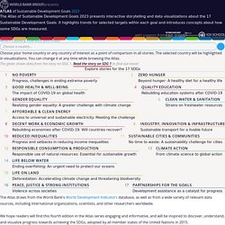
Coronavirus 2019-nCoV. Lancet Inf Dis Article: Here. Mobile Version: Here. Data sources: Full list. The Atlas of Sustainable Development Goals 2020. The Atlas of Sustainable Development Goals 2020 was produced by the Development Economics Data Group (DECDG) of the World Bank, in collaboration with various units across the World Bank.
The Partnership Fund for the Sustainable Development Goals (SDG Fund) provided generous financial support. The publication was prepared by a team led by Ana Florina Pirlea, Divyanshi Wadhwa, and Andrew Whitby, with editorial guidance from Matthew Welch under the management of Umar Serajuddin and the overall direction of Haishan Fu. Data visualizations were produced by Maarten Lambrechts, Yaryna Serkez, Jan Willem Tulp, and Elbert Wang. Contributions for the SDG Atlas 2020 were received from: Chisako Fukuda, David Mariano, Mikael Ello Reventar, Jomo Tariku, and Nina Vucenik managed the communications and outreach strategy and produced promotional material.
Denden.shinyapps. Ookla 5G Map - Tracking 5G Network Rollouts Around the World. Free Driving Directions, Traffic Reports & GPS Navigation App by Waze. Causes of Death (COD) Visualization. World Population Prospects - Population Division - United Nations. Maps & Data. Tools. #MoveTheDate Solutions (beta) Latest Earthquakes. Seismic Monitor - Recent earthquakes on a world map and much more. Earthquake monitor: interactive map of latest earthquakes worldwide.
Quick links: Most recent quakes | Recent major quakes | News & Reports | Top 20 quakes past 24 hours | Country / region lists | Quakes near volcanoes | Past earthquakes | Monthly reports | NEW: Fast Twitter alerts (Mag>2.8) | Twitter alerts (Mag>4) | Twitter alerts (Mag>5) | NEW: Earthquake stats | Glossary - explanations of terms | FAQFacebook: NEW: QuakesAlert (quake notifications) | EarthquakeMonitor (earthquake summaries and significant events)On the global map, only larger quakes are included (otherwise, there would be thousands of points).
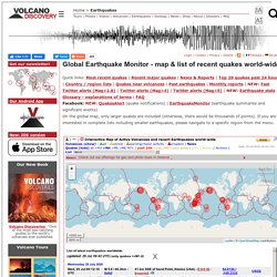
If you are interested in complete lists including smaller earthquakes, please navigate to a specific region from the menu. Notes:An optimized version as stand-alone tool is available at: earthquakes.volcanodiscovery.com or www.volcanoesandearthquakes.com. Severe Weather Information Centre 2.0. Severe Weather Information Centre. Fire Atlas - Global Fire Emissions Database. Latest revision: April 24th, 2019 Contact details: Niels Andela (niels.andela@nasa.gov).
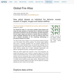
"The Global Fire Atlas of individual fire size, duration, speed and direction" Andela et al. (2019) The Global Fire Atlas is a new freely available global dataset that tracks the daily dynamics of individual fires to determine the timing and location of ignitions, fire size and duration, and daily expansion, fire line length, speed, and direction of spread. Data are available in easily accessible GIS-layers and can also be explored online here and a detailed description of the underlying methodology is provided by Andela et al. (2019). The data provide unique insights in the environmental conditions that give rise to the world's most extreme wildfires. PlugShare - EV Charging Station Map - Find a place to charge your car! Digital Attack Map. Travel Risk Map. Tableau. ReMoveTrail. The Global Consciousness Project. Terria Map.
NationalMap. The True Size Of ... Global Carbon Atlas. Wikimapia - Let's describe the whole world! EdGCM. Welcome to OSGeo-Live 10.0 — OSGeo-Live 10.0 Documentation. OSGeo Labs - Geo for All Labs World-Wide. World Migration Map - Data Visualization by Metrocosm. This map shows the estimated net immigration (inflows minus outflows) by origin and destination country between 2010 and 2015.
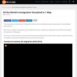
Blue circles = positive net migration (more inflows). Red circles = negative net migration (more outflows). Each yellow dot represents 1,000 people. Hover over a circle to see that country’s total net migration between 2010 and 2015. Click a circle (or tap the circle twice on mobile) to view only the migration flows in and out of that country. Country-to-country net migration (2010-2015) The data for this map comes from the U.N. Full screen version / Youtube video. Maps of Immigrants and Emigrants Around the World. OpenStreetMap. Where is this?
Reverse Directions Welcome to OpenStreetMap! OpenStreetMap is a map of the world, created by people like you and free to use under an open license. Hosting is supported by UCL, Bytemark Hosting, and other partners. Learn More Start Mapping. GeoHack - Berlin. Creating a Sustainable World. Happy Planet Index. How terrorism in the West compares to terrorism everywhere else - Washington Post. Global Maps. Earthquake 3D Live Stream. Global Incident Map Displaying Terrorist Acts, Suspicious Activity, and General Terrorism News. Earth - Your life on earth.
Explore BBC Earth's unique interactive, personalised just to you. Find out how, since the date of your birth, your life has progressed; including how many times your heart has beaten, and how far you have travelled through space. Investigate how the world around you has changed since you've been alive; from the amount the sea has risen, and the tectonic plates have moved, to the number of earthquakes and volcanoes that have erupted. Grasp the impact we've had on the planet in your lifetime; from how much fuel and food we've used to the species we've discovered and endangered. And see how the BBC was there with you, capturing some of the most amazing wonders of the natural world. Explore, enjoy, and share with your friends either the whole page, or your favourite insights.
This is your story, the story of your life on earth. These Maps Show You How to Live, Not Just Where. Data for GOOD Knowledge is the first step on the way to progress.
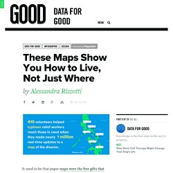
It used to be that paper maps were the free gifts that came with your new compass, graphically representing geography via points, lines, and fire-breathing dragons—all of which indicated orientation, distance, latitude, longitude, and the sheer vastness of uncharted territory. But today’s multidimensional digital maps are comprehensive, interactive, and they’ve got the compass built right in. Plus, they’re changing the way we interact with our environments and with each other. Untitled. Windytv / Windyty, wind map & forecast. World by Map: Statistics, Maps and Charts. 24556520177_d5a5b6d97a_o. Maptionnaire Analysis. Maptionnaire - gather local insight for smarter urban planning. Our World in Data. Open Source GIS and Freeware GIS Applications - GIS Lounge. An open source application by definition is software that you can freely access and modify the source code for.
Open source projects typically are worked on by a community of volunteer programmers. Open source GIS programs are based on different base programming languages. Three main groups of open source GIS (outside of web GIS) in terms of programming languages are: “C” languages, Java, and .NET. The first group would be the group that uses “C” language for its implementation. This is the more mature of the groups of open source GIS, probably for the simple reason that is the group that has been working on GIS software applications the longest and has a long history of resuse of code.
The second group of Open Source GIS would be the ones that use JAVA as the implementation language. The third most influential group of Open Source GIS would be the one that integrates applications that use “.NET” as the implementation language. Open Source GIS Software. GmapGIS: Web application to draw on Google maps; Create, share,link,embed and publish interactive maps with polygons, lines, circles, markers and labels.
jQuery map Plugins. ArcGIS Open Data. CIA Maps. 2015 World Economic Freedom Levels: Heat Map for Continents and Countries. Gallery. Create interactive data visualizations and maps. GetSharedSiteSession?rc=4&redirect= Visualize. Visualize. Draw On Maps and Make Them Easily. Map creator online to make a map with multiple locations and regions.
NatGeo Mapmaker Interactive. YouTube Help The URL to a YouTube video must be the full length url.
To ensure you are using the correct URL, visit your video on youtube.com. Interactive Maps. AURIN. Australian Urban Research Infrastructure Network. Origin of crops. By Colin K.
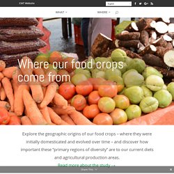
Khoury, Harold A. Achicanoy, Carlos Navarro-Racines, Steven Sotelo, and Andy Jarvis at the International Center for Tropical Agriculture (CIAT). Version 1.0 (May 2016). This work is licensed under a Creative Commons Attribution 4.0 International (CC BY 4.0). Planning Maps Online. Melbourne - Planning Schemes Online. Skip to content Department of Transport, Planning and Local Infrastructure Planning Schemes Online You are here: Home > Planning Schemes > Melbourne Other Resources Search by address, view an interactive map or get a planning report.
ChoiceMaps by Walk Score. Directory, Data & Mapping. Mapping. Mapcarta - The Free Map. Baidu Maps 百度地图. Global ambient air pollution. AirVisual pollution. AirVisual. AirVisual - World pollution map. Air Pollution in World: Real-time Air Quality Index Visual Map. Carbon Dioxide Emissions / Countries of the World. Pollution Locator: USA. Over 4 billion pounds of toxic chemicals are released by industry into the nation's environment each year, including 72 million pounds of recognized carcinogens.
Scorecard can give you a detailed report on chemicals being released from any of 20,000 industrial facilities, or a summary report for any area in the country. Scorecard spotlights the top polluters in the U.S., and ranks states and counties by pollutant releases. Provide your zipcode to get a report for your community, or use the Pollution Locator to search for reports on specific areas. To zoom in to your state's report, click on the map below. United States Environmental Release Reports Available at This Level View National Report. TRI and Superfund Environmental Maps.
TRI and Superfund Environmental Maps. TOXMAP classic provides an Advanced Search as well as the ability to save search results and to build custom regions to focus your search. It does not require Flash and is accessible to users with disabilities. No new features are planned. The beta version of TOXMAP is in active development. It has an improved map appearance and interactive capabilities as well as improved U.S. Census layers, availability by Census tract, and additional and updated datasets. Climate Action Tracker.
Climate Change Threatens Health. Light pollution map. Access to clean water and sanitation around the world – mapped. Around the world, 946 million people still go to the toilet outside. Eritrea is top of the list, with 77% of its population practising open defecation, a practice which can lead to the contamination of drinking water sources, and the spread of diseases such as cholera, diarrhoea, dysentry, hepatitis A and typhoid.
A huge global effort has been focused on reducing these numbers and new data from the WHO/Unicef Joint Monitoring Programme, which has measured the progress made on access to drinking water and sanitation since 1990, shows that there have been improvements in certain areas. Map and Estimates of the Oil Spill in the Gulf of Mexico - Interactive Map. Radiation Network. Detail Maps. This page is devoted to detailed maps for regions of particular interest. Europe. Our network currently has a few Monitoring Stations in Europe. Australia. ArboNET Disease Maps. Virus & Contagious Disease Surveillance. Virus & Contagious Disease Surveillance.
DengueMap. Marker Color. Interactive Heart Map Australia. 4 Maps Show Opportunities for Limiting Climate Change - Resource Watch. Discover The Forest. A global map of wind, weather, and ocean conditions. Mapping Environmental Justice.