
World Migration Map - Data Visualization by Metrocosm This map shows the estimated net immigration (inflows minus outflows) by origin and destination country between 2010 and 2015. Blue circles = positive net migration (more inflows). Red circles = negative net migration (more outflows). Each yellow dot represents 1,000 people. Hover over a circle to see that country’s total net migration between 2010 and 2015.
What Causes Ocean Currents? The systems of ocean surface currents and deep water currents are, as expected, connected, but the locations of the physical connections are limited to three areas (one per main ocean), and are all on the Northern Hemisphere. The downwelling occurs on the Northern Atlantic, while the upwelling occurs on the Northern Pacific and the Northern Indian Ocean, as shown on the side map. The extents of the continental shelf block, or at least seriously limit, the movement of the ocean currents. To see a 3D view of the Conveyor Belt enlarge the diagram below.
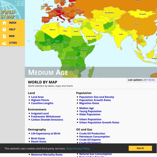
40 Maps That Will Help You Make Sense of the World If you’re a visual learner like myself, then you know maps, charts and infographics can really help bring data and information to life. Maps can make a point resonate with readers and this collection aims to do just that. Hopefully some of these maps will surprise you and you’ll learn something new. A few are important to know, some interpret and display data in a beautiful or creative way, and a few may even make you chuckle or shake your head. If you enjoy this collection of maps, the Sifter highly recommends the r/MapPorn sub reddit.
OpenStreetMap Where is this? Reverse Directions Welcome to OpenStreetMap! OpenStreetMap is a map of the world, created by people like you and free to use under an open license. Hosting is supported by UCL, Bytemark Hosting, and other partners. Learn More Start Mapping You decide Australia's population, we'll show you how it looks Australia's population has more than quadrupled in the past century, with the number of people tipped to reach 25 million this year. If current trends continue the population will top 40 million within 40 years. Some say Australia should have stopped growing decades ago. Others point out Australia is a wealthy country with plenty of space to welcome more. This is your chance to decide how big (or small) you think Australia should be.
9 Excellent Free Map Creation Tools for Teachers and Students 1- Umapper UMapper is a great mapping tool for educators. It allows its users to create and manage interactive maps and geogames online. These maps can be shared with others or be embedded in blogs and websites Origin of crops by Colin K. Khoury, Harold A. Achicanoy, Carlos Navarro-Racines, Steven Sotelo, and Andy Jarvis at the International Center for Tropical Agriculture (CIAT). Version 1.0 (May 2016). This work is licensed under a Creative Commons Attribution 4.0 International (CC BY 4.0). This work is associated with the publication:
Glossary of geography terms A[edit] absolute humidity The mass of water vapor in the atmosphere per unit of volume of space.[1] absolute location The location of a point on the Earth's surface that can be expressed by a grid reference such as latitude and longitude.[2] The #1 reason people die early, in each country You're probably aware that heart disease and cancer are far and away the leading causes of death in America. But globally the picture is more complicated: (Vox / Anand Katakam and Joss Fong) It's worth stressing that "cause of lost years of life" and "cause of death" aren't identical. For example, deaths from preterm births may cause more lost years of life in a country than deaths from heart disease even if heart disease is the leading cause of death. Deaths from preterm births amount to many decades of lost life, whereas heart disease tends to develop much later on.
Earth - Your life on earth Explore BBC Earth's unique interactive, personalised just to you. Find out how, since the date of your birth, your life has progressed; including how many times your heart has beaten, and how far you have travelled through space. Investigate how the world around you has changed since you've been alive; from the amount the sea has risen, and the tectonic plates have moved, to the number of earthquakes and volcanoes that have erupted. Grasp the impact we've had on the planet in your lifetime; from how much fuel and food we've used to the species we've discovered and endangered. And see how the BBC was there with you, capturing some of the most amazing wonders of the natural world. Explore, enjoy, and share with your friends either the whole page, or your favourite insights.