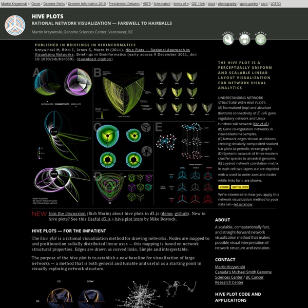


Data Visualization, Design and Information Munging // Martin Krzywinski / Genome Sciences Center Recent Changes Map 50 Watts Maladies Mentales Images from Le Livre de la Sante by Joseph Handler (Monte Carlo: Andre Sauret, 1968) volume 10: L'homme et son Esprit 2. View the entire series Une cure de sommeil, illus. by Hartley L'homme et son esprit, illus. Consequences des frustrations affectives dans la premiere enfance, illus. by Jean Alessandrini Maladies mentales et classes sociales, collage by Schmid Boxe et traumatisme cranien, photo Howard Sochurek-Magnum Les centres de la fatigue nerveuse, illus. Les relations du malade avec son medecin, illus. by Schmid Le psychanalyse, illus. by Patergnani La lutte contre l'alcoolisme, document Comite national de Defense contre l'Alcoolisme 'Le labyrinthe,' illus. Types psychiques et somatiques d'apres Thooris, Sheldon et Kretschmer Four blown-up details from the spread for "Les States de l'Eros," illustrations by Chaillet (channeling Hans Bellmer):
The art of Pi (`pi`), Phi (`phi`) and `e` // Martin Krzywinski / Genome Sciences Center ▲ 2013 day ▲ 2014 day ▲ 2015 day ▲ 2014 approx day ▲ Circular art This section contains various art work based on , and that I created over the years. day art and approximation day art is kept separate. All of the posters are listed in the posters section. Circular and spiral art based on the digits of , and . Read about how they were made and browse through the posters. Some of the art shown here has been featured in a Numberphile video. Fri 10-07-2015 The Jurassic World Creation Lab webpage shows you how one might create a dinosaur from a sample of DNA. ▲ We can't get dinosaur genomics right, but we can get it less wrong. With enough time, you'll grow your own brand new dinosaur. What went wrong? ▲ Corn World: Teeth on the Cob. Thu 11-06-2015 I was commissioned by Scientific American to create an information graphic based on Figure 9 in the landmark Nature Integrative analysis of 111 reference human epigenomes paper. ▲ Network diagram redesign of the heatmap for a select set of traits.
yhat | Predictive Model Management Pigment Bombs and Photography by Diver and Aguilar Diver & Aguilar is a photographic duo in London, composed of photographer Mike Diver and retouch artist Pedro Aguilar. Their work features a collection of high-end clients and fine art photography for clients such as GQ, Nike, Audi, The Financial Times and Graff Diamonds. For this absolutely beautiful / amazing (amazeful?) series of photos, they used a high speed flash and special effects triggers to freeze a moment in time that makes you wish that you were there to witness it. Though I'm sure the real thing couldn't live up to these perfectly sculpted images. Some other hand-picked posts you might enjoy on our Design Blog: Pretty and Mysterious Photography by Lisa WassmannEyes that Tell Stories: Unique Iris PortraitsThe Olympic Dreams Series by James Dodd: Photography Via Junk Culture
Why Are Data-Viz Designers So Obsessed With Circles? In 1726, Filippo Juvarra put the finishing touches on the dome of the Basilica of Superga, an intricately designed church in Turin, Italy. The artist painted the interior roof of the building with a kaleidoscopic pattern that when paired with the dome’s ring of windows creates the effect of ornate, concentric circles. Nearly 300 years later, in the French town of Cessy, engineers finished building the Compact Muon Solenoid, a massive particle detector that, when viewed in cross-section, bears a striking resemblance to Juvarra’s circular basilica dome. “These things look so similar, and yet they’re separated by 300 years,” says Manuel Lima. “One is all about religion and spirituality and the other is about science.” Lima, a design lead at Google and creator of the website Visual Complexity, was intrigued by the circle’s ubiquity. In his new book, Lima attempts to find out. From a psychological perspective, the circle represents happiness, unity, perfection, and wholeness.
20+ Cheatsheets & Infographics For Photographers We love cheatsheets as one can refer to them and make quick amendments to better our skills. Since many loved our last compilation of cheatsheet for designers, we’ve decided to compile another set of cheatsheets, this time for photographers. Amateur photographers, and even pros can easily benefit from these cheatsheets as it is a resource for fresh and new ideas. We’ve scoured the Web and have found a wide variety of cheatsheets covering various aspects of photography and catering to the many levels of skills and interest of anyone who calls themselves a photographer. Most of the pictures you see here are cropped for a nice fit, so remember to click on the links to check out the entire cheatsheet or infographic. Recommended Reading: Five Vital Black & White Photography Tips Focal Lengths Manual Photography 3 Ways to Affect Depth of Field What Your Camera Captures At Every Lens’ Focal Length Photography Cheatsheet 3 Elements of Exposure Color Temperature Scale F-Stop Chart Lighting Modifiers