
Top 50+ Tools for Creating Infographics Telling your story in visual form through the use of infographics has been one of the hottest trends in recent times. Given the tremendous information available online, people are now more interested to get information through colorful and interesting graphics, instead of words and numbers. Creating infographics, however, requires tremendous analytical and creative skills plus the ability to convert these data and information into interesting visuals. The good news is, there are available resources online that you can use to help you create infographics. In this post, we will list down all available resources and tools that you can use to simplify the process of creating infographics. If you want to view some excellent examples of a well-designed infographics, then checkout our previous post on the following topics: These are online applications that you can use to generate charts, graphs and tables. 06-Creately Create interesting charts and diagrams quickly and collaboratively.
22 outils gratuits pour visualiser et analyser les données (1ère partie) Vous avez des données à explorer ? Voici quelques outils qui pourront vous être utiles pour les transformer en informations et en graphiques attrayants. Pour faire parler des données, rien ne vaut une panoplie d'outils de visualisation graphique. Il en existe de nombreux, notamment destinés aux professionnels versés dans l'analyse statistique. Mais leur prix, généralement élevé, ne convient pas aux utilisateurs moins spécialisés qui n'ont besoin qu'occasionnellement d'afficher des données sous une forme graphique. Or, il existe, pour ceux dont le budget est limité, un nombre surprenant d'outils très intéressants pour la visualisation et l'analyse de données, accessibles gratuitement. Computerworld souligne que la correction des textes se fait simplement. DataWrangler (cliquer ici pour agrandir l'image) Refine intègre plusieurs algorithmes retrouvant les mots orthographiés différemment mais qui devraient en fait être regroupés. Google Refine (cliquer ici pour agrandir l'image)
The Enliven Project's false rape accusations infographic: great intentions, but it isn't accurate. Yesterday, under the headline, "The saddest graph you'll see today," Dylan Matthews at the Washington Post published this infographic created by the Enliven Project to put the legal issues around rape, its prosecutions, and concerns about false accusations into perspective. The graphic quickly made the rounds on Twitter and Facebook, but unfortunately, while well-intentioned, it is also misleading in significant ways that can be used to undercut its basic message, which is sound: that false rape accusations are rare. The persistent myth that false accusations are common makes it incredibly difficult for victims to get justice—the overwhelming threat of being accused of making it all up to cover up for one's slutty ways (see recently: Steubenville, Notre Dame, Cleveland) is enough to make women simply not report. Sadly, the graphic meant to set the record straight on false accusations only confuses matters. The graphic assumes one-rape-per-rapist. Emphasis mine.
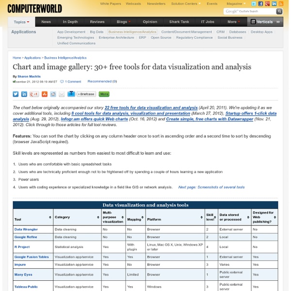
Visualisation de l'information : de multiples outils Dans un monde où l'information est toujours plus abondante, le professionnel rencontre souvent des difficultés – même s'il utilise des méthodologies de recherche efficaces – pour analyser et traiter des volumes d'information qui peuvent être importants. De nombreux outils, dont plusieurs gratuits, peuvent heureusement lui permettre de manipuler les données, de les visualiser graphiquement et de mettre ainsi en évidence modèles et tendances. Pour découvrir ces outils, on pourra consulter avec profit les dossiers, recensements et supports cités ci-après. Dans un article d'avril 2011 paru dans Computerworld et intitulé "Image gallery: 22 free tools for data visualization and analysis", Sharon Machlis proposait déjà un recensement de 22 outils, classés dans un tableau indiquant pour chacun leur usage, la plateforme (navigateur, code...), le "niveau" de difficulté, etc., suivi d'une copie d'écran pour chacun des outils. +Béatrice Foenix-Riou
10 sites pour créer une infographie Les infographies permettent de visualiser plus facilement un ensemble de données parfois complexe. Une image est parfois plus parlante qu’un long discours ! Elles permettent de comprendre en un coup d’œil les principaux enseignements d’une étude quantitative par exemple. Certains utilisent également ce type de visualisation pour présenter leurs compétences au sein d’un CV original. De nombreux services existent pour réaliser facilement une infographie : nous en avons sélectionné dix. Réaliser une infographie en ligne Infogr.am Une référence, puisque l’outil a déjà permis de créer plus de 340 000 infographies ! Piktochart Ici aussi, il s’agit d’une référence : plus de 100 000 comptes ont été créés sur le site, vous pouvez donc utiliser le service les yeux fermés ! Easel.ly Il s’agit d’un outil très facile à prendre en main, qui permet de réaliser une infographie facilement. Une infographie représentant l’activité sur les réseaux sociaux What About Me Visual.ly Vizify Get About Me CV Gram Kinzaa
50 Great Examples of Data Visualization Wrapping your brain around data online can be challenging, especially when dealing with huge volumes of information. And trying to find related content can also be difficult, depending on what data you’re looking for. But data visualizations can make all of that much easier, allowing you to see the concepts that you’re learning about in a more interesting, and often more useful manner. Below are 50 of the best data visualizations and tools for creating your own visualizations out there, covering everything from Digg activity to network connectivity to what’s currently happening on Twitter. Music, Movies and Other Media Narratives 2.0 visualizes music. Liveplasma is a music and movie visualization app that aims to help you discover other musicians or movies you might enjoy. Tuneglue is another music visualization service. MusicMap is similar to TuneGlue in its interface, but seems slightly more intuitive. Digg, Twitter, Delicious, and Flickr Internet Visualizations
A Scholarly Discussion with Andrew Gelman and Anthony Unwin This is how scholarly exchanges used to work: Scientist A publishes a result, Scientist B then writes an angry letter saying that Scientist A is full of it, to which A responds with more insults, etc., and all that published in a fine scholarly journal. I was recently asked to respond to a piece Andrew Gelman and Anthony Unwin had written about visualization for the Journal of Computational and Graphical Statistics, which had some issues. In addition to yours truly, the journal’s editor Richard Levine also asked Hadley Wickham, Stephen Few, and Paul Murrell for comment. The original article, responses, and Gelman and Unwin’s rejoinder are only going to appear in the March 2013 issue of the journal. This was an interesting exercise. Without spoiling the fun of reading the original article, they took a number of examples from FlowingData and then generalized from those to all of information visualization. Here are the links to the articles:
L'Œil au Carré : stratégies de veille sur Internet How to make an infographic online: five essential free tools Given the popularity of infographics, you’d be wise to consider using them to help achieve your content marketing goals. They can be great for social sharing, blog fodder and inbound links. The last time I created an infographic I used – wait for it - Microsoft Excel. Thankfully there are now some far better options, and they're surprisingly easy to use. I have compiled five of online tools that will help you to create infographics. They’re all free, though some require registration (or to connect your Twitter or Facebook account) and most have the upgrade options. Hold on a moment! Before you begin, consider that many infographics are often – to quote Econsultancy Research Director Linus Gregoriadis – “high on graphics and low on information”. As such it is important to map out your story / message / goals before starting to work on the design itself. There’s a great post on the LEWIS PR blog that explains how to optimise an infographic, based around three key questions, which are: 1. 2. 3.
86 Helpful Tools for the Data Professional PLUS 45 Bonus Tools I have been working on this (mostly) annotated collection of tools and articles that I believe would be of help to both the data dabbler and professional. If you are a data scientist, data analyst or data dummy, chances are there is something in here for you. Included is a list of tools, such as programming languages and web-based utilities, data mining resources, some prominent organizations in the field, repositories where you can play with data, events you may want to attend and important articles you should take a look at. The second segment of the list includes a number of art and design resources the infographic designers might like including color palette generators and image searches. There are also some invisible web resources (if you’re looking for something on Google and not finding it) and metadata resources so you can appropriately curate your data. This is in no way a complete list so please contact me here with any suggestions! Data Tools Data Mining Organizations Repositories