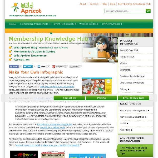
The Anatomy Of An Infographic: 5 Steps To Create A Powerful Visual
Information is very powerful but for the most bit it is bland and unimaginative. Infographics channel information in a visually pleasing, instantly understandable manner, making it not only powerful, but extremely beautiful. Once used predominantly to make maps more approachable, scientific charts less daunting and as key learning tools for children, inforgraphics have now permeated all aspects of the modern world. I designed a couple of infographics back in college, the need arising especially around the time Soccer World Cup fever spiked. It was a fun process representing the different groups, predicting winners in each group at each stage and creating a mock pairing of teams that would clash all the way leading upto the finals. I was a devout Argentinian supporter at the time.
10 Awesome Free Tools To Make Infographics
Advertisement Who can resist a colourful, thoughtful venn diagram anyway? In terms of blogging success, infographics are far more likely to be shared than your average blog post. This means more eyeballs on your important information, more people rallying for your cause, more backlinks and more visits to your blog. In short, a quality infographic done well could be what your blog needs right now. Designing An Infographic
Personal Learning Environment
Symbaloo EDU PLE | Personal Learning Environment Free Version Premium Version Follow Symbaloo on Social Media!
How To Create Outstanding Modern Infographics
In this tutorial you will learn that data doesn't have to be boring, it can be beautiful! Learn how to use various graph tools, illustration techniques and typography to make an accurate and inspiring infographic in Adobe Illustrator. Start by using the Rectangle Tool (M) to draw a shape. Give it a subtle radial gradient too. The entire design is based on a grid of four columns. To make the columns first select the rectangle and drag a guide onto the centre of the shape.
Education Resources Information Center
Showing 1 to 15 of 11,184 results Stewart, Georgina – Educational Philosophy and Theory, 2011 This paper comments on the process of re-development of the Maori-medium Science (Putaiao) curriculum, as part of overall curriculum development in Aotearoa New Zealand. A significant difference from the English Science curriculum was the addition of an "extra strand" covering the history and philosophy of science.
EdTech Cheat Sheet
edtechdigest.com © 2010-2014 EdTech Digest. Skip to content ← Education Transformed Through IT (Intervention Technology)
Make Cookie Moons
The Moon's phases in Oreos The Moon has "phases." That means it looks a little different to us each night during its one-month orbit of our planet.
Data Visualization: Modern Approaches
About The Author Vitaly Friedman loves beautiful content and doesn’t like to give in easily. When he is not writing or speaking at a conference, he’s most probably running … More about Vitaly Friedman … Data presentation can be beautiful, elegant and descriptive. There is a variety of conventional ways to visualize data - tables, histograms, pie charts and bar graphs are being used every day, in every project and on every possible occasion.
Tomorrow’s College Will Be Free
edtechdigest.com © 2010-2014 EdTech Digest. Skip to content