
Color CRAYON TIP: An Acronym for Effective Information Design – The Visual Communication Guy: Designing Information to Engage, Educate, and Inspire People. What is Color CRAYON TIP?
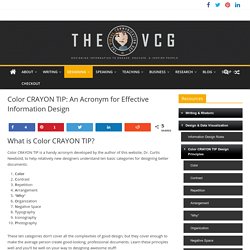
Color CRAYON TIP is a handy acronym developed by the author of this website, Dr. Curtis Newbold, to help relatively new designers understand ten basic categories for designing better documents: ColorContrastRepetitionArrangement“Why“OrganizationNegative SpaceTypographyIconographyPhotography These ten categories don’t cover all the complexities of good design, but they cover enough to make the average person create good-looking, professional documents. Learn these principles well and you’ll be well on your way to designing awesome stuff! Click on any cube to learn more. To purchase a 30×20 printed poster of the Color CRAYON-TIP method, please visit the online store.
Information Design Rules – The Visual Communication Guy: Designing Information to Engage, Educate, and Inspire People. When designing information, follow the rules!
Below you’ll find the top ten rules for each of the ten categories of design, assembled in an easy-to-remember acronym, Color C.R.A.Y.O.N. T.I.P.
Digital Humanities. Data & Visualisation. Information Architecture and Prototyping. Presentation & Visual Information. Time Planners. Writing. Elcohslibrary. Tools for innovation. 9 Figures of Speech that Will Make You More Creative. If you haven’t ever paid attention to the scores of figures of speech out there (like metaphors, puns, and similes), you might want to take a moment to review the list.
If you find yourself in a creativity slump, a good place to turn to are the figures of speech. Creative advertisers make effective use of them to make their designs more engaging. You’ll find that the more you employ figures of speech to your visual communications, the more visually interesting and creative they will become. Here are nine examples to give you sense for how visual figures of speech are fantastic creativity tools. Visual Irony: Juxtaposing two ideas that communicate opposite ideas. Designing to Inform and Delight: Drawing Inspiration from Milton Glaser. Good visual communicators reach into the depths of culture and listen to its heartbeat.
Those who really have the ability to affect an audience recognize not only what the people enjoy, but what they are missing and don’t know it yet. Some argue that designers are the architects of the future; they are the people that create the stuff we want, need, see, and use and thus significantly impact the way the rest of us view our world. For the last century in America, there has been sad byproduct of the need to increase wealth: the atrophy of good design.
Sources. Visual communication is a very broad topic.
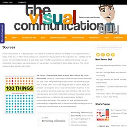
The number of sources that influence my thinking in visual communication is always on the rise, so the list below certainly isn’t comprehensive by any stretch of the imagination. But I wanted to list the sources that seem to be seminal (or at least widely read) in the field, sources that you might want to pick up if you are interested in improving your own visual literacy or if you just want some pointers for better design practices. Infographic_Color-CRAYON-TIP1.jpg (JPEG Image, 4500 × 3000 pixels) - Scaled (22%)
How to Transform a Design from Amateur to Professional in Four Easy Steps. You’ve probably been asked to create a brochure or a flier or a poster before.
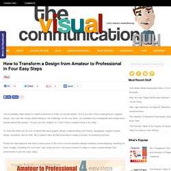
And if you don’t have a background in graphic design, you may feel uneasy about taking on the challenge. At the very least, you probably have inadequate and maybe even tossed around the phrase, “I’m just not that creative” or “I don’t have a creative bone in my body.” It’s true that there can be a lot involved with good graphic design–understanding color theory, typography, negative space, layout, resolution, and so forth. But it doesn’t take all that know-how to create a simple, nice-looking brochure. Follow the chart below to see how to avoid some of the most common amateur design mistakes (center-aligning, inserting too many images, including too much text, only using one font, not using contrast) in order to make a simple design look professional in just four easy steps. Help spread visual literacy. Design Knowledge. TiddlyWiki — a non-linear personal web notebook.
What is Visual Rhetoric? Visual Rhetoric Overview, Definition, and Examples. Visual rhetoric, in a nutshell, refers to how we are persuaded by the things we see.
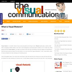
Rhetoric (particularly in politics) often refers to language, whether written or oral, that is used strategically to persuade people to believe or act in certain way. When people talk about visual rhetoric, you might be inclined to think that they are referring to the way images are manipulated to skew the way we perceive things. But visual rhetoric is so much more than image manipulation. In fact, visual rhetoric refers to how we interpret and make meaning out of anything we see. Look at the graphic below. So what is Visual Rhetoric, Exactly? Visual rhetoric is part of a communication process where we interpret and make meaning out of the world around us. The problem is, we sometimes communicate visually without even realizing it.
The fact is, visual rhetoric (or the way people interpret messages by what they see) is affected by a whole host of things.