
Public Domain Release 2016 - Visualization. Pixel Chart. The Colors of Motion. Information is Beautiful. Legacy Page. Welcome to MAPfrappe, my interactive site for cartographic “mixtures.”
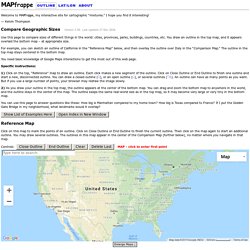
I hope you find it interesting! — Kelvin Thompson Compare Geographic Sizes Version 3.56.Last updated 27 Dec 2018. Use this page to compare sizes of different things in the world: cities, provinces, parks, buildings, countries, etc. You draw an outline in the top map, and it appears overlaid the bottom map – at appropriate size. PBDB Navigator. Diagrams. Timeline Diagrams - Buildings are ordered by year built, giving a historical view of a city's development.
Diagram Search Form The search form for the SkyscraperPage Diagrams is one of the most powerful and versatile building searching tools available today. For descriptions on using the search form see: Search Form Instructions. Diagrams. Flag Stories — The complexity of flags. The Pudding.
What is Big Data? A super simple explanation for everyone. Make charts and dashboards online. Visualizing Which Countries People Are Trying To Get Away From, And Where They're Going. The patterns of human migrations around the world are fascinating to think about.
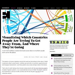
Global movements reflect current events—whether war and strife, or economic opportunity and technological improvement—and these patterns also slowly reshape nations themselves. That’s why it’s worth taking a few minutes to play around with this new interactive graphic of global migration patterns. In an unprecedented amount of detail, the graphic captures the movements in and out of 196 countries over the last 20 years (see here for the interactive version). Built with software normally used in the field of genetics, the visualization accompanies a new analysis published in the journal Science today that provides the most detailed look at migration patterns yet.
Our World in Data — Visualising the Empirical Evidence on how the World is Changing. AnIntroductionToVisualizingData. Using data visualization to bridge gap in research, programs & policies. The Institute for Health Policy (IHP), based in the School of Public Health at The University of Texas, contributes to improving public health by developing creative ways to bridge the gap between scientific research, practical programs and policy solutions.
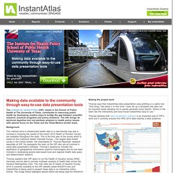
The IHP brings its technical expertise and non-partisan analysis to health policy issues, with special focus on the Texas and the Texas-Mexico border areas. Background The Institute aims to disseminate health data in a user-friendly way and is involved in ensuring the results of the recent 2010 Health of Houston Survey are available throughout the state. This is the first year of the survey which is based on the California Health Interview Survey – the largest state health survey in the United States. We interviewed Dr. Thomas explains that IHP plans to run the Health of Houston survey (HHS) biennially and be able to provide multiyear analysis of health data across the Houston Metropolitan Area. Making the project work Key benefits. Gapminder: Unveiling the beauty of statistics for a fact based world view. Visual Analysis Best Practices. Tableau Software helps people see and understand data.
Tableau helps anyone quickly analyze, visualize and share information. Dataesthetics: The Power and Beauty of Data Visualization. One of my areas of interest that has grown over the last couple years has been data visualization.
I’m a visually-oriented learner, and I look forward to seeing any techniques, illustrations, or technologies that: 1) Allow people to assimilate information as fast as possible. 2) Deepen understanding of knowledge by visually illustrating data in new and interesting ways. There is nothing like having an intellectual epiphony after looking at a picture for a few seconds (pictures can definitely be worth a thousand words). 3) Present information in an aesthetically pleasing way. Or, in extreme examples, inspire a sense of awe! Thanks in large part to del.icio.us, I’ve come across a wide assortment of sites and blogs that really illustrate some amazing work in this area. While cleaning up my knowledge management related bookmarks, I started to revisit many of the sites I’ve tagged in recent months.
Blog About Infographics and Data Visualization - Cool Infographics. Free data, statistics, analysis, visualization & sharing - knoema.com. 50 Great Examples of Data Visualization. Wrapping your brain around data online can be challenging, especially when dealing with huge volumes of information.

And trying to find related content can also be difficult, depending on what data you’re looking for. But data visualizations can make all of that much easier, allowing you to see the concepts that you’re learning about in a more interesting, and often more useful manner. Below are 50 of the best data visualizations and tools for creating your own visualizations out there, covering everything from Digg activity to network connectivity to what’s currently happening on Twitter. Music, Movies and Other Media Narratives 2.0 visualizes music. Liveplasma is a music and movie visualization app that aims to help you discover other musicians or movies you might enjoy. Tuneglue is another music visualization service. ChartsBin.com - Visualize your data.
Data Visualization: Modern Approaches. Data presentation can be beautiful, elegant and descriptive.
There is a variety of conventional ways to visualize data – tables, histograms, pie charts and bar graphs are being used every day, in every project and on every possible occasion. However, to convey a message to your readers effectively, sometimes you need more than just a simple pie chart of your results. Visual Data.