
1. Color perception. Color can only exist when three components are present: a viewer, an object, and light.
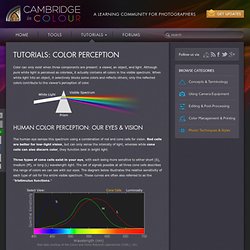
Although pure white light is perceived as colorless, it actually contains all colors in the visible spectrum. When white light hits an object, it selectively blocks some colors and reflects others; only the reflected colors contribute to the viewer's perception of color. The human eye senses this spectrum using a combination of rod and cone cells for vision. Rod cells are better for low-light vision, but can only sense the intensity of light, whereas while cone cells can also discern color, they function best in bright light. Three types of cone cells exist in your eye, with each being more sensitive to either short (S), medium (M), or long (L) wavelength light. Raw data courtesy of the Colour and Vision Research Laboratories (CVRL), UCL. 2. Bit depth. Bit depth quantifies how many unique colors are available in an image's color palette in terms of the number of 0's and 1's, or "bits," which are used to specify each color.
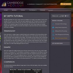
This does not mean that the image necessarily uses all of these colors, but that it can instead specify colors with that level of precision. For a grayscale image, the bit depth quantifies how many unique shades are available. 3. Basics of digital camera pixels. The continuous advance of digital camera technology can be quite confusing because new terms are constantly being introduced.
This tutorial aims to clear up some of this digital pixel confusion — particularly for those who are either considering or have just purchased their first digital camera. Concepts such as sensor size, megapixels, dithering and print size are discussed. Every digital image consists of a fundamental small-scale descriptor: THE PIXEL, invented by combining the words "PICture ELement. " 4. Overview of color management. 5. Understanding color spaces. A "color space" is a useful conceptual tool for understanding the color capabilities of a particular device or digital file.

When trying to reproduce color on another device, color spaces can show whether you will be able to retain shadow/highlight detail, color saturation, and by how much either will be compromised. Similar to how an artist might mix their primary colors on a palette in order to visualize the range of colors/shades they have to draw from, a color space is effectively just a digital palette — except these colors are much more precisely organized and quantified. above palette photo is a modified version of the original by tibchris However, unlike with an artist's palette, color spaces often remain unseen and serve only as backdrops for behind the scenes calculations. 6. Color space conversion. Color space conversion is what happens when a color management module (CMM) translates color from one device's space to another.

Conversion may require approximations in order to preserve the image's most important color qualities. Knowing how these approximations work can help you control how the photo may change — hopefully maintaining the intended look or mood. The translation stage attempts to create a best match between devices — even when seemingly incompatible. If the original device has a larger color gamut than the final device, some of the those colors will be outside the final device's color space. These "out-of-gamut colors" occur with nearly every conversion and are called a gamut mismatch. Each time a gamut mismatch occurs, the CMM uses the rendering intent to decide what qualities of the image it should prioritize.
7. Understanding gamma correction. Gamma is an important but seldom understood characteristic of virtually all digital imaging systems.
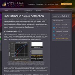
It defines the relationship between a pixel's numerical value and its actual luminance. Without gamma, shades captured by digital cameras wouldn't appear as they did to our eyes (on a standard monitor). It's also referred to as gamma correction, gamma encoding or gamma compression, but these all refer to a similar concept. Understanding how gamma works can improve one's exposure technique, in addition to helping one make the most of image editing. 1. Refer to the tutorial on the photoshop curves tool if you're having trouble interpreting the graph. Compared to a camera, we are much more sensitive to changes in dark tones than we are to similar changes in bright tones. But how does all of this relate to gamma? Technical Note: Gamma is defined by Vout = Vingamma , where Vout is the output luminance value and Vin is the input/actual luminance value.
8. Monitor calibration for photography. Knowing how to calibrate your monitor is critical for any photographer who wants accurate and predictable photographic prints.

If your monitor is not correctly reproducing shades and colors, then all the time spent on image editing and post-processing could actually be counter-productive. This tutorial covers basic calibration for the casual photographer, in addition to using calibration and profiling devices for high-precision results. Furthermore, it assumes that tossing your old monitor and buying a new one is not an option. 9. Soft proofing: matching on-screen photos with prints. 10. Working space comparison: sRGB vs. Adobe RGB 1998. Adobe RGB 1998 and sRGB IEC61966-2.1 (sRGB) are two of the most common working spaces used in digital photography.
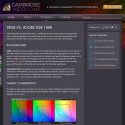
This section aims to clear up some of the confusion associated with sRGB and Adobe RGB 1998, and to provide guidance on when to use each working space.