
Physicists Finally See Light as a Particle and a Wave at the Same Time — NOVA Next. It’s a fundamental property of the universe, and one that continues to blow people’s minds: photons behave as both particles and waves, matter and energy.
About. John the Math Guy: What color is the dress??!??!?!? The Dimensions of Colour. Paint mixing processes Artists who use physical paint media mix their colours in three basic ways: 1. by physical mixing, 2. by glazing (using superimposed transparent paint layers), and 3. by interspersing small patches of colour that optically blend completely or partially at the intended viewing distance. The physical mixing of paints is often described simply as subtractive, but in reality a component of additive-averaging mixing is usually also involved. In a physical mixture of paints, most light bounces around and interacts with grains of all components in the mixture before emerging, so that each component has the opportunity to influence the colour of the light. Improving the Color Constancy of Prints by Ink Design_百度文库. Tolerances for spot colors. There is a little bit of a hole in the most recent version of the ISO spec for flexo printing.

I will explain the hole, discuss my analysis, and provide a patch for this hole, but first a bit of background. There is a family of standards called ISO 12647, which all cover printing. In particular, they provide some target color values, along with acceptance tolerances around those colors. Belltown Design My Top 11 Articles - on paint color consultation - Belltown Design. "Is my green the same as yours?", revisited. Node_Chroma. PBS Off Book by COLOURlovers. Off Book is a bi-weekly web series from PBS that explores cutting edge art, the artists that make it, and the people that share it online.
Episodes have ranged from web design to viral video to steampunk culture, and their latest entry into the series is all about color. Viewing Distance: The Misunderstood Concept. ICC profiles. January 23, 2012 | Leave a Comment.
Evaluating color in printers and ICC profiles. Color management: Evaluating color in printers and ICC profiles by Norman Koren updated Feb. 15, 2005.
Bill Atkinson updates free profile, profile target downloads. Nature photographer and fine-art printer Bill Atkinson - better known to early computer geeks as one of the creators of the Macintosh computer - has updated his collection of free profiles for newer Epson wide format printers. Over the past several weeks, Atkinson has been assembling on his web site profiles for use with the Epson Stylus Pro 4800, 7800 and 9800 and three different paper stocks: Epson's Premium Luster (250), Premium Semimatte (250) and Premium Glossy (250). PHOTO VIEWING distance affects perceived sharpness despite resolution.
SpectrumViz_1. DP&I.com. Visual Perception. We see color in the objects around us because they absorb most of the wavelengths from the sun, called white light; and they reflect only a particular wavelength into our eyes.
For example, a red apple absorbs all but the 760-nm wavelength. Therefore, we see it as red in color. Objects that are white in color are objects that do not absorb any viewable wavelengths; while objects that are black absorb almost all viewable wavelengths. The role of working spaces in Adobe applications. ColorGamut.mov (video/quicktime Object) The Effect of Image Size on the Color Appearance of Image Reproductions - Mahdi Nezamabadi. ArtImaging. UPDIG-DISG - imagemuse.org. UPDIG Digital Image Submission Guidelines Creating and preparing digital reproductions of artworks not only requires the careful attention to details already presented, but also poses significant additional challenges.

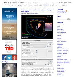
Unlike typical photo reproduction, the colors within digital files of artworks should not be subjected to interpretation or individual preference. The reproduction must produce the same perceived color (within physical limitations) as the original artwork. Changes in image size affect perceived contrast. 22 May 2007, SPIE Newsroom.
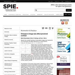
DOI: 10.1117/2.1200704.0724 Original works of art and their reproductions are usually viewed under quite different conditions. Visual angle and physical size are two of several factors affecting color perception. Variations in size lead to changes in perceived contrast. In this research, a projector (the larger ’original’) and an LCD monitor (the smaller ’reproduction’) were used to reproduce achromatic noise patterns with very different physical sizes.1,2 These patterns consisted of random dots that were filtered to contain only a narrow band of spatial frequencies. Three one-octave cosine filters were used to filter a uniform ‘white’ noise pattern. Figure 1. Figure 2. Figure 2 shows that for low spatial frequency patterns, observers had to increase the larger projector's image contrast to match that of the smaller image on the monitor. Figure 3. Online. Why Archiving Matters: Industry Perspective One member's take on the Archiving Conference and its importance at this time. » view blog post SD&A Marks 25th Year The Stereoscopic Displays & Applications Conference, held as part of the Electronic Imaging Symposium, hosts interesting papers, an annual 3D Theatre, a Demonstration Session, and other events.

Learn more about it here. » Read press release. Perception puzzles, Visual Perception, Optical illusions and Paradoxes. This page illustrates that our visual perception cannot always be trusted.

The components of an object can distort the perception of the complete object. Color Vision – Webvision. SBFAQ Part 6: Color for Text and Graph Legibility. 6.1 Is blue bad? 6.2 Should text be black on white or white on black? 6.3 What colors produce the most readable text? 6.4 How do I use color in graphs and charts?