
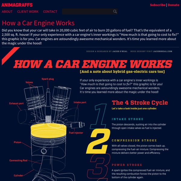
http://animagraffs.com/how-a-car-engine-works/
Related: MotorisationInternational Networks Archive \\ Remapping Our World The following six maps deal with an array of major current world issues, from the serious to the seriously frivolous. They were developed for the INA by Jonathan Harris of Flaming Toast Productions. The maps may not be reproduced or rebroadcast without express written consent of the INA. If you are interested in using the maps, please contact us. Click maps to enlarge them. How Americans Die By Matthew C. Klein / Bloomberg View / April 17, 2014How Americans Die The mortality rate fell by about 17 percent from 1968 through 2010, years for which we have detailed data.Almost all of this improvement can be attributed to improved survival prospects for men. It looks like progress stopped in the mid-1990s… Mortality rate per 100,000 people …but that’s only because the population has aged a lot since then. Share of population This has a big effect on the overall mortality rate, because old people die sooner than the young. Mortality rate per 100,000 people by age If you divide the population into separate age cohorts, you can see that improvements in life expectancy have been broad-based and ongoing.Looking at mortality for each age cohort since 1968, we see that Americans under 25 have made the most progress. Mortality rate per 100,000 people by age (1968 = 100) But one line in this chart looks unusual!
Curvy in HTML5 Curvy is a HTML5 puzzle game using the canvas element. Just rotate the tiles so that like colors connect. Modernizr tells me you don't have canvas support in your browser. Sadly, this game uses technology that's only in browsers with HTML5 support. We've tested Chrome 12, Firefox 4 and Opera 11. Presented to you by FlamingLunchbox is a puzzle, originally for Android phones, using a simple idea.
40 Maps They Didn’t Teach You In School By the time we graduate high school, we learn that they never taught us the most interesting things in there. Sure, you might be able to name the European countries or point New York on the map, but does that give a you real understanding of how the world functions? To fill this gap, we have gathered a great and informative selection of infographical maps that they should’ve shown us at school: every single one of these maps reveals different fun and interesting facts, which can actually help you draw some pretty interesting conclusions. Show Full Text What makes infographical maps so engaging is how easy it becomes to conceive graphically presented information. The best part, there are brilliant services like Target Map that “allow everyone (from individuals to large organizations) to represent their data on maps of any country in the world and to share their knowledge with the whole Internet Community.”
a blog by victor powell May 29, 2013 In probability theory, the central limit theorem (CLT) states that, given certain conditions, the mean of a sufficiently large number of independent random variables, each with a well-defined mean and well-defined variance, will be approximately normally distributed. -- Central Limit Theorem - Wikipedia which is what we see here. at every triangle, the ball has a 50/50 shot of going to the left or to the right. you can also think of it like coin flips, where the number of coin flips is (bins -1) if we assign heads to 0, and tails, 1 (or 0 for left, 1 for right as in the case of the visualization above) for 1 coin flip, the possible sums of coin flips are: so for 1 coin flip, there are 2 different possible outcomes, each equally likely. the expected percentage of the possible outcomes is then:
KenKen, Math Puzzles that make you smarter KENKEN for your Mobile Fun, addicting, yet educational. The KenKen iOS and Android apps are perfect for the whole family! KENKEN in the Classroom Calling all educators! Join our FREE program to use KenKen puzzles with your students. Stunning Infographics and Data Visualization Feb 02 2010 Information graphics, or infographics, are visual representations of information, data or knowledge. The graphics are used where complex information needs to be explained quickly and clearly, such as on signs and maps and in journalism, technical writing and education. Today, infographics surround us in the media, in published works both mainstream and scientific and in road signs and manuals. They illustrate information that would be unwieldy in text form and act as a visual shorthand for everyday concepts, such as “Stop” and “Go.”
Wind Map An invisible, ancient source of energy surrounds us—energy that powered the first explorations of the world, and that may be a key to the future. This map shows you the delicate tracery of wind flowing over the US. The wind map is a personal art project, not associated with any company. We've done our best to make this as accurate as possible, but can't make any guarantees about the correctness of the data or our software. Please do not use the map or its data to fly a plane, sail a boat, or fight wildfires :-)
The Way to Personal Branding Personal Branding is something that a person does to better market themselves and their careers. This includes defining who you are by finding your skills and passions, establishing how (as a person) you are perceived by others (via personal relationships, professional relationships, and your online reputation) and finally by defining what you want to achieve. This Infographic created by sestyle goes through the whole process step by step to get you on your way to establishing a personal brand for yourself. **Please note that Enfuzed is not responsible for any typographical errors or incorrect information given in any infographics posted on enfuzed.com**
Viral: Photo-Sharing Explosions This is a series of videos that visualizes a single piece of content being shared between hundreds of thousands of individuals on Facebook. We've tried to capture the frenetic energy surrounding three of the most shared images, all of which were photos published on George Takei's Page. Each visualization is made up of a series of branches starting from a single person. As the branch grows, re-shares split off on their own arcs, sometimes spawning a new generation of re-shares, sometimes exploding in a short-lived burst of activity. The two different colors show gender, and each successive generation becomes more and more white as time goes by.
PhotOH! Money that speaks for the 99% PhotOH! Money that speaks for the 99% · Monday, October 17th, 2011 at 12:35 pm You can see more money that speaks for the 99% here, at Occupy George. Brilliant: H/t: @katewarren