
http://www.educatorstechnology.com/2013/01/great-infographic-making-tools-for.html
Related: Webb-resurser46 Tools To Make Infographics In The Classroom Infographics are interesting–a mash of (hopefully) easily-consumed visuals (so, symbols, shapes, and images) and added relevant character-based data (so, numbers, words, and brief sentences). The learning application for them is clear, with many academic standards–including the Common Core standards–requiring teachers to use a variety of media forms, charts, and other data for both information reading as well as general fluency. It’s curious they haven’t really “caught on” in schools considering how well they bridge both the old-form textbook habit of cramming tons of information into a small space, while also neatly overlapping with the dynamic and digital world.
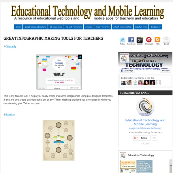
30+ Really Useful Infographics Tools & Resources Infographic credit: Ivan Cash Infographics are everywhere! Whether you’re a fan of them or not , infographics have become a staple of web content and are engaged in a seemingly endless love affair with social media. You Suck at Infographics An infographic, or information graphic, is designed to convey a huge set of data in a fraction of the time that it takes to wade through a dense, numbers-heavy paragraph. The best ones are also entertaining. According to Stew Langille, the CEO of data visualization start-up Visual.ly, the average pageview for a newspaper infographic is about 30 times that of a text-based article. But creating an effective infographic is much more difficult than just arranging a few charts around a cartoon character. It requires graphic designers to tap into their inner data analyst and journalist — to crunch numbers and craft a convincing narrative.
40+ Tools to Create Infographics with Your Students Here is a comprehensive list of some very good tools for making infographics. The list features more than 40 applications so you have a wide variety of options to choose from.While some of these tools are pretty basic and you can use them without any complications, others do require some advanced tech knowledge and design know-how. As a teacher and educator, my favourite infographic making tools are Google Draw and Pictochart. I invite you to read this step by step visual guide to learn more about how you can easily set up your infographic using Google Draw. Also bear in mind that most of these tools require a sign-up and some of them are fremium: they have, besides the basic free version, a pro version that offers more advanced features. I ll let you now explore this list and looking forward to your feedback.
Educational Technology and Mobile Learning: The 16 Types of Social Media Personalities- Which One Are You ? With the massive uptake of social networking sites, social media has become part and parcel of our digital life.Your daily dose of social media depends on how much time you have to spend on such virtual networks. It also depends on the purpose behind you joining them, if you are using them solely for personal and socializing goals then you might find yourself running the risk of addiction to these platforms. A distinct new breed of social media personalities has been born, according to an extensive new study by conversation experts "first direst". Which one are you?The Ultras? 9 Data Visualization Tools for Librarians and Educators Data visualization and infographics tools are a great way to keep students and readers engaged. Here are ten free applications which will enable you to create your own infographics, maps, graphs, charts, and diagrams: Creately The free version of Creately enables users to design and store 5 diagrams which can include Venn diagrams, UI & Web mockups, Flowcharts, Organizational charts, UML diagrams, Mind maps, Network plans, SWOT analysis, Value stream maps, TQM diagrams and more. Stat Planet
Anatomy of a Great Infographic Share this infographic on your site! <a href=" src=" alt="Anatomy of a Great Infographic" width="500" border="0" /></a><br />Source: <a href=" of a Great Infographic</a> Embed this infographic on your site! Educational Technology and Mobile Learning: A Beautiful Visual on The Connected Teacher I have just started reading the book after the last scheduled in my reading list for this month and I must say that this is the best of the titles I am reading in June. The Rise of the Network Society: The Information Age: Economy, Society, and Culture is the first in Castells' ground-breaking trilogy.It is an account of the economic and social dynamics of the new age of information. Based on research in the USA, Asia, Latin America, and Europe, it aims to formulate a systematic theory of the information society which takes account of the fundamental effects of information technology on the contemporary world. The book is jargon rich and it sent me searching in Google in several instances. I will soon share with you a review once I finish reading it.