
Matt Cutts: Gadgets, Google, and SEO Fitbit has discontinued their Fitbit One step trackers, which seems like a good opportunity to step back and reflect on wearing one for the last decade or so. I’ve enjoyed using Fitbit trackers, but the One devices seemed like they broke down too often. I’m pretty proud that I ended up earning all the activity-related Fitbit badges though:
Which Is Right for Me? 22 Responsive CSS Frameworks and Boilerplates Explained CSS frameworks have been around for years now, but the arrival of responsive design practices has rendered many of our old favorites useless. Fortunately, lots of really talented developers have jumped in to fill the gap with the next generation of CSS frameworks and boilerplates. There’s already a ton of these things floating around. Everyone has a list, but no one really walks you through how each framework and boilerplate differs from the next so that you can make an informed decision. That’s our goal today. Follow along as we take a look at what makes each of these 22 responsive CSS frameworks and boilerplates unique.
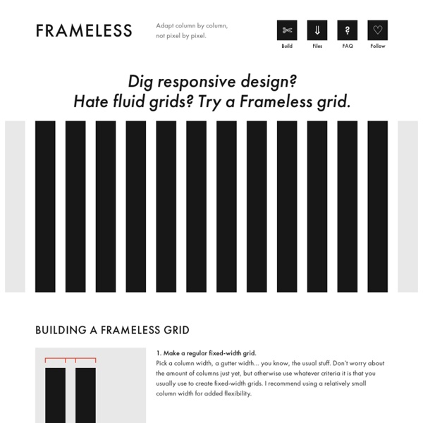
Less Framework 4 - adaptive CSS grid system I called Less Framework "a CSS grid system for designing adaptive websites". It was basically a fixed-width grid that adapted to a couple of then popular screen widths by shedding some of its columns. It also had matching typographic presets to go with it, built with a modular scale based on the golden ratio. The resources it was originally published with are still available on GitHub. Contrary to how most CSS frameworks work, Less Framework simply provided a set of code comments and visual templates, instead of having predefined classes to control the layout with. This is how I still work today and definitely a method I advocate.
Retina Display for Mobile Web As of late, I’ve been tasked with optimizing images for the iPhone4′s Retina Display. Retina Display has 4 times the number of pixels than previous iPhones and all other smart phone screens currently on the market. The text and graphics look amazing! This is due to the high pixel density of 326ppi. Looking through various blogs and tutorials, I was unable to find a straight forward solution on how this is done for browser based mobile applications, NOT downloadable mobile applications. 15 Responsive CSS Frameworks Worth Considering Taking the next step of our responsive layout coverage (we recently published the articles Responsive WordPress Themes and jQuery Plugins to help with Responsive Layouts), today we are taking a look at responsive CSS frameworks that we feel are worth your consideration. Just like most CSS frameworks, all of the frameworks below will help you rapidly develop sites by eliminating the need to write basic CSS styles yourself, as you would expect. But, on top of that, they also come with a responsive layout helping you to quickly and easily create mobile-specific sites. Less Framework 4 The Less Framework contains 4 adaptive layouts and 3 sets of typography presets, all based on a single grid, composed of 68 px columns with 24 px gutters. The idea is to first code the Default Layout (992 px), and then use CSS3 media queries to code several child layouts: 768, 480, and 320 px.
The Free Keyword Niche Finder - WordStream's Niche Keyword Research Tool Learn More about The FREE Keyword Niche Finder Want to know more about The Free Keyword Niche Finder, like what are "keyword niches," or what does "relative frequency" mean, or where do we get the data from for our keyword finder? Then, keep reading or you can use the links to the right to jump down to a particular topic of interest.
Bootstrap Toolbox - Tools, Utilities, Generators and Templates Ever since it was initially released, Bootstrap has taken the internet by a storm. It keeps growing in popularity with each passing day — and why shouldn’t it be popular? After all, where else do you find a responsive framework with such an extensive library of pre-styled components, and a community that offers many, many extras and addons? In this collection, we have put together some of the best Bootstrap resources. Nay! We have tried to create the ultimate Bootstrap toolbox page: utilities, generators, templates… and much more!
Four Methods to Create Equal Height Columns Back when tables were used for layouts, creating equal height columns was very simple. All you had to do was create three cells in a row and you have a layout with equal height columns. The method for creating equal height columns isn’t as straightforward when you use CSS for layouts. This article discusses some methods to create equal height columns that work on all major web browsers (including the infamous IE6). All of these methods show how to create a three column layout. Flat UI Header 3The Vatican transitions to a Header 4Great American Bites: Telluride's Oak, The Header 5Author Diane Alberts loves her some good Header 6With the success of young-adult book-to-movie
How to Design a Mobile Responsive Website To build a mobile site or not to build a mobile site; this is a question at the forefront of many a discussion. There is, however, another option: responsive web design. When, why, and how should you go about designing a responsive website? With mobile internet users set to surpass desktop internet users in the US by 2015, with tablets becoming more popular, and even with TV internet usage increasing, it’s important for companies to provide a great user experience for all their visitors no matter what device they’re on.