
Grid System Generator A limitação do Responsive Web Design - Locaweb Developer Network O Responsive Web Design pode adequar websites para vários tipos de tamanho de tela, mas essa adequação só chega até a estrutura do site. Você pode falar que o site terá 3, 2 ou 1 coluna e mais nada. As Media Queries ajudam a resolver nosso problema estrutural. Essa parte é super importante, mas não é suficiente. Nada contra, mas… Entenda que não sou contra o RWD, pelo amor de Deus… Eu amo ele de paixão. Existem cenários que não foram bem explorados e que ainda vão nos atormentar por muito tempo, como é o caso dos navegadores em consoles. Muitos formatos estão surgindo de todos os cantos e isso é algo realmente perturbador. Um exemplo básico Costumo usar um exemplo bem básico para você entender a brincadeira. Em uma tela menor, como ficaria: Muito, muito, muito ruim. O mais legal seria que no mobile esse elemento virasse um dropdown. Essa é uma solução básica e você pode nem gostar dela.
Grid Designer 2 If you're familiar with the grid, a bit of design and basic typography, using this script should be pretty easy - most of the functions are pretty self-explanatory. If you're unfamiliar with grids in general, you could start by reading an excellent series of articles by web designer Mark Boulton. For those who want a real understanding of the theory of grids in relation to design and typography, I strongly recommend this book. On the Columns tab, you can start your design in two ways: Fill in the number of columns, total width, gutters and margin widths, all specified in pixels - then press the design button. The grid preview on the Columns tab will display the widths of each area, in pixels. Use the Typography tab to adjust and calculate basic typographic settings for your design. Finally, on the Export tab, you can generate copy-and-paste ready CSS, and a sample XHTML template.
960 Grid System 30+ Must Have jQuery Plugins & Responsive Tools for Web Developers jQuery, ‘the missing UI library for the web’ as they describe it, is an essential tool for designing modern web applications and interfaces. It provides a wide range of UI components and development tools that you can use to build rich web applications. Today we are featuring 30+ jQuery plugins, libraries and tools that we have found useful. Hopefully, you will find them valuable for your upcoming projects. If you know of any useful jQuery plugin that you have used or authored, do share in the comments section below. CSS3 and jQuery Filtering and Sorting Plugin – MixItUp MixItUp is a light-weight but powerful jQuery plugin that provides beautiful animated filtering and sorting of categorized and ordered content. Retina-ready Touch Supported jQuery Lightbox Swipebox is a jQuery “lightbox” plugin for desktop, mobile and tablet. Block Slide – A CSS3 Animated Modal Window Image Gallery jQuery Plugin You can set the animation you wish to use for the modal boxes as they slide in.
Golden Grid System GGS was my next step after Less Framework. Instead of a fixed-width grid, it used a fully fluid-width one, without even a maximum width. The resources it was published with are still available on GitHub. The idea was to take a 18-column grid, use the outermost columns as margins, and use the remaining 16 to lay elements out. On smaller screens the 16 columns could be folded into 8, 4 and 2. While the grid's columns were fluid — proportional to the screen's width — the gutters (spaces between the columns) were proportional to the font-size being used. GGS also contained a set of typographic presets, strictly to a baseline grid. Correctly setting all of these measurements is difficult, of course. When published, GGS gained a lot of attention, as the web design community was searching ways to work with fluid-width grids, which have always been troublesome, running counter to many graphic design principles. Later on I developed Frameless, the last entry in my early CSS grid system saga.
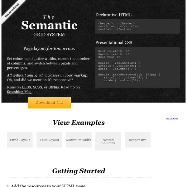
Grid (page layout) A grid applied within an image (instead of a page) using additional angular lines to guide proportions. In graphic design, a grid is a structure (usually two-dimensional) made up of a series of intersecting straight (vertical, horizontal, and angular) or curved guide lines used to structure content. The grid serves as an armature on which a designer can organize graphic elements (images, glyphs, paragraphs) in a rational, easy to absorb manner. A grid can be use to organize graphic elements in relation to a page, in relation to other graphic elements on the page, or relation to other parts of the same graphic element or shape. The less common printing term “reference grid,” is an unrelated system with roots in the early days of printing. Before the invention of movable type and printing, simple grids based on optimal proportions had been used to arrange handwritten text on pages. Some examples of grid system frameworks are: There are also CSS frameworks that include their own grid system:
15 Responsive Navigation jQuery Plugins For the most of us, the most difficult aspect of building a responsive layout is the planning and coding of the navigation. As there is no truly tried and tested universal solution, the style of the menu you use will depend on the type of site you are building. If it is a small site, a <select> drop-down menu or a basic “three line” toggle menu will probably be suffice. But if it is a larger site (an e-commerce store for example) that relies upon a mega-menu for navigation on its desktop version, then a drawer-style navigation or an animated side panel menu will most likely help you. So, no matter what type of site you are building, in this post we will hopefully have the solution for you in the form of these responsive navigation jQuery plugins. Sidr Sidr is an easy to use plugin that will create a responsive Facebook-a-like side menu. Sidr →GitHub → Navgoco Navgoco →GitHub → FlexNav FlexNav is a mobile-first example of using media queries and jQuery to make a robust drop-down menu. FlexNav →
Less Framework 4 I called Less Framework "a CSS grid system for designing adaptive websites". It was basically a fixed-width grid that adapted to a couple of then popular screen widths by shedding some of its columns. It also had matching typographic presets to go with it, built with a modular scale based on the golden ratio. The resources it was originally published with are still available on GitHub. Contrary to how most CSS frameworks work, Less Framework simply provided a set of code comments and visual templates, instead of having predefined classes to control the layout with. This is how I still work today and definitely a method I advocate. /* Default Layout: 992px. Less Framework was popular in the early days of responsive design. Eventually, I moved on from fixed-width grid systems and worked on a fully fluid-width one, in the form of Golden Grid System. Less Framework's popularity was helped by the following contributions and the lovely people behind them (dead links crossed off):
The Hypnotic Effect of Parallax Scrolling and How it Impacts User Experience Parallax scrolling has become increasingly popular in web page design. Pages that employ it often create an impression of action through clever techniques that utilize page depth, animation, and movement. Owing its beginnings to the multiplane camera technique developed by early animators in the 1940’s, parallax scrolling was first popularized in the 1980’s as a way to add depth in 2D video games. These day’s though, you mostly hear about parallax scrolling as a way to improve user experience in web design. It works by having the foreground and background move at different speeds while the user is scrolling. This creates a hypnotic animated effect that can impress, engage, and direct the viewer’s attention toward whatever you desire. Example of parallax scrolling courtesy OhSqueezy Advantages So what does this mean for you? Designing your website with parallax scrolling can help to improve all of the following areas: All of these factors combine to create an engrossing user experience.
Fluid 960 Grid System | 16-column Grid Article Heading Subheading Lorem ipsum dolor sit amet, consectetuer adipiscing elit, sed diam nonummy nibh euismod tincidunt ut laoreet dolore magna aliquam erat volutpat. Ut wisi enim ad minim veniam, quis nostrud exerci tation ullamcorper suscipit lobortis nisl ut aliquip ex ea commodo consequat. Heading 3 Heading 4 Heading 5 Duis autem vel eum iriure dolor in hendrerit in vulputate velit esse molestie consequat, vel illum dolore eu feugiat nulla facilisis at vero eros et accumsan et iusto odio dignissim qui blandit praesent luptatum zzril delenit augue duis dolore te feugait nulla facilisi. Heading 6 Epsum factorial non deposit quid pro quo hic escorol.