
Nouvelle identité visuelle de l'Opéra de Saint-ÉtienneGraphéine – Agence de communication Paris Lyon. Voici quelques photos du lancement de saison.
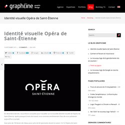
On pouvait retrouver sur le visage de chacun des collaborateurs de l’opéra, le même sourire que dans la brochure ! Ci-dessus : l’équipe de Graphéine Lyon, avec de gauche à droite, Mathias (Directeur de Création), Céline (Chef de projet-Office Manager), Adrienn (Directrice artistique) et Jonas (Graphiste-Maquettiste). Merci à la ville de Saint-Étienne et Olivier Barbé (Directeur de la communication de la Ville), Éric Blanc de la Naulte (Directeur de l’Opéra) et Oumama Ryan ( Directrice de la communication ) de nous avoir fait confiance tout au long du projet et d’avoir appuyés nos idées les plus folles par un optimisme à toute épreuve, même quand les délais étaient apparemment intenables ! ( cf : La brochure de saison fût livrée 2h avant le lancement de saison ! De Tekstbrouwmeester. Contributed by Amsterdam-based Sander Crombach.
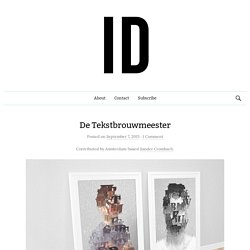
De Tekstbrouwmeester is a company that writes high quality texts for all sorts of clients. Hobart Reese, who made portraits of famous people in 1922 using only a typewriter, was the inspiration for the identity. The fundamental idea is to use nothing but letters to make images, repositioning the letters in different sizes, colours and positions. The ability for clients to create their own content is becoming more and more important. A website, Facebook cover photo, or the back of a business card are examples where branding can be shown. The tool consists of primary and secondary controls. With the secondary controls you can adjust the letter size, the size range, line height, letter spacing, and choose between colour or black and white.
GT Sectra by Grilli Type was the font chosen for the identity. Yesterday. Contributed by Dervla O’Shea of London-based Dixon Baxi.
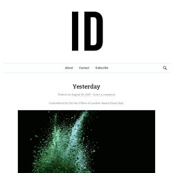
A multi-platform rebrand, UKTV Yesterday was underpinned by the new positioning ‘Entertainment Inspired by History’. This led to challenging the viewer perception of how history can be portrayed, with the aim of transforming it into a vivid, immersive experience. POM POM. Contributed by Alexander Andreyev of Reynolds & Reyner.
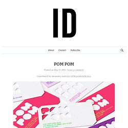
POM POM is a modern and stylish lingerie brand that we created for a Los Angeles-based fashion designer. In each set there are two kinds of panties packed in individual boxes that resemble diagonally-cut cubes in shape. The first one is more comfortable and simple, for everyday use at work or fitness sessions, and the second box offers a more creative and interesting lingerie type for evenings and nights, parties and leisure. The 2-piece set is read not only in the packaging and the brand name, but also in the brand’s slogan “Work hard, play hard.” The word “POM POM” means “a bob on a hat” in English. The client wanted a kitschy and playful, yet sophisticated design. The target audience is fashion conscious, body conscious women, ages 18-40 (young 40) with a slightly narrower range of 22-35. Reynolds & Reyner elsewhere on Identity Designed: Coffee House London, Liverpool English Pub. Tiko. Contributed by Hayley Mountford of Moving Brands.
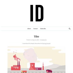
Tiko is a leading connected home device — a smart grid system that connects to a user’s home electricity supply. Moving Brands worked with Tiko founders to bring clarity, consensus and purpose to this new business. Connected home devices remain unchartered territory for many people. Metta on Behance. UP. Noise 13. Contributed by Claire Saccoccini of San Fransisco-based Noise 13.
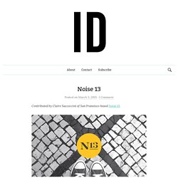
After nearly 15 years, Noise 13 has turned the mirror inward and done a bit of self reflection on our own brand. After much blood, sweat and tears (not really — just lots of coffee), we’re so excited to introduce our new look! Last year, we kicked off the process with strategy and brand positioning. While this is something we offer our clients, it’s always harder to see the full picture when you’re looking at yourself, so we enlisted some help. The amazing team at SeriesC helped us focus on our unique strengths and refine our message. El Camino Foodtruck. Contributed by Orlando Fernandez of Monterrey-based Savvy Studio.
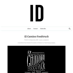
El Camino Foodtruck is our answer to Monterrey’s gastronomic needs. Its menu caters for all tastes, ranging from vegetarian options to delicious Texas-style hamburgers and sandwiches. The Spanish/English combination in its name is a play with words that aims to communicate these flavours. For this project we developed an exhaustive graphic language which is constantly growing. Aena. Contributed by Marco Kindler von Knobloch of Madrid-based Biográfica.
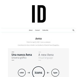
Aena is the world’s number one airport operator in terms of passenger traffic. Over 577 million passengers passed through Spanish airports in the last three years. The company manages 46 airports and 2 heliports in Spain and participates directly and indirectly in the management of a further 15 airports in Europe and America, including London Luton Airport, with a 51% stake. Taking the logo designed by Estudio Mariscal as a starting point, we created and structured a new visual language: a graphic system to meet the multiple needs of the company. ADC Festival 2015. Contributed by Barcelona and London-based CROWD Studio.
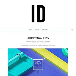
“Each April, hundreds of people from around the world converge on Miami Beach to celebrate their inner artists at North America’s most inspiring beachside creative festival. “There are no advertising speakers or panels at the ADC Festival. Germina. Contributed by Orlando Fernandez of Monterrey-based Savvy Studio.
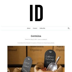
Germina reinterprets Mexico’s traditional market stalls, selling product in bulk with a wide range of seeds, grains and cereals: from poppy seeds to different varieties of quinoa, dried spicy chickpeas as snacks or nutritious cereal bars — all catering towards more health-conscious lifestyles. The design was crafted as a contemporary take on typical market aesthetics and experience, mostly resulting from a direct relationship between customer and vendor, through a clean, modern graphic language.
All designs seek to be extremely practical, using basic packaging made from recycled materials — all customisable — emphasising the product’s name, weight and price, thus, following the rituals from habitual market shopping experience. Natural, almost rustic materials communicate the brand’s core values in a very direct manner, glorifying its products and the trade’s casual nature.