
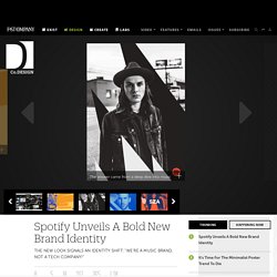
/再見 二手書店 SEE YOU - k...@XuHY_____采集到logo/VI(90图)_花瓣. Spotify Unveils A Bold New Brand Identity. For a brand that fronts such a vast and eclectic array of music—a database of some 30 million songs, including the top tunes in Malta, Bulgaria, and Paraguay, among others—Spotify’s brand identity has always been surprisingly sedate: black, white, and an uninspiring green for colors; an off-the-shelf font; and a little stylized sound wave as a logo.
That made for a fairly dismal array of tools for communicating with the brand’s 60 million avid fans. A framework for student opportunity. In his 2013 State of the Union Address, President Obama spoke urgently about the need for education reform to keep the United States relevant in a global economy.
Many schools fall short of providing their students with the education they need to compete in today’s marketplace. Not only does this prevent students from pursuing new career opportunities in growing sectors, it will impede the US from retaining its edge. As the President said, “If you think education is expensive, wait until you see how much ignorance costs.” Fortunately, new models of education are being pioneered to address these shortcomings. Obama spoke highly of one school in particular, the Brooklyn-based NYC Pathways in Technology Early College High School, or P-Tech. FÖDA, Austin. Design and Brand Development.: Pattern Language.
The exploration of Mesoamerican motifs to create a new pattern language.
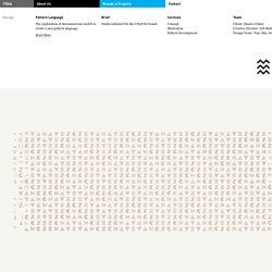
The defining element of the CH∆VEZ brand identity system is its pattern. Creative Director Jett Butler and Designer Tom Ahn placed considerable time and value on developing a glyph palette, each representational of a contextual element of the project. This stated first in simple chalk studies, evolving into finely tuned elements cut from steel, burned into wood, and silkscreened on to various strata. Behance. Responsive Logos. Google Visual Assets Guidelines - Part 1 on Behance. Google Visual Assets Guidelines - Part 2 on Behance. Google’s brand is shaped in many ways; one of which is through maintaining the visual coherence of our visual assets.
In January 2012, expanding on the new iconography style started by Creative Lab, we began creating this solid, yet flexible, set of guidelines that have been helping Google’s designers and vendors to produce high quality work that helps strengthen Google’s identity. What you see here is a visual summary of the guidelines, divided into two Behance projects: Part 2: User interface icons and Illustrations Google design style: Executive Creative Director: Chris WigginsGraphic Designers: Jesse Kaczmarek, Nicholas Jitkoff, Jonathan Lee, Andy Gugel, Alex Griendling, Christopher Bettig, Jefferson Cheng, Roger Oddone, Yan Yan, Zachary Gibson.
Examples of Work — Identity, Polyester. Visual image of the the Ljubljana Architecture and Design Museum - brand - top design - AD518.com. 来自斯洛文尼亚 IlovarStritar 工作室的作品,他们为卢布尔雅那建筑与设计博物馆(MAO, Muzej za arhitekturo in oblikovanje / Museum of Architecture and Design, Ljubljana)设计的VI项目,其视觉核心是一个MAO字母衍生的多形态标志,点击后面的官网链接可以看到更多相关内容。
Wallonia.be on Behance. What’s in a brand? Belgium’s regions put their best foot forward. Date: 26/07/2013 11:05:00 All three of Belgium’s regions – Brussels, Flanders and Wallonia – have gone through a significant rebranding in the past year.
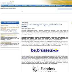
As the new logos and marketing campaigns start to roll-out, the regions hope to strengthen their position both internationally, and within the borders of their own country. Brussels unveiled a new logo and marketing campaign in July 2012, while Wallonia and Flanders have followed suit in the past months. To help position themselves on international markets, all three regions have notably chosen a slogan in English.
Globalization has pushed countries to engage in so-called ‘nation branding’ to help attract foreign investments. Brussels was the first to go, launching its new marketing campaign in July 2012. A Study in Brand Minimalism. Documents » Landscape Monolith. 2013, série de 11 photographies modifiées, 36 x 24 cm.
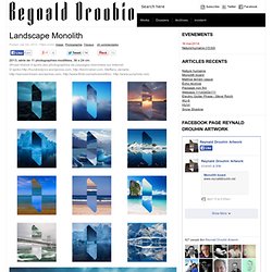
(Projet réalisé d’après des photographies de paysages cherchées sur Internet.
To Create The Future Of Brand Identity, Ideo Looks Inward. On March 25, the designers at each of Ideo’s 11 international offices put their other projects aside and spent the day thinking about Ideo.
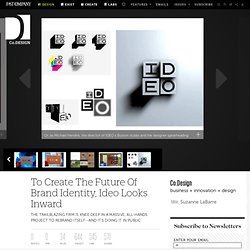
The aim was to brainstorm a new identity system--the second time it’s been overhauled since the firm was founded in 1991--and the ideas, which can be viewed on a Tumblr dedicated to the project, took many forms. There were experimental business cards and animated GIFs, handmade crafts and polished mini-movies. Meet The Accidental Designer Of The GitHub And Twitter Logos. Simon Oxley was drinking beer and watching TV on his couch (like any good freelancer) when he noticed that a hot new startup called Twitter was using his art as a logo.
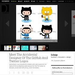
At first, he thought he was drunk. “I checked the label on the beer I was drinking and called my wife to come see,” he says. “It was a total, surreal surprise.” Oxley, who is British-born and Tokyo-based, was (and is) a freelance contributor to iStockphoto, one of the web’s most popular resources for stock photos and illustrations. He originally joined the service because Adobe Creative Suite came with a free membership. His biggest sales, though, have been from startups like Twitter, who paid “a relatively small amount of money” for a library of images including the bird and the robot, which still appears when you visit a broken link.
DING3000 product design company visual image - brand - top design - AD518.com. Russian Mikhailov & Partners PR strategy consulting firm Brand - brand - top design - AD518.com. The Houses of Westeros poster - Darrin Crescenzi. Yesterday, owner Michael Jordan unveiled the new visual identity for the 2014–15 Charlotte Hornets NBA team, a project I’m pleased to announce I helped develop for Jordan Brand alongside the fine folks at Rare Design and with the aid of collaborator David Iglesias.
Excited to share the full case study soon. A Top Nike Designer Rebrands Game Of Thrones. If you’re Nike Brand Design rock star Darrin Crescenzi, and you’ve created everything from the Nike Fuel gauge to the U.S. Men’s Olympic Basketball uniforms, what do you do in your spare time? You, like the rest of us, get hopelessly addicted to George R.R. Martin’s fantasy series Game of Thrones. The Art of Logo Design. Help Remedies. I don't know what the back of my head looks like I don't know who wrote Poor Richard's Almanack/what time it is I need to buy a gift for someone.
Welcome to UAE Nation Brand. More4 Rebrand by ManvsMachine. Follow-Up: DC Comics. Yesterday, DC Comics officially unveiled its new identity, after the whole internet (including us) stole its thunder at the start of the week when we all judged its new branding effort based on a single, black-and-white rendition of their new logo. Now it’s an uphill battle to get people on board with what is actually a fairly good looking and flexible identity designed by Landor. The design of the new DC Entertainment identity uses a “peel” effect — the D is strategically placed over the C with the upper right-hand portion of the D peeling back to unveil the hidden C — symbolizing the duality of the iconic characters that are present within DC Entertainment’s portfolio.— Press Release.
Paul Rand + Steve Jobs. I can’t help thinking that Paul Rand and Steve Jobs are cooking up a new identity for a heavenly company. In 1986 Jobs approached Rand to design the logo for his NeXT educational computer company. After obtaining permission from IBM, Jobs offered Rand a handsome sum to develop a logo for a product that was not yet public. The only thing Rand knew was that the mysterious NeXT computer was a black cube.
With this scant yet meaningful intelligence, Rand developed a unique proposal book for the mark that walked the reader – Mr. Jobs – through the step by step conceptual process to the final, logical outcome. Zurich Instruments on the Behance Network. Trade marks and symbols by Stefan Kanchev. 40 Examples of Trendy Web Illustrations in Logos at DzineBlog. Here's Looking At Hue.