
What I Use to Visualize Data. Mar 8, 2016 “What tool should I learn?
What’s the best?” Dataviz.tools. Datavisualization.ch Selected Tools. Introducing Vega-Lite. Provide sensible defaults, but allow customization.
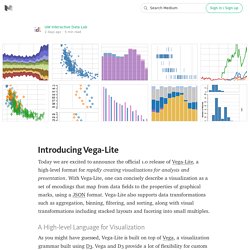
Vega-Lite’s compiler automatically chooses default properties of a visualization based on a set of carefully designed rules. However, one can specify additional properties to customize the visualization. For example, the stacked bar chart on the left has a custom color palette. Deck.gl. Raw. Quartz/Chartbuilder. Charted. ChartAccent. FastCharts.io. NounProject. Quick, Draw! The Data. Data Viz Project. Find the graphic you need. Semiotic Data Visualization. Big Data Visualization: Review of the 20 Best Tools. Big Data is amazing.
It describes our everyday behavior, keeps track of the places we go, stores what we like to do and how much time we spend doing our favorite activities. Big Data is made of numbers, and I think we all agree when we say: Numbers are difficult to look at. Enter Big Data visualization. Google, Facebook, Amazon, Apple, Twitter and Netflix all ask better questions of their data – and make better business decisions – by using data visualization. 4 Tools to Pick Your Chart Colors. I used to manually select my color schemes with trial and error, but these days, there are a lot of tools to help you pick colors for your charts.
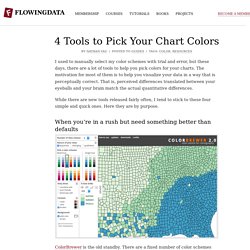
The motivation for most of them is to help you visualize your data in a way that is perceptually correct. That is, perceived differences translated between your eyeballs and your brain match the actual quantitative differences. While there are new tools released fairly often, I tend to stick to these four simple and quick ones. Project Lincoln from Adobe aims to reverse data visualization workflow. Kepler.gl. Cartography Playground. The Chartmaker Directory. iNZight for Data Analysis. D3.js - Data-Driven Documents.
d3-annotation. Hitchhiker’s Guide to d3.js. D3 in Depth. An Intro to D3.js. Intro to Scrollama.js. What Scrollama is a modern and lightweight JavaScript library for scrollytelling using IntersectionObserver in favor of scroll events.
Using IntersectionObserver abstracts element-in-view detection and removes the need to monitor scroll events, which contribute towards a sluggish experience. It offers three main features: React + D3. r2d3 - R Interface to D3 Visualizations. A Periodic Table of Visualization Methods. Visualization Universe - The Most Searched for Visualization Types, Tools, and Books. Visual Vocabulary. Infographic Taxonomy - Vizualism. What Makes A Good Data Visualization? Hi there.
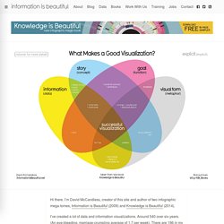
I’m David McCandless, creator of this site and author of two infographic mega-tomes, Information is Beautiful (2009) and Knowledge is Beautiful (2014). I’ve created a lot of data and information visualizations. Around 540 over six years. (An eye-bleeding, marriage-crumpling average of 1.7 per week). There are 196 in my new book, Knowledge is Beautiful (out now). This graphic visualises the four elements I think are necessary for a successful “good” visualization. i.e. one that works. All four elements in his graphic seem essential. See how, interestingly, if you combine information & function & visual form without story, you get “boring”.
Twenty rules for good graphics. Ask the Question, Visualize the Answer. While working through the recent animated pyramid chart tutorial, I came across a chart showing the shrinking surplus of women in Germany by Lisa Charlotte Rost.
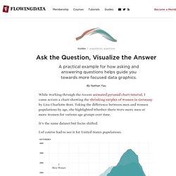
Taking the difference between men and women populations by age, she highlighted whether there were more men or more women for various age groups over time. It’s the same dataset but focus shifted. I of course had to see it for United States populations. Why not to use two axes, and what to use instead. See, Think, Design, Produce 3. By Jonathan Corum March 28, 2016 This is an audio transcript of my talk at See, Think, Design, Produce in San Francisco on Feb. 11, 2015.
Graphs – beauty and truth. A good graph is elegant I really like graphs.
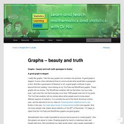
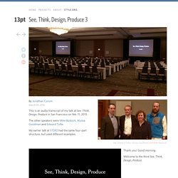
I like the way graphs turn numbers into pictures. A good graph is elegant. It uses a few well-placed lines to communicate what would take a paragraph of text. And like a good piece of literature or art, a good graph continues to give, beyond the first reading. Spreadsheets have made it possible for anyone and everyone to create graphs. Three graphs spurred me to write this post. How to design a better table. In 2009 I did a survey of the use of data displays in a number of leading journals and found that, in all of the sciences that I surveyed, the dominant form of data display was the table.1 This is despite the century-old warning of the brothers Farquhar that: “Getting information from a table is like extracting sunbeams from a cucumber.”2 Figure 1 shows the results for the New England Journal of Medicine, which are essentially identical to those from the Journal of the American Medical Association and all of the other journals I looked at.
Figure 1. Display format frequency for the 2008 New England Journal of Medicine. Clear Off the Table. We received a lot of attention for our Data Looks Better Naked post. People got bored on Christmas Eve and some interesting searches for Star Trek somehow landed them on our page. Now their charts look better. The principles outlined in that article aren’t just for charts, though. You can apply them to your data tables with similar improvements in readability and aesthetics. To paraphrase Edward Tufte, too often when we create a data table, we imprison our data behind a wall of grid lines. In the gif below we start with a table formatted similar to one of Excel’s many styling options which, much like the chart styles, do nothing to improve the table. Mapshaper. 45 Ways to Communicate Two Quantities.
12 Visualizations to Show a Single Number. Six Simple Techniques for Presenting Data: Hans Rosling (TED, 2006) Hans Rosling presented a fantastic talk at TED. The delivery was inspiring, the mood was electric, and it was all about statistics. Yes, statistics – a topic most often associated with dry and boring presentations. Hans Rosling uses six simple techniques for presenting data which transform a run-of-the-mill presentation into a must-see presentation. I encourage you to: Watch the video;Read the analysis in this speech critique; andShare your thoughts on this presentation. Plotting numeric data by groups. After my post on making dotplots with concise code using plyr and ggplot, I got an email from my dad who practices immigration law and runs a website with a variety of immigration resources and tools. Visualizing Incomplete and Missing Data. Visualizing Outliers. Urban Institute Data Visualization style guide.
Urban's main colors are cyan, gray, and black. Yellow and magenta are used as secondary colors throughout the new Urban brand. WTF Visualizations. Disinformation Visualization: How to lie with datavis. By Mushon Zer-Aviv, January 31, 2014. How to Spot Visualization Lies. How Information Graphics Reveal Your Brain’s Blind Spots. Why you should never trust a data visualisation. The Problem with Dashboards (And A Solution) Why Tufte is Wrong about Pie Charts. Stitch Fix Algorithms Tour. Blockchain explained.
Post-truth. Charting All the Beer Styles. Beer Viz. The First Time… Visualizing the evolution of individual scientific impact. Shift Your Point of View. All the National Food Days. Cuisine Ingredients. Our World in Data — Visualising the Empirical Evidence on how the World is Changing. A 3-D View of a Chart That Predicts The Economic Future: The Yield Curve. Virus trading cards. Modern Family Structure. The Ekmans' Atlas of Emotions. Data USA. Snake oil? Scientific evidence for health supplements. Antibiotic Resistance. The MicrobeScope - Infectious Diseases in Context.
A Game Tree of Rafael Nadal's Tennis Matches in Season 2013. Winds of change. U.S. Gun Deaths in 2013. Smog from Space. Flight Risk. The Graphic Continuum. Time map. The Evolution of Trust. The Lifespan of News Stories. Illustrated guide to all 6,887 deaths in Game of Thrones. Coronavirus Simulations. Masks Work. Really. We’ll Show You How. What's Cooking? The depth of the problem. Thai boys rescue. The Death Toll Comparison Breakdown. Stat Language Wars Infographic.
The Data Science Industry: Who Does What (Infographic) The Best Time of Day to Do Everything, According to Science [Infographic] What is Meditation / Mindfulness Good for? MPA 635: Data visualization. Algorithms drawn as IKEA furniture instructions. Drowning in plastic. Overview.