
Coronavirus: there's no one perfect model of the disease. The world is gripped by the COVID-19 pandemic, caused by the spread of a virus called SARS-CoV-2.

Since the emergence of this new virus, mathematical modelling has been at the forefront of policy decision-making around the disease. Mathematical modelling has already been used widely to help make decisions around the control of the COVID-19 spread. For example, the imposed social-distancing measures in the UK have been widely attributed to the projected outcomes of the COVID-19 epidemic based on a mathematical model led by Neil Ferguson’s research group at Imperial College London. Models represent the spread of the virus as a graph with a curved line indicating how many infections there will probably be at any point in time. As the virus spreads, the line curves up until it peaks, and then falls down again as the virus is expected to eventually decline. Imperial v Oxford: which model is correct? Do these seemingly differing findings mean that one model is more accurate than the other?
COVID-19: Imperial researchers model likely impact of public health measures. Researchers from Imperial have analysed the likely impact of multiple public health measures on slowing and suppressing the spread of coronavirus.

The latest analysis comes from a team modelling the spread and impact COVID-19 and whose data are informing current UK government policy on the pandemic. The findings are published in the 9th report from the WHO Collaborating Centre for Infectious Disease Modelling within the MRC Centre for Global Infectious Disease Analysis, J-IDEA, Imperial College London. Professor Neil Ferguson, head of the MRC GIDA team and director of the Abdul Latif Jameel Institute for Disease and Emergency Analytics (J-IDEA), said: “The world is facing the most serious public health crisis in generations. Here we provide concrete estimates of the scale of the threat countries now face. Combining multiple measures. COVID19 incidence Dashboards. Lancet Inf Dis Article: Here.
Mobile Version: Here. Lead by JHU CSSE. Automation Support: Esri Living Atlas team and JHU APL. Contact US. FAQ. Data sources: WHO, CDC, ECDC, NHC, DXY, 1point3acres, Worldometers.info, BNO, the COVID Tracking Project (testing and hospitalizations), state and national government health departments, and local media reports. Downloadable database: GitHub: Here. Confirmed cases include presumptive positive cases and probable cases, in accordance with CDC guidelines as of April 14. Death totals in the US include confirmed and probable, in accordance with CDC guidelines as of April 14. Recovered cases outside China are estimates based on local media reports, and state and local reporting when available, and therefore may be substantially lower than the true number. Coronavirus Live Update: 416916 Cases Detected in 172 Countries. Tracking coronavirus: Map, data and timeline.
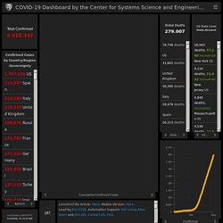
The table below shows cases of coronavirus (officially known as SARS-CoV-2, COVID-19, or 2019-nCoV) around the world.
Each figure is verified by our team through local health departments or local media. A distribution map and a timeline with a list of recent updates can be found below the table. State-by-state breakdownsUnited States | Canada | Australia | China Other links Global map of cases | News updates Visualizations: World | United States We need your help: Join us on Patreon or support us with a one-time donation on PayPal. Green = no active cases Follow us / Tips Notes Diamond Princess: Cases are not included in the Japanese government’s official count. 380 of the 712 were asymptomatic. 14 are U.S. citizens whose test results weren’t known until they left the ship.
Note: Due to the high number of new cases, it may take several days before new locations appear on the map. Timeline for major updates (GMT) The timeline below shows updates with at least 100 new cases or 10 new deaths. All State Comparison of Testing Efforts - Johns Hopkins Coronavirus Resource Center. Math and Data of SARS-COV-2.
Epidemiological models. CSSEGISandData/COVID-19: Novel Coronavirus (COVID-19) Cases, provided by JHU CSSE. COVID-19 Scenarios. Provisional Death Counts for Coronavirus Disease (COVID-19) Provisional death counts deliver the most complete and accurate picture of lives lost to COVID-19.
They are based on death certificates, which are the most reliable source of data and contain information not available anywhere else, including comorbid conditions, race and ethnicity, and place of death. How it Works The National Center for Health Statistics (NCHS) uses incoming data from death certificates to produce provisional COVID-19 death counts. These include deaths occurring within the 50 states and the District of Columbia. NCHS also provides summaries that examine deaths in specific categories and in greater geographic detail, such as deaths by county and by race and Hispanic origin. COVID-19 deaths are identified using a new ICD–10 code. Why These Numbers are Different Provisional death counts may not match counts from other sources, such as media reports or numbers from county health departments.
Death certificates take time to be completed. Technical Notes: Provisional Death Counts for Coronavirus Disease (COVID-19) The provisional counts for coronavirus disease (COVID-19) deaths are based on a current flow of mortality data in the National Vital Statistics System.
National provisional counts include deaths occurring within the 50 states and the District of Columbia that have been received and coded as of the date specified. It is important to note that it can take several weeks for death records to be submitted to National Center for Health Statistics (NCHS), processed, coded, and tabulated. Therefore, the data shown on this page may be incomplete, and will likely not include all deaths that occurred during a given time period, especially for the more recent time periods. Death counts for earlier weeks are continually revised and may increase or decrease as new and updated death certificate data are received from the states by NCHS.
COVID-19 death counts shown here may differ from other published sources, as data currently are lagged by an average of 1–2 weeks. Nature and sources of data Table 1. Excess Deaths Associated with COVID-19. Estimates of excess deaths can provide information about the burden of mortality potentially related to the COVID-19 pandemic, including deaths that are directly or indirectly attributed to COVID-19.
Excess deaths are typically defined as the difference between the observed numbers of deaths in specific time periods and expected numbers of deaths in the same time periods. This visualization provides weekly estimates of excess deaths by the jurisdiction in which the death occurred. Weekly counts of deaths are compared with historical trends to determine whether the number of deaths is significantly higher than expected. Our World in Data. DATA VISUALIZATION. Epidēmia. HÆLTH.IT. Back.Track. COVID-19. SARS-CoV-2. SARS-CoV-2 Vaccine. COVID-19 Crux. COVID-19 Clues. PLATEA. Zoonology. PANDEMOCRACY.