
Movement data exploration and analysis. MovingPandas is a Python library for handling movement data based on Pandas and GeoPandas.
It provides trajectory data structures and functions for analysis and visualization. The MovingPandas repository is hosted on Github. For more information on individual releases, check out the Changelog. The official documentation is hosted on ReadTheDocs. Cadastre.data.gouv.fr. LeoLabs : suivre les satellites en dataviz!
Données cadastrales ouvertes. Welcome - Humanitarian Data Exchange. Préparation de données (spatiales) avec R. Arabesque. Visualisation de données dans R avec ggplot2 et autres packages. Nextstrain. Groupe fmr – (flux, matrices, réseaux) Learn D3: Introduction / D3. Géodes - Santé publique France. Tableau de bord COVID-19 Suivi de l’épidémie de COVID-19 en France. 40 Years of Nautical Piracy – Adventures In Mapping. CartographieNumerique/DataPNUD2018. Our World in Data. Collection of data visualizations to get inspired and finding the right type. Disarm-platform/MapPalettes: A set of palettes for maps.
- Statistiques locales. Arpenteur BnF. Explore — SNCF Open Data. Une version python pour l’outil de synthèse colorée. Dans le but de pouvoir analyser des images de grande taille plus rapidement, un re-développement de l’outil sous Python a été réalisé.
Le code source est disponible librement sur ce dépôt Github : Description du fonctionnement Ce projet utilise la bibliothèque Flask, qui permet de créer des applications web multi-threads, c’est à dire avec plusieurs traitements possibles en parallèle. See How the World’s Most Polluted Air Compares With Your City’s. The floating particles on this page depict microscopic particulate pollution called PM2.5.
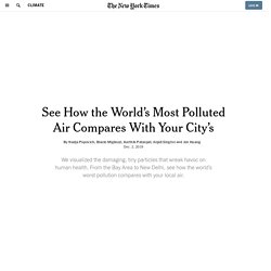
The number of particles you see here represents the upper limit for “good” air quality, as defined by the United States Environmental Protection Agency: 12 micrograms per cubic meter over 24 hours. We made our best guess for your location, or you can pick another.This is pollution in New York City on the worst air quality day this year. Particulate concentrations reached 41 µg/m3 during the highest hour, a level that would be considered “unhealthy for sensitive groups.” Compare that to the air in California last year, when a thick blanket of smoke from the Camp Fire descended across the Bay Area. Particulate pollution hit nearly 200 µg/m3, well within the “very unhealthy” range when people are advised to limit outdoor activity.
Martin Grandjean » Digital humanities, Data visualization, Network analysis » Mapping a Century of International Congresses. International congresses, meetings of diplomats and experts, have been almost exclusively European events for more than a century.
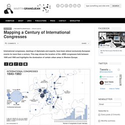
This map shows the location of the +8000 congresses held between 1840 and 1960 and highlights the domination of certain urban areas in Western Europe. A map of the distribution of international congresses with a focus on Europe (between 1840 and 1960, 6 congresses out of 7 took place in Europe). Scale: Paris=1092; London=546; Berlin=188. - Flow map visualization tool. Catalogue GeoBretagne - GeoBretagne. Data Agglo Le Havre. Home - MapX. Get creative with globe visualizations. ArcGIS API for JavaScript turned one release older this month.
In this release we have some features in 3D that I’m really excited about because they help create appealing cartographic globe visualizations, like these ones: You know how cartographers like to abstract away the reality? These features bring us one step closer to that goal. First of all, we can replace the realistic sky with a custom background color that best fits the data visualization in the web scene. We can also make the view background completely transparent so that you can integrate your scene within your website. Poppy Field - Visualising War Fatalities. Free GIS Datasets - Categorised List. Strava et les enjeux du Big data. Tableaux de l'Économie Française - Tableaux de l'Économie Française.
What's New in Revision 10? » Gridded Population of the World (GPW), v4. What's New in Revision 10?
In July 2016, SEDAC released the Gridded Population of the World, version 4 (GPWv4) data collection which included seven raster data sets available at 30-arcsecond resolution in GeoTiff format, and one vector data set of administrative unit center points. For this latest release, the eight 4.0 data sets originally released with version 4 have been updated, and a ninth data set, on basic demographic characteristics (age and sex), has been added. The nine data sets, collectively referred to as the Revision 10 (or v4.10) data sets, incorporate boundary or population updates for 65 countries, additional attributes in the centroids and national identifier data sets, an updated water mask which includes more recent glacier data and local water data sources for high latitude countries, and additional format and resolution options.
Extensive Data Shows Punishing Reach of Racism for Black Boys. Black boys raised in America, even in the wealthiest families and living in some of the most well-to-do neighborhoods, still earn less in adulthood than white boys with similar backgrounds, according to a sweeping new study that traced the lives of millions of children. White boys who grow up rich are likely to remain that way. Black boys raised at the top, however, are more likely to become poor than to stay wealthy in their own adult households. Most white boys raised in wealthy families will stay rich or upper middle class as adults, but black boys raised in similarly rich households will not. Open Data Inception - A Comprehensive List of 2600+ #OpenData Portals in the World. Multivariate Map Collection - Jim Vallandingham. Winners of the 2017 Information is Beautiful Awards.
From nuclear warnings to whether your favourite band will ‘make it big’.

Prizes amounting to £20,000 were awarded to winners and runners-up across eight categories, from Current Affairs and Politics, to Arts, Entertainment and Pop Culture Held annually since 2012, the Information is Beautiful Awards are a collaboration between the Kantar data consultancy group and David McCandless, a data journalist and author of similarly-titled, best-selling book, Information is Beautiful. According to the organisers, the awards ‘celebrate global excellence in data visualisation, infographics and information design’. Chopina04 (Cyrille Chopin) / Repositories. Three Interactive Maps. If you’ve ever spoken to onto the DL team about a project there’s a fair chance we’ve tried to get a map into it somewhere.
We like maps. We like the way they can provide scale, context, and navigation in one view. Those are hard things to design for interactive interfaces. Below are three maps that we’ve built over the past year. They’re very different in design and application. Acled Data. Introducing Tableau Public 10.5. Geo.data.gouv.fr. W. E. B. Du Bois's Modernist Data Visualizations of Black Life.
Shanghai Metro Flow. Collection of data visualizations to get inspired and finding the right type. Max Galka. Cartostats - Sciencesconf.org. Nouvelles compositions graphiques.
Visualizing the Great Migration - The Most Under-Reported Story of the 20th Century. Clara Dealberto. La #mondialisation en #terminale, une sélection de #cartographies dynamiques #éducation #géographie #cartolycée. The Globe of Bird Migration. Have you ever seen... a chocolate infographic ? Real life #dataviz by @BIGinfographie for @libe #photoViz #chocoViz. La #cartothèque de #geomartinique.
GEOBS : Observer, Visualiser, Analyser l'Information Géographique Numérique. Resources. Spyglass on the Past: New York City 1836 and Today. After the Map. Home - Eurostat. The globe of economic complexity. About close x The Globe of Economic Complexity The globe of economic complexity dynamically maps out the entire world production of goods to create an economic landscape of countries around the globe.

The original Atlas of Economic Complexity The Globe is built upon The Atlas of Economic Complexity, a powerful interactive tool that enables users to visualize a country’s total trade, track how these dynamics change over time and explore growth opportunities for more than a hundred countries worldwide. The Center for international development Associated Paper This project will be featured at the 2015 IEEE VIS conference in Chicago. GeoMedia EventXplorer. Unfiltered.news. ACS Commute Map. Presenting gvSIG Online: the solution for Spatial Data Infrastructures on Open Source software.
During the last International gvSIG Conference a new product added to the gvSIG Association catalogue was presented for the first time. We think it will be well received because it meets an every time more and more need to have a solution for implementing Spatial Data Infrastructures, using open source software and reducing implementation costs of the current market alternatives. gvSIG Online is result of the experience accumulated by the gvSIG Association at the Spatial Data Infrastructure projects implementation of all types and in any sector, from petrol companies to local administrations.
But, what is gvSIG Online? We can define the product in a few lines… The Antiquities Coalition Site - Culture Under Threat Map. LAYER: Areas Under Threat or Control of Terror Groups What it Displays: A heat map of areas that are under the direct control of terrorist groups or threatened by areas they have occupied between January and October 2015. Information from no earlier than 2015 was included due to the continually shifting nature of the MENA conflicts. The terrorist groups included in this map were based on terror groups as defined by the National Counterterrorism Center. The “Rules” of Data Visualization Get an Update.
Geoff McGhee is a journalist and data visualizer at Stanford University’s Bill Lane Center for the American West. Data Points is a new series where we explore the world of data visualization, information graphics, and cartography. In the past decade, computer-aided data visualization has migrated from the halls of science and academia into journalism, marketing, political discourse, and many other parts of everyday life. A lively conversation has developed online about data visualization, with blogs and social media accounts devoted to critiquing them. But what are the rules of a complex practice that draws on research into cognitive theory, graphical perception, statistics and journalism? With his 2012 book The Functional Art, the journalist and educator Alberto Cairo helped tie together many strands into a compelling and easy-to-follow guide to data visualization and information graphics. Alberto Cairo: Today you have confluence of factors.
Créer une carte collaborative avec le lo... Death map nyc. Histography. Une infographie interactive de l'histoire de l'humanité. Histography est un projet fou et démesuré qui présente à travers une frise chronologique interactive l’histoire de l’humanité du Big Bang jusqu’en 2015. Rien que ça. ArcGIS Web Application. Forbes Welcome. Data visualization: Science on the map. Illustration by the Project Twins When linguist Lauren Gawne roams the valleys of Nepal documenting endangered Tibetan languages, she takes pains to distinguish each dialect's geographical origin. Unlock Earth's Secrets. World Development Indicators - Google Public Data Explorer.
Transforming Data into Visualization. Data visualization explains a story to the user; a story that if told well should help the viewer discern information and relationships between the data. Data visualization, for a designer, is the process of taking a complex structure and breaking it down in a way that the reader can easily comprehend. It is a powerful tool used to translate complex data into accessible insights. In this article, I’ll explain the four critical steps we took to create a visualization graph for the World Economic Forum (WEF). Le portail cartographique de données. The 37 best tools for data visualization. The Data Visualisation Catalogue. Occupation du sol en France métropolitaine. 8 tools for visualizing data with open source. Data visualization is the mechanism of taking tabular or spatial data and conveying it in a human-friendly and visual way.
There are several open source tools that can help you create useful, informative graphs. In this post we will take a look at eight open source, data visualization tools. Datawrapper Datawrapper was created by journalism organizations from Europe, designed to make data visualization easy for news institutes. Based on a web based GUI (graphics user interface), it promises to let you create a graph in just four steps. To create a graph, click on the "New Chart" link on the top menu bar. Image provided by Nitish Tiwari. Chart JS Chart JS is a clean charting library. Charted Created by the product science team at Medium, this is one of most minimal charting tools available online. Image provided by Nitish Tiwari. Imagination at work. SmartGov - Africa. Infraestructura de Datos Espaciales. Wo Europas Bevölkerung wächst – und wo sie schrumpft. Wo wächst und schrumpft Europa wirklich? Population Lines Print. Bloomberg Billionaires.
Open Data Zürich - Stadt Zürich. Map of scientific collaboration (Redux!) Inventaire du patrimoine naturel national. Free mapping data will elevate flood risk knowledge. Reviving the Statistical Atlas of the United States with New Data. The National Map: Viewer and Download Platform. BETA PORTAL ICGC - Innovació i prototipatge de productes i serveis en l'àmbit de la geoinformació.
Opendata Indre-et-Loire. OpenData Saône-et-Loire. OpenData Aquitaine. OpenData Montpellier. OpenData Toulouse. OpenData Bordeaux.