

Timeline Maps Mapping time has long been an interest of cartographers. Visualizing historical events in a timeline or chart or diagram is an effective way to show the rise and fall of empires and states, religious history, and important human and natural occurrences. We have over 100 examples in the Rumsey Map Collection, ranging in date from 1770 to 1967. We highlight a few below. Sebastian Adams' 1881 Synchronological Chart of Universal History is 23 feet long and shows 5,885 years of history, from 4004 B.C. to 1881 A.D. It is the longest timeline we have seen.
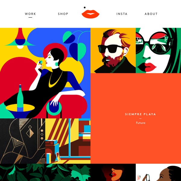
Your Face Here Airbnb’s Design Language System (DLS) contributes to an accessible, inclusive design practice for our user experience—from typefaces and color to illustration and motion design. Click here to learn more. Words can set the tone for a company, but it’s the pictures that give it a face. Illustration has yet to find its place in the tech world, because it’s often unconsidered and thrown in on the fly. Whether being used to distill complex messages or add a touch of whimsy, illustration is one piece that makes up a company’s visual brand identity. With nearly a decade-long career as an illustrator in Silicon Valley, I’m just now seeing illustration pique interest in the tech industry.
harding meyer News Text Galleries Photography 32 brilliant design portfolios to inspire you: Page 2 16. Sagmeister & Walsh Sure, it’s a little sketchy to have a live cam of your office feeding into your portfolio website homepage. creativebloq Paris may be the epicentre of global fashion, having played host to the likes of Coco Chanel, Jean-Paul Gaultier, Yves Saint Laurent and Christian Louboutin - but it's also home to its fair share of world-class graphic design and illustration. From iconic, long-established boutique studios such as M/M Paris, est. 1992, to young, exciting, multidisciplinary individuals like Leslie David, est. 2009, the Parisian design scene is definitely burning bright. We've done the top agencies of New York and new talent from London recently, so read on to discover five more exciting stars of design based in the French capital... 01.
Top Ten Typefaces Used by Book Design Winners The American Association of University Presses (AAUP) holds an annual Book, Jacket & Journal Show which catalogs the best in book design and exhibits it around the country. The jurors for this year’s show include some important names in typography, including William Drentel and Jessica Helfand of Design Observer, and typographer and type designer Kent Lew, who created the Font Bureau’s lovely and literary text face, Whitman. Jessica Helfand, William Drentel, Susan Colberg, and Kent Lew examine AAUP Show entries. The catalog of the show is a beautiful record of the selected entries, and, because typeface credits are included, it’s also a good gauge of current trends in typeface selection for books and journals.
Brightening up a Financial Brand – Putnam Studio Bringing empathy, humanity, and joy through Illustration A few years ago, the fine folks at Credit Karma decided it was time to launch an internal branding project as their current brand needed a refresh and realignment. They decided to kick off a comprehensive project and revisit all of their brand assets: logo, colors, and website to name a few. During this process they decided to move forward with a unique and own-able illustration style. With a subject as sensitive as personal finance, Credit Karma knew that a strong illustration style and strategy would give their users a sense of empowerment and optimism as they plan for the future.
Harry Clarke’s Looking Glass With their intricate line and often ghoulish tone, the works of Irish artist Harry Clarke are amongst the most striking in the history of illustration and stained glass design. Kelly Sullivan explores how, unknown to many at the time, Clarke took to including his own face in many of his pictures. The Irish stained glass artist and illustrator Harry Clarke was prolific, producing, in his short life, over a hundred stained glass windows. An Alphabet of Organic Type (ca.1650) In this section of the site we bring you curated collections of images, books, audio and film, shining a light on curiosities and wonders from a wide range of online archives. With a leaning toward the surprising, the strange, and the beautiful, we hope to provide an ever-growing cabinet of curiosities for the digital age, a kind of hyperlinked Wunderkammer – an archive of materials which truly celebrates the breadth and variety of our shared cultural commons and the minds that have made it. Some of our most popular posts include visions of the future from late 19th century France, a dictionary of Victorian slang and a film showing the very talented “hand-farting” farmer of Michigan. With each post including links back to the original source we encourage you to explore these wonderful online sources for yourself. Check out our Sources page to see where we find the content.
Tokyo 2020 unveils first ever animated pictograms used in Olympics’ history The Tokyo 2020 Organising Committee of the Paralympic and Olympic Games has unveiled the first animated pictograms to be used in the history of the event. The expansive bank of 73 pictograms created by Japanese designer Masaaki Hiromura have been animated by Japanese motion designer Kota Iguchi to show each sport in full action mode, appearing from a white background as fragments, showing a small sequence of that sport in motion, freezing for a moment, then disappearing back to a blank frame. It’s another first for the Japanese city’s Olympic heritage, as static pictograms were first introduced at the Tokyo 1964 Olympic Games.