
Our World in Data. Luis Carli. Le Tableau de Bord de la RATP. Intl Statistical Literacy Project. The International Statistical Literacy Project (ISLP) is a project initiated by the International Association for Statistical Education➶ (IASE), which is the education section of the International Statistical Institute➶ (ISI).
The main objective of the ISLP is to contribute to promoting statistical literacy across the world, among young and adults, in all walks of life. To this end, we provide an online repository of international resources and news in Statistical Literacy, international activities to promote the resources and the individuals and institutions behind them, and outreach activities to increase awareness. Contact the IASE Executive➶ or the ISLP Director Reija Helenius➶ by e-mail if you have any questions. New Country Coordinator in Finland - Welcome to the ISLP team Jaana Kesti! Statistical Graphics vs. InfoVis. The current issue of the Statistical Computing and Graphics Newsletter features two invited articles, which both look at the “graphical display of quantitative data” – one from the perspective of statistical graphics, and one from the perspective of information visualization.
Robert Kosara writes from an InfoVis view: Visualization: It’s More than Pictures! Information visualization is a field that has had trouble defining its boundaries, and that consequently is often misunderstood. It doesn’t help that InfoVis, as it is also known, produces pretty pictures that people like to look at and link to or send around. But InfoVis is more than pretty pictures, and it is more than statistical graphics. The key to understanding InfoVis is to ignore the images for a moment and focus on the part that is often lost: interaction. . … read on in the Newsletter. Histomap « Blog about Stats. Data for infographics are particularly numerous and varied.
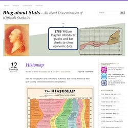
Historical data give us very looooooooooooooong infographics. Taken from the book by Anthony Grafton and Daniel Rosenberg –> Amazon link Some examples are presented by The Morning News. Like this: Like Loading... Weave (Web-based Analysis and Visualization Environment) Weave - Home - UMass Lowell IVPR Issue Tracker. Eurostat - Tables, Graphs and Maps Interface (TGM) map. Many Eyes. Statistical Visualization. For his book The Visual Miscellaneum, David McCandless, along with Lee Byron, had a look at breakups on Facebook, according to status updates.
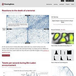
They looked for the phrase "we broke up because" in status updates, and then graphed the frequencies over time. Why they couldn't just look at updates to relationship status, I'm not sure. Notice the peak leading up to the holiday season and spring cleaning. Then there's the people who think it's a funny April Fool's joke to say the broke up with their significant other. Finally, there's the highlight of Mondays, which you might lead you to believe that people like to call it quits during the beginning of the week. eXplorerDemo. TrendCompass. Internet Glossary of Statistical Terms by Dr. Howard S. Hoffman. (french) Boîte à moustaches. Un article de Wikipédia, l'encyclopédie libre. Dans les représentations graphiques de données statistiques, la boîte à moustaches (aussi appelée diagramme en boîte, boîte de Tukey ou box plot) est un moyen rapide de figurer le profil essentiel d'une série statistique quantitative.
Elle a été inventée en 1977 par John Tukey, mais peut faire l'objet de certains aménagements selon les utilisateurs. Son nom est la traduction de Box and Whiskers Plot. Principe[modifier | modifier le code] Il s'agit de tracer un rectangle allant du premier quartile au troisième quartile et coupé par la médiane. ), voire aux 5e et 95e centiles. Comparaison de deux diagrammes en boîte à moustaches avec- pour la boîte inférieure : Q1 = 3, M = 7, Q3=12, - pour la boîte supérieure : Q1 = 7, M = 9, Q3=12, Historique[modifier | modifier le code] Dans les diagrammes en boîte de Tukey, la longueur des « moustaches » vaut 1,5 fois l’écart interquartile. On les y désigne aussi sous les vocables de boîtes à pattes ou Box Plot. Newsletter. ASA Statistics Computing and Graphics.
Home The Computing and Graphics Newsletter is distributed to members of the Statistical Computing and Statistical Graphics Sections of the ASA.

Their annual dues assist section activities. If you are an ASA member, but do not belong to either of these Sections, please consider joining. If you are not an ASA member, but find the articles in the Newsletter interesting, you might want to give our organization a look. Editorial Staff The Newsletter is produced by two volunteer editors, one from each of the Computing and Graphics Sections, with articles from both ASA members and non-members. Online Issues.