
Lexipedia - Where words have meaning. Online Visual Thesaurus. Visual thesaurus for Design. (noun) designing the act of working out the form of something (as by making a sketch or outline or plan) he contributed to the design of a new instrument (noun) figure, pattern.
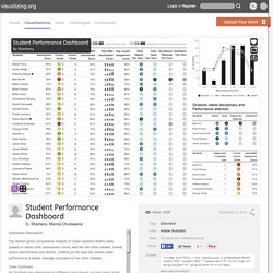
Andrew cooke: military spending. Please download these two images. they were made using freely available data and tools - i've included a description of the technique, scripts and data files that you can use as the basis for further work. note - someone drew my attention to the fact that russia does not appear on this map!
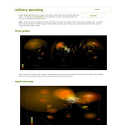
This is unintentional - i assume there was a parsing error that stopped it being listed. at some point i will go back and check/regenerate the map (or maybe someone else could?!). Three views of the earth. each country is represented by a circle that shows the amount of money spent on the military (size of circle) and what fraction of the country's earnings that uses (colour). the same data as above, presented as ellipses on a cylindrical projection. the countries are not named, and the scaling is slightly different, but once you see africa (central collection of small dots) the layout is clear. the usa dominates the upper/left third of the map. what are the pictures? The Best Tools for Visualization. Visualization is a technique to graphically represent sets of data.
When data is large or abstract, visualization can help make the data easier to read or understand. There are visualization tools for search, music, networks, online communities, and almost anything else you can think of. Whether you want a desktop application or a web-based tool, there are many specific tools are available on the web that let you visualize all kinds of data. Here are some of the best: ORA. More Business Insights with Better Excel Charts and Dashboards. Make your own little planet.
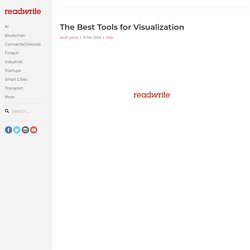
NodeXL: Network Overview, Discovery and Exploration for Excel - Home. iPlots - High interaction graphics for R. Kumu. Visualization Tools. Links and reference. Mapping applications. Commercial tools. Mkweb.bcgsc.ca/schemaball/?home. Schemaball is a flexible schema visualizer for SQL databases.
The purpose of Schemaball is to help visualize the relationships between tables. Tables are related by foreign keys, which are fields which store the value of a record field from another table. Foreign keys create a lookup relationship between two tables. Large schemas can have hundreds of tables and table relationships. Keeping track of them call can be tedious, error-prone and slow down the schema development process. The Evolution of the Web.
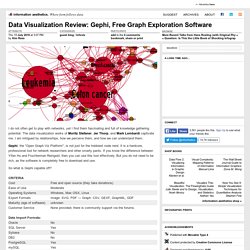
Knowledge Cartography. Student Performance Dashboard. Dashboard Description: Top section gives comparative analysis of Class teachers Maths class (based on latest math assessment score) with the her other classes, overall school performance and district.
Looking at the data her current class performance is below Average compared to her other classes. Class Summary: All Students are categorised in different colors based on their latest math assessment score. Green is for top performers, Red is for poor scorers, so that class teacher can quickly analyse which student requires more attention. Up and down arrows ( next to Current Course grade) shows students’ performance has gone up or down against the grade goal.
Similar to performance, I have categories behavioural data in different shades of blue. Top Right section gives comparative analysis of detailed student performance with other classes, school and district level students. Right bottom gives overall details of students which requires special disciplinary and performance attention. Bl.ocks.org - mbostock. Hive Plots - Linear Layout for Network Visualization - Visually Interpreting Network Structure and Content Made Possible. July « 2008 « scienceoss.com. Gephi, an open source graph visualization and manipulation software. Data Visualization Review: Gephi, Free Graph Exploration Software. I do not often get to play with networks, yet I find them fascinating and full of knowledge gathering potential.
The data visualization works of Moritz Stefaner, Jer Thorp, and Mark Lombardi captivate me. I am intrigued by relationships, how we perceive them, and how we can understand them. Gephi, the "Open Graph Viz Platform", is not just for the hobbiest node nerd. It is a hardcore, professional tool for network researchers and other smarty pants. If you know the difference between Yifan Hu and Fruchterman Reingold, then you can use this tool effectively.
Blog. Announcement Community ~ gsoc It’s a great news, Gephi has been accepted again for the Google Summer of Code for the 5th year!
The program is the best way for students around the world to start contributing to an open-source project. Home Page. Graphviz - Graph Visualization Software. JpGraph - Most powerful PHP-driven charts. StatCrunch - Data analysis on the Web. Many Eyes.
Flow Map Layout. Mondrian - Interactive Statistical Data Visualization in JAVA. GGobi data visualization system. InfoVis CyberInfrastructure- Software. Gapminder: Unveiling the beauty of statistics for a fact based world view. Desktop. This software has been renamed to Gapminder World Offline Because of technical problems the software on this page is no longer being maintained!

Please visit Gapminder World Offline (Beta) instead. Gapminder Desktop With Gapminder Desktop you can show animated statistics from your own laptop! Install the free software and watch the how-to video with Hans Rosling. Peltier Tech Blog. Constable Henry: Just a moment, sir.
I know everyone in this neighborhood, but I’ve never seen your face before. Can you account for yourself? Freddy: Yes, I am Dr. Frederick Fronkonsteen, newly arrived from America. by The FrankensTeam This guest post is from the E90E50 FrankensTeam, i.e., Roberto Mensa, Kris Szabó, and Gábor Madács. While I was reading Jon’s work using VBA Approaches to Plotting Gaps in Excel Charts I started to think, because I felt there had to be another solution which was waiting to be discovered… Jon provided two different VBA routines as a solution for the problem: one changes the chart series formatting, the other changes the underlying data.
Some time ago I realized that it is possible to use union of ranges in chart series. Now, a few months later, thinking about the gap problem… Eureka! The union of separate ranges could be a solution, especially if we can build it up using the UDF within a named formula! Case study: A brief review of online visualisation tools that can help. There is a growing range of online tools to help users their data.
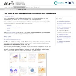
This brief review highlights four online visualisation tools that can help. The links page also links to lots more useful resources. Online tools that can help visualise data (these tools are free to use, but any data uploaded is typically then available on the system for other users) highlighted below include: On the resources and links page, we also link to free software applications and libraries for visualising data, and development languages for more sophisticated data visualisation. Many Eyes. Links and reference. SWF Charts > Introduction. XML/SWF Charts is a simple, yet powerful tool to create attractive charts and graphs from XML data. Create an XML source to describe a chart, then pass it to this tool's flash file to generate the chart.
The XML source can be prepared manually, or generated dynamically using any scripting language (PHP, ASP, CFML, Perl, etc.) XML/SWF Charts makes the best of both the XML and SWF worlds. XML provides flexible data generation, and Flash provides the best graphic quality. Gallery. "Spike" map Interactive United States population density map. Average rating: 7.5 (23 votes) 2D histogram An extension of the concept of histogram to display the colour image content. 38 Tools For Beautiful Data Visualisations.
As we enter the Big Data era, it becomes more important to properly expand our capacity to process information for analysis and communication purposes. In a business context, this is evident as good visualisation techniques can support statistical treatment of data, or even become an analysis technique. But also, can be used as a communication tool to report insights that inform decisions. Grapher 10. IVL - software. Juice Labs - Chart Chooser. Convenient Tools for Daily Research. SOCR: Statistics Online Computational Resource. Venn Templates and Venn Diagram Software - Free and no download required with Gliffy Online.
A Venn diagram is a simple way to represent the relationships between groups of things with a clear, visual display. Let your ideas overlap In a Venn diagram, large circles represent groups of things with a shared attribute. Areas where these circles overlap represent individuals that belong equally to both groups. For example, a Venn diagram with one circle representing things made with yeast and another representing alcoholic beverages would have an overlapping zone where you could find both beer and wine. Circles in a Venn diagram can overlap partially, overlap completely, or even be totally separate — letting the viewer see the relationship between the groups at a glance.
Introduction to Circos, Features and Uses // CIRCOS Circular Genome Data Visualization. Python plotting. Gephi, an open source graph visualization and manipulation software. Poster_raster.png (PNG Image, 2268 × 3289 pixels) ParaView - Open Source Scientific Visualization. Protovis. Protovis composes custom views of data with simple marks such as bars and dots. Unlike low-level graphics libraries that quickly become tedious for visualization, Protovis defines marks through dynamic properties that encode data, allowing inheritance, scales and layouts to simplify construction.
Protovis is free and open-source, provided under the BSD License. It uses JavaScript and SVG for web-native visualizations; no plugin required (though you will need a modern web browser)! Although programming experience is helpful, Protovis is mostly declarative and designed to be learned by example. Protovis is no longer under active development.The final release of Protovis was v3.3.1 (4.7 MB).
This project was led by Mike Bostock and Jeff Heer of the Stanford Visualization Group, with significant help from Vadim Ogievetsky. Updates. » Beyond Tag Clouds: TagArcs for Wordpress Tag Visualization (part I) Cytoscape: An Open Source Platform for Complex Network Analysis and Visualization. Tableau Software. Space-Time Research. VIDI.
D3.js - Data-Driven Documents. DataTables (table plug-in for jQuery) Js.
Immersion: a people-centric view of your email life. ImagePlot visualization software: explore patterns in large image collections. What is ImagePlot? ImagePlot is a free software tool that visualizes collections of images and video of any size. It is implemented as a macro which works with the open source image processing program ImageJ. Onyxfish/csvkit. Data visualisation and Infographics tools. Circos. Web-based visualisation tools. Processing. Software Tool Lists. PANDA: A Newsroom Data Appliance 1.1.2 — panda 1.1.2 documentation.