

Powering Your Interaction – Approaching Significance. With all the manuscripts I see, as editor-in-chief of Journal of Experimental Social Psychology, it’s clear that authors are following a wide variety of standards for statistical power analysis.
In particular, the standards for power analysis of interaction effects are not clear. Most authors simply open up GPower software and plug in the numerator degrees of freedom of the interaction effect, which gives a very generous estimate. I often hear that power analysis is impossible to carry out for a novel effect, because you don’t know the effect size ahead of time. But for novel effects that are built upon existing ones, a little reasoning can let you guess the likely size of the new one. That’s the good news. Heather’s Trilemma Meet our example social psychologist, Heather. The result actually shows a slightly larger effect size, d = .63.
An Adventure in Statistics: adventr for R and RStudio. R is a free software environment for statistical analysis and graphics.
R in its native form comes with a reasonable amount of functionality. However, the beauty of R is that it can be expanded by downloading packages that add specific functionality to the program. Being open source, anyone can write a package - even I can. Calling Bullshit — Syllabus. Logistics Course: INFO 198 / BIOL 106B.
University of Washington To be offered: Autumn Quarter 2017 Credit: 3 credits, graded Enrollment: 180 students Instructors: Carl T. Bergstrom and Jevin West Synopsis: Our world is saturated with bullshit. Learn to detect and defuse it. JASP vs. SPSS - JASP - Free Statistical Software. The first version of SPSS was published 59 years ago.

The first version of JASP was published three years ago. How does an expensive IBM-developed program compare to the free and open source program which was until recently just developed by a handful of scientists? My approach for this review is as a university lecturer in psychology. 15 Most Common Types of Data Visualisation. 15 Chart Types, Visualisations and How To Use Them With the growing amount and accessibility of data, data visualisation is becoming increasingly important.
Not only does visualised data represent large quantities of data coherently, it doesn’t distort what the data has to say and helps the user discern relationships in the data. According to the writers of A Tour Through the Visualization Zoo, “The goal of visualization is to aid our understanding of data by leveraging the human visual system's highly-tuned ability to see patterns, spot trends, and identify outliers.”
In general, there are two basic types of data visualisation: exploration, which helps find a story the data is telling you, and explanation, which tells a story to an audience. New Tools for Designing Powerful Studies. Why do studies fail to replicate?

There are several possible explanations but a notable one is that many studies are underpowered – that is, they have sample sizes that are simply too small given the size of the effect under investigation. In an article in Psychological Science, researchers from the University of Notre Dame explain why many studies end up inadequately powered and offer open-source tools that can help researchers proactively avoid the problem. Statistical power, as psychological scientists Samantha F. Anderson, Ken Kelley, and Scott E. Maxwell describe in their article, is the “probability of rejecting the null hypothesis of no effect when the true effect is nonnull in the population.”
Pericchi , Pereira : Adaptative significance levels using optimal decision rules: Balancing by weighting the error probabilities. Our purpose is to recommend a change in the paradigm of testing by generalizing a very natural idea, originated perhaps in Jeffreys [Proceedings of the Cambridge Philosophy Society 31 (1935) 203–222; The Theory of Probability (1961) Oxford Univ.
Press] and clearly exposed by DeGroot [Probability and Statistics (1975) Addison-Wesley], with the aim of developing an approach that is attractive to all schools of statistics, resulting in a procedure better suited to the needs of science. The essential idea is to base testing statistical hypotheses on minimizing a weighted sum of type I and type II error probabilities instead of the prevailing paradigm, which is fixing type I error probability and minimizing type II error probability.
For simple vs simple hypotheses, the optimal criterion is to reject the null using the likelihood ratio as the evidence (ordering) statistic, with a fixed threshold value instead of a fixed tail probability. One set of data, many stories – Zan. In March 2017, Brookings Institute put out a paper by Case & Deaton on Mortality and Morbidity in the 21st Century.
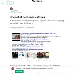
This report got picked up in the news. Valencia 9 - "Voulez-Vous Do Bayes avec Moi?" What is the Relationship Between the Reproducibility of Experimental Results and P Values? - Statistics By Jim. The ability to reproduce experimental results should be related to P values.
After all, both of these statistical concepts have similar foundations. P values help you separate the signal of population level effects from the noise in sample data.Reproducible results support the notion that the findings can be generalized to the population rather than applying only to a specific sample. So, P values are related to reproducibility in theory. Untitled. Science Isn’t Broken. If you follow the headlines, your confidence in science may have taken a hit lately.

Peer review? More like self-review. The Datasaurus Dozen - Same Stats, Different Graphs: Generating Datasets with Varied Appearance and Identical Statistics through Simulated Annealing. ...make both calculations and graphs. Both sorts of output should be studied; each will contribute to understanding. F. J. GitHub - oscci/deevybee_repo. Introducing jamovi: Free and Open Statistical Software Combining Ease of Use with the Power of R – JEPS Bulletin.
For too long, Psychology has had to put up with costly, bulky, and inflexible statistics software. Today, we’d like to introduce you to a breath of fresh air: jamovi, free statistics software available for all platforms that is intuitive and user-friendly, and developed with so much pace that its capabilities will potentially soon outrun SPSS. As can be seen above, jamovi has a beautiful user interface with some very handy features: It does real-time computation and presents and updates results immediately with beautiful figures and neat APA tables. These results can then be copy-pasted into your editing software such as Word. Basic analyses (e.g., t-tests, ANOVAs, correlations, contingency tables, proportion tests) are already available and more will be arriving shortly. Still Not Significant (with images, tweets) · anniebruton.
Research » Blog Archive. Psychologically Flawed. What to do if your p-value is just over the arbitrary threshold for ‘significance’ of p=0.05? You don’t need to play the significance testing game – there are better methods, like quoting the effect size with a confidence interval – but if you do, the rules are simple: the result is either significant or it is not. So if your p-value remains stubbornly higher than 0.05, you should call it ‘non-significant’ and write it up as such.
The problem for many authors is that this just isn’t the answer they were looking for: publishing so-called ‘negative results’ is harder than ‘positive results’. Saturday Morning Breakfast Cereal. Tax credit claimants, nationalities and 'non-UK families' – the data. More than 7% of all couples in the UK comprise one UK national and one non-UK national, according to analysis compiled by the Office for National Statistics (ONS) for the Guardian.
But when any such couples claim tax credits, they could be considered migrant families by the British government. HMRC, which collects and supplies the government with data on tax credits, defines non-UK families as ones “where at least one adult is a migrant in the family”. There are more than 1.1 million couples in the UK where one partner is a British national and the other a foreign national. ‘Nobody’s ever asked this before’ and other research question misconceptions. [41] Falsely Reassuring: Analyses of ALL p-values. [39] Power Naps: When do within-subject comparisons help vs hurt (yes, hurt) power? A recent Science-paper (.pdf) used a total sample size of N=40 to arrive at the conclusion that implicit racial and gender stereotypes can be reduced while napping. Top 10 ways to save science from its statistical self. Daniel Lakens: Which statistics should you report?
Is this the worst government statistic ever created? I forgot to post this column up last year. It’s a fun one: the Department for Communities and Local Government have produced a truly farcical piece of evidence, and promoted it very hard, claiming it as good stats. How can you tell if scientific evidence is strong or weak? - 8 ways to be a more savvy science reader. The most reliable type of study — especially for clinical trials — is the randomized, placebo-controlled, double-blind study. If you are looking at a clinical trial, a psychology study, or an animal study, and it hasn't been designed like this — and there isn't a good reason that it couldn't have been — then you might want to question the results. [33] “The” Effect Size Does Not Exist. Consider the robust phenomenon of anchoring, where people’s numerical estimates are biased towards arbitrary starting points.
[30] Trim-and-Fill is Full of It (bias) Statistically significant findings are much more likely to be published than non-significant ones (no citation necessary). Because overestimated effects are more likely to be statistically significant than are underestimated effects, this means that most published effects are overestimates. [27] Thirty-somethings are Shrinking and Other U-Shaped Challenges. A recent Psych Science (.pdf) paper found that sports teams can perform worse when they have too much talent. For example, in Study 3 they found that NBA teams with a higher percentage of talented players win more games, but that teams with the highest levels of talented players win fewer games. The hypothesis is easy enough to articulate, but pause for a moment and ask yourself, “How would you test it?” UK finalist in $1m global teacher prize. The NHS Is Calling Out Journalists On Twitter For Getting Their Facts Wrong - BuzzFeed News.
The Cognitive Science Song. The one chart you need to understand any health study. On the accuracy of statistical procedures in Microsoft Excel 2007. Daniel Gilbert on Twitter: "@Neuro_Skeptic effect sizes in psych experiments are typically meaningless. They tell you about the strength of arbitrary manipulations." That Catcalling Video and Why “Research Methods” is such an Exciting Topic (Really!) — The Message. [29] Help! Someone Thinks I p-hacked. [26] What If Games Were Shorter? Stirling Behavioural Science Blog : This one goes up to eleven.
Spurious Correlations. Liz_buckley: Um. Guys. It's 50% longer,... Power (Statistics) Dan Meyer: Math class needs a makeover. A formula for justice. Do we need a statistics campaign? Using Mammography to Screen Women for Breast Cancer May Be Less Effective In Reducing Death Rates Than Previously Estimated - September 22, 2010 -2010 Releases - Press Releases. Chances are, we'd all benefit from a statistics lesson. The simple truth about statistics. Statistical literacy guide. Hakeem Al-Kazak - Types and Errors (Statistics Song)