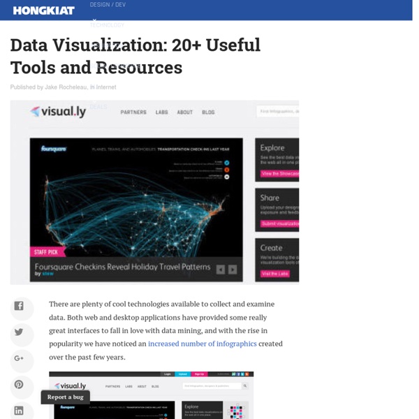
Data Visualization: 20+ Useful Tools and Resources
Issuu - You Publish
Data Visualization: Modern Approaches
Category:Free data visualization software
This is a category of articles relating to data visualization software which can be freely used, copied, studied, modified, and redistributed by everyone that obtains a copy: "free software" or "open source software". Typically, this means software which is distributed with a free software license, and whose source code is available to anyone who receives a copy of the software. Subcategories This category has only the following subcategory. Pages in category "Free data visualization software" The following 18 pages are in this category, out of 18 total.
Mosaic Maker: A world of creative photo possibilities.
Tons of fun stuff... Give one of our toys a spin! Framer, FX, Trading Card, Mosaic Maker, CD Cover, Photobooth, Bead Art, Magazine Cover, Billboard, Mosaic Maker, Color Palette Generator, Mosaic Maker, Calendar, Lolcat Generator, Cube, Pop Art Poster, Mat, Hockneyizer, Movie Poster, Motivator, Jigsaw, Wallpaper, Map Maker, Pocket Album, Badge Maker, I know, right?
Provenance: From e-Science to the Web Of Data
Free Online Word Cloud Generator
Great Data Visualization Tells a Great Story
Think of all the popular data visualization pieces out there - the ones that you always hear in lectures, read about in blogs, and the ones that popped into your head as you were reading this sentence. What do they all have in common? They probably all told a great story. Let's face it. Show the Story in the Data I first got my hands dirty with data visualization when I was at The New York Times for a summer. It was obvious I had a lot to learn right from the start, and during my three months there, I learned more about data visualization than I ever had - design, organization, fact checking, sleuthing, and research. Take a look at any New York Times graphic. Sure you could make a line chart or histogram with default settings straight out of Excel, but where's the story? Humanize the Data The New York Times is objective. Jonathan Harris does excellent work with data visualization as story. Compel to Action I later saw a Gapminder talk that wasn't as impressive. The Lesson: Find the Story
Yippy Cloud Creator
Related:
Related:
