
Face. Design Bureau. Dazzling first UK show featuring leading designer Ivan Chermayeff opens. It’s not a flawless guide, but you can often tell how significant the subject of an exhibition is based on who writes the foreword in the show’s catalogue.

That Milton Glaser contributed an essay for Ivan Chermayeff: Cut and Paste at The De La Warr Pavilion is a good guide that if you’re interested in graphic design, he’s a name with which you should be familiar. This is though Ivan’s first ever UK solo exhibition, bringing together his collages, illustrations, posters, publications and identity work – the Chermayeff & Geismar & Haviv studio he co-founded produced work for the likes of Chase Manhattan bank, MoMA and the Smithsonian.
His book watching words move became an important resource for graphic designers interested in playing with traditional type formats and his sense of fun (allied with technical brilliance) shines through across the work on display. Ivan Chermayeff: Cut and Paste at The De La Warr Pavilion, Bexhill, runs until 14 September. Shining the spotlight on Canadian design - The Creative Edge.
In honor of Canada Day, we thought we’d take a moment to celebrate Canadian design, both historical and contemporary.

We’re all familiar with the US 20th century design greats—Saul Bass, Milton Glaser, etc. —but Canadian designers from the 1950s, 60s and 70s, of equal artistic stature, remain obscure to many of us. If you want the full history of Canadian design, look no further than this article from the Canadian Encyclopedia, which covers everything from early 19th century engraving to the present. Rather than attempt anything of that detail, we will be focusing on the highlights, beginning in the 1950s and moving to the present day. Flat File – the work of Herb Lubalin, in context – Creative Review. A new web publication on the Readymag platform is set to look at one piece of work from the Herb Lubalin Study Centre archive each week.
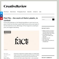
If the first instalment on the 1964 design of Fact magazine is anything to go by, we suggest subscribing. Examining a single piece of graphic design on a weekly basis might not sound like a schedule attuned to the pace of modern web publishing, but when the work comes direct from the archive at the Herb Lubalin Study Center – and is presented via the Readymag format – it’s likely to be a bit special. The first instalment of Flat File, with its focus on Lubalin’s art direction and design of Fact magazine in 1964, does not disappoint. Flat File is edited by the HLSC’s Alexander Tochilovsky and designed by Readymag founder, Anton Herasymenko (whose own art direction on the sleek Enso design journal also neatly demonstrates the web platform). See flatfile.lubalincenter.com. Az project. Baroni, D., Vitta, M., Storia del design grafico, Longanesi, Milan 2003, p. 319.
Jacob Parr - home. Jacob Parr (@jacob_parr) L'uomo che ha inventato le copertine dei dischi. Il 18 luglio 2011 è morto all’età di 94 anni Alex Steinweiss, il graphic designer statunitense che ha inventato le copertine dei dischi in vinile.
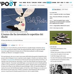
Fino agli anni Quaranta, infatti, le copertine dei dischi erano tutte uguali. Steinweiss fu il primo ad avere l’idea di personalizzarle con delle immagini artistiche, per illustrare e accompagnare la musica. Nel 1939 Steinweiss, che aveva 22 anni, venne assunto dall’etichetta discografica Columbia Records e propose subito di disegnare le nuove copertine in modo originale. «Il modo in cui vendevano i dischi era ridicolo», ha raccontato Steinweiss in un’intervista del 1990 riportata dal New York Times. «Le copertine erano di carta marrone, marroncina, o verde. Steinweiss, che è nato a Brooklyn nel 1917 da genitori immigrati, ha inventato anche la confezione in cui vengono conservati i 33 giri.
Please Enjoy. “Le 10 cose che ho imparato” di Milton Glaser - Timetocomm. 'philadelphia explained' installation by paula scher. Jun 12, 2015 'philadelphia explained' installation by paula scher philadelphia explained by paula scher all installation photos by sam fritch courtesy of pentagram pentagram’s paula scher worked in collaboration with students at her alma mater, the tyler school of art, to create ‘philadelphia explained’ – a large-scale installation that details the city and its surrounding areas. the hand-painted map created by scher and 154 participants covers the walls and floor of temple contemporary, the school’s 2,100 square-foot gallery.
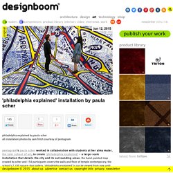
‘philadelphia explained’ is can be viewed from now until july 17, 2015. the immersive environment fills the walls and floor of the 2,100-square-foot gallery. hartwig was chosen because he has an interest in the subject matter and was capable of organizing the installation, working with 133 current tyler students. scher created a map that provided the basis of the installation, with additional details painted by 154 tyler students and other participants. Maria Mordvintseva-Keeler on Behance.
Milton Glaser. Paul Rand. Saul Bass. Seymour Chwast. David Carson.