
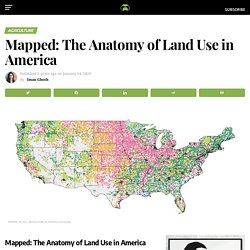
Origins of New York City's Immigrants. <a href=" src=" alt="Origins of New York City's Immigrants - Libertycruise.nyc - Infographic" title="Origins of New York City's Immigrants - Libertycruise.nyc - Infographic" /></a><a href=" alt="Libertycruise.nyc" title="Libertycruise.nyc">Infographic created by Libertycruise.nyc</a> Within 50 years, Italy has dropped from the #1 country of origin for foreign-born New York City immigrants to #20.

Today, the immigrants arriving in New York City are quite different from those of a few decades ago, with a downtick of immigrants coming from European countries (Italy, Poland, the U.S.S.R., Germany, and Ireland) and a huge uptick from China and island nations (Dominican Republic, Jamaica). There are 8.8 times more people coming to NYC from the Dominican Republic than in the 1970s. The Dominican Republic is the #1 source of foreign-born New York City residents today. We also have 8.9 times more Chinese people and 4.6 times more Jamaican people. 4.8k Shares 4.1k. Cartes sur table : l’ébullition en Amérique latine expliquée en trois minutes. America After Climate Change, Mapped. Mapped: The Anatomy of Land Use in the United States. The World’s Top Coffee Producing Countries In many cities around the world, there’s a café on every corner, so it comes as no surprise that coffee is one of the globes’ top commodities.
As the third most consumed beverage globally, after water and tea, coffee beans are in high demand almost everywhere. Mapping America's Education Deserts. 11.2 million Americans live in education deserts - in areas which are more than 60 minutes from the nearest public college.
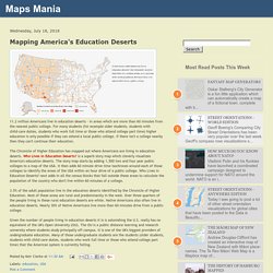
For many students (for example older students, students with child-care duties, students who work full time or those who attend college part time) higher education is only possible if they can attend a local public college. If there isn't a college nearby then they can't continue their education. The Chronicle of Higher Education has mapped out where Americans are living in education deserts. Who Lives in Education Deserts? Is a superb story map which cleverly visualizes America's education deserts. 3.5% of the adult population live in the education deserts identified by the Chronicle of Higher Education. Les cartels de la drogue, au centre des élections mexicaines. Drought worsens across southern Plains and southwestern United States. Geoconfluences.ens-lyon. Sur France Inter : la forêt amazonienne au bord du point de bascule.
La forêt amazonienne pourrait basculer vers un cycle de dégradation continue, conduisant à son assèchement et à sa transformation en savane.
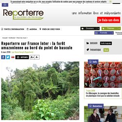
Cela aurait des conséquences énormes sur tout le cycle hydrologique de l’Amérique du sud. L’alerte a été lancée par deux scientifiques : ce seuil pourrait être atteint prochainement si la déforestation se poursuit. L’Amérique latine fragilisée par des «coups d’Etat masqués» Dans mon pays, à une époque pas très lointaine, quand un gouvernement élu était renversé par un coup d’Etat militaire, les gens ayant un peu vécu regardaient le ciel de Lima, presque toujours couleur ventre d’âne, et disaient en soupirant : c’est le retour à la normale.

Extensive Data Shows Punishing Reach of Racism for Black Boys. Black boys raised in America, even in the wealthiest families and living in some of the most well-to-do neighborhoods, still earn less in adulthood than white boys with similar backgrounds, according to a sweeping new study that traced the lives of millions of children. White boys who grow up rich are likely to remain that way. Black boys raised at the top, however, are more likely to become poor than to stay wealthy in their own adult households. Most white boys raised in wealthy families will stay rich or upper middle class as adults, but black boys raised in similarly rich households will not. Carte. Les fusillades aux États-Unis.
United States Historical Maps - Perry-Castañeda Map Collection - UT Library Online. Historical Maps of the United States Historical Maps of U.S.

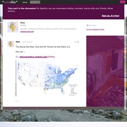
CitiesHistorical Maps of TexasHistorical Maps of Texas CitiesMaps of National Historic Parks, Memorials, Military Parks and BattlefieldsNational Atlas of the United States of America (1970)Pre-1945 Topographic Maps of the United StatesU.S. Historical Maps on Other Web Sites Early Inhabitants (From The National Atlas of the United States of America (Arch C. Gerlach, editor). Early Indian Tribes, Culture Areas, and Linguistic Stocks - Eastern U.S. (632K) Early Indian Tribes, Culture Areas, and Linguistic Stocks - Western U.S. (639K) Early Indian Tribes, Culture Areas, and Linguistic Stocks - Alaska (942K) The Racial Dot Map : One Dot Per Person for the Entire U.S. Pas mal ... Take part in the discussion!
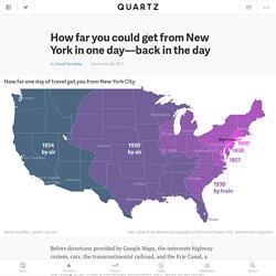
On Seenthis, you can recommend articles, comment, discuss with your friends, follow authors... Education, santé, chômage... La Guyane, un territoire sous tension. How far you could get from New York in one day—back in the day. The Chinese mega-city Shenzhen normally conjures images of wide streets, tall buildings, booming factory production, record-breaking construction speed, money, pollution, and materialism.
But on the eastern edge of the city, 15,000 Chinese people—many of them artists—don loose linen and cotton clothes, live on narrow lanes and alleys in traditional-style houses, and go against all stereotypes about modern Chinese living. “It’s like a Hollywood film set of an old Chinese village,” says Mary Ann O’Donnell, an American who has lived in and researched Shenzhen for over 20 years. Even down to the lattes. This is Wutong Art Village. Carte des anomalies de températures à la surface du sol. Source : earthobservatory.nasa.gov - Observations du 26 décembre 2017 au 2 janvier 2018.
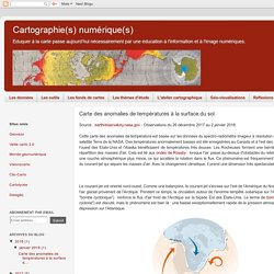
Cette carte des anomalies de température est basée sur les données du spectro-radiomètre imageur à résolution moyenne (MODIS) du satellite Terra de la NASA. Une géographie populaire de la Caraibe, un incontournable pour mieux connaître la région. How the Economic Power of American Cities Compares to Entire Countries. Geoconfluences.ens-lyon. Un article mis en ligne en novembre 2017 aborde cette frontière sous l'angle de ceux qui l'ont traversée malgré les contrôles, en renouvelant les études migratoires sur cette région : Anna Perraudin, « Garder ses distances.
(Dés)activation des réseaux communautaires et territoires migratoires, entre Mexique et États-Unis », Espace populations sociétés [En ligne], 2017-2 | 2017, mis en ligne le 30 novembre 2017. L'article révise la vision traditionnelle de la migration transnationale qui insiste sur l'importance des liens communautaires parmi les migrants. Son enquête au long cours sur un groupe identifié au Mexique comme des Indiens, les Santiaguenses, montre en fait l'éclatement des lieux de destination aux États-Unis et relativise l'attachement des migrants à leur « communauté » d'origine, laquelle n'est pas structurante dans leur parcours migratoire même si des solidarités existent. Six maps that show the anatomy of America’s vast infrastructure - Washington Post. GéoMartinique - Cartothèque. Commute Maps Reveal a US Divided by Megaregions. Even if you don’t hate your commute—even on the days free of gridlock, packed buses, and sweaty uphill bike rides—it’s probably tinged by a least a little drudgery.
Not your favorite part of day, perhaps? Maybe, though, you'll feel better knowing you're taking part in a powerful economic movement. Like, literally. “The best way to measure functional economic geography is through commutes,” says Alasdair Rae, an urban and regional analyst with the University of Sheffield. La République Dominicaine partenaire de la France pour contrôler le trafic de stupéfiants et mener les opérations de secours à la population. Buon #lunedi iniziamo con una carta sul confine Usa-Messico "Dobbiamo renderlo sicuro", ha ribadito @realDonaldTrump. Les villes américaines / La ségrégation raciale des villes américaines diminue-t-elle toujours ? Posted by urbanites on mercredi, novembre 9, 2016 · Leave a Comment. Migration between California and other US states:... #GeoawesomeMapOfTheDay Mapping five years of #drought in the #map US.
Ethnic neighborhoods in NYC by world region. Here's Everyone Who's Immigrated to the U.S. Since 1820. From 1820 to 2013, 79 million people obtained lawful permanent resident status in the United States. The interactive map below visualizes all of them based on their prior country of residence. The brightness of a country corresponds to its total migration to the U.S. at the given time. Use the controls at the bottom to stop / resume the animation or to move back and forth in time. ACS Commute Map. Interactive map : Loss of Indian land. Indigenous Peoples and Natural Ecosystems in Central America and Southern Mexico. Authors: Center for the Support of Native Lands and National Geographic Date Released: December 2001 In January of this year Native Lands’ new map, Indigenous Peoples and Natural Ecosystems in Central America and Southern Mexico, was completed.
It is an update of an earlier map, The Coexistence of Indigenous Peoples and the Natural Environment in Central America, published in 1992. Like its predecessor, this map is bilingual, with texts in English and Spanish. Exploring Mexico through Dynamic Web Maps. One of the people I regard most highly here at Esri has created an online atlas of Mexico. He started it off as an Esri storymap, but as he continued to add content, it soon become a “story atlas.”
As an educator I was immediately struck by how useful the atlas could be as a tool to teach and learn about Mexico. I am continually amazed and also hear from educators at how little American students really know about their neighbor to the south. The maps can be accessed in many different ways, such as an ArcGIS Online presentation with a description here, as an iPad iBook, but I think most importantly, as a series of story maps. Each of these separate story maps contains 1 to 6 thematically related maps on the following topics: You can use this resource of over 30 thematic maps to teach and learn about population, landforms, climate, historical landmarks, caves, indigenous cultures, tourist attractions, and more. Mexico story map with precipitation theme. Statewide Agricultural Baseline Project. Clean Streets Index. Chicago Growth (1830 - 2030) - Ecoclimax.
Top 20 richest cities in America - Vivid Maps. Household heating costs are expected to be lower than previous two winters. October 6, 2015 Source: U.S. Energy Information Administration, based on 2014 American Community Survey Most U.S. households can expect lower heating expenditures this winter (October through March) compared with the past two winters. The growth of America's Hispanic population. Jc fichet sur Twitter : "Le #trafic portuaire en #Amerique latine et #Caraïbes via @ElOrdenMundial #ports #océans. Movimiento de contenedores en puertos de América Latina y el Caribe, Ranking 2014. Mexico's Cartels and the Economics of Cocaine. By Scott StewartVice President of Analysis At Stratfor, we follow Mexico's criminal cartels closely.
In fact, we are currently finishing our 2013 cartel forecast, which will be released later this month. As we analyze the Mexican cartels, we recognize that to understand their actions and the interactions between them, we need to acknowledge that at their core they are businesses and not politically motivated militant organizations. This means that although violence between and within the cartels grabs much of the spotlight, a careful analysis of the cartels must look beyond the violence to the business factors that drive their interests — and their bankrolls.
There are several distinct business factors that have a profound impact on cartel behavior. Vox Maps sur Twitter : "Which crops are harvested where in the US? Mass incarceration in America, explained in 28 maps and charts. 3 maps that explain America. The United States of America is a young country, but it's also big and complicated and fascinating. It can be tough to distill all that down to a few maps, but here are three that capture the story of America about as well as anything.
If you enjoyed this, please read our much more comprehensive 70 Maps that Explain America, which goes through everything from early colonization to slavery and its legacies to the history of American global power. 1) Watch America become the country it is today. How America became the most powerful country on Earth, in 11 maps. By Max Fisher on May 20, 2015 We take it for granted that the United States is the most powerful country on Earth today, and perhaps in human history.
The story of how that came to be is long, fascinating, complex — and often misunderstood. Here, excerpted in part from "70 maps that explain America," are maps that help show some of the key moments and forces that contributed to the US's rise as sole global superpower. A Map of the U.S. by Property Value Instead of Land Area.
Cartograms are fun tools for swapping out land area for some other variable. Lettre d'information. Pour informer des nouveautés du site, nous publions une lettre d'information selon un rythme mensuel. Cette lettre est publiée sur le site, mais vous pouvez aussi vous y abonner pour la recevoir directement dans votre boîte mail. Pour vous abonner cliquez ici ou écrivez à sympa@listes.ens-lyon.fr avec en objet « subscribe geoconfluences-info » Charts that illustrates America's global dominance - Business Insider. Newyork : Tous les messages sur newyork. Share of counties where whites are a minority has doubled since 1980. Last week’s Census Bureau release of 2014 population estimates confirms that the U.S. is becoming ever more diverse, at the local level as well as nationally.
California's Long Challenge With Drought. Jobs-by-block-groups.png (PNG Image, 1898 × 903 pixels) - Scaled (53%) The chart that shows where US companies are moving for tax purposes. A Map From the Los Angeles Times Shows Distribution of Homeless Population Across L.A. County. The remarkable racial segregation of Washington, D.C., in 1 map - The Washington Post. The most racist places in America, according to Google. Visions carto sur Twitter : "Ce matin, c'est : ségrégation, revenus, niveaux de richesses, inégalités aux Etats-Unis sur. Reviving the Statistical Atlas of the United States with New Data. Hydro Flow Map. Poles of Inaccessibility - the Remotest Places on Earth. 2000px-Census-2000-Data-Top-US-Ancestries-by-County.svg.0.png (PNG Image, 2000 × 1483 pixels) - Scaled (51%)
Quinze cartes pour comprendre les changements religieux au Brésil. Interactive: When Do Americans Leave For Work? The Death Penalty In The US Is Finally In Retreat. Reflecting a racial shift, 78 counties turned majority-minority since 2000. World Water Day: Mapping the spread of dams in the US — CartoDB Blog. Which Flight Will Get You There Fastest? Le dessous des Cartes. How Has the Drought Affected California’s Water Use? New Interactive Map Shows Big Potential for America’s Wind Energy Future. Uk.businessinsider. Latin America Dominates List of World's Most Violent Cities. Average Internet speed in Brazil.Interactive... Las Vegas City Limits: A Boom Town’s Growing Water Woes — ProPublica. HDI Map. Geography of Poverty. America’s busiest container ports in 2014.