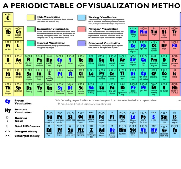


http://www.visual-literacy.org/periodic_table/periodic_table.html#
Related: HOW TO? • Data visualization, infografica, mindmapping • Metodologia • Big Pictures • groupement-3How to Find the Right Chart Type to Represent your Numeric Data 22 Feb 2016 Charts help you visualize numeric data in a graphical format but the problem is there are just too many types of charts to choose from. This diagram will help you pick the right chart for your data type. couch mode print story David Byrne’s Hand-Drawn Pencil Diagrams of the Human Condition by Maria Popova “Science’s job is to map our ignorance.” David Byrne may have authored both one of last year’s best albums and best music books, but he is also one of the sharpest thinkers of our time and a kind of visual philosopher. About a decade ago, Byrne began making “mental maps of imaginary territory” in a little notebook based on self-directed instructions to draw anything from a Venn diagram about relationships to an evolutionary tree of pleasure — part Wendy MacNaughton, part Julian Hibbard, yet wholly unlike anything else.
The 10 Most Important Work Skills in 2020 Share this infographic on your site! <a href=" src=" alt="Important Work Skills for 2020" width="500" border="0" /></a><br />Source: <a href=" The 10 Most Important Work Skills in 2020 Future Work Skills of 2020: Sources: The most liberal and conservative big cities in America, in one chart Even the most conservative cities in America are barely right of center, as this great chart from the Economist, based on research from Chris Tausanovitch at UCLA and Christopher Warshaw at MIT, shows: It's no surprise that most big cities are left of center, as the Pew Research Center points out. What's interesting is how liberal even the median big city is. Cincinnati, for example, hangs around the center of big cities' political spectrum, but the Economist's chart shows it's still fairly liberal. For another look at the liberal and conservative towns and cities each state, check out this map from Business Insider: WATCH: 'The 220-year history of the anti-vaccine movement
STATIONARY WAVES, light & sound revision from A-level Physics Tutor, your free guide for effective physics revision. Introduction Stationary or Standing waves have become very important in physics in the last hundred years or so. Understanding them has not only given insights into sound but many other important topics eg AC circuit theory, quantum mechanics, nanotechnology. Formation of stationary waves Butterfly Chart – Excel Chart with Dual Converging Scales A Butterfly chart is a chart where two entities are compared side by side using scales meeting at the center. Due to its shape, the chart resembles a butterfly and hence the name. These charts are sometimes also known as Funnel or Tornado Charts though I find “butterfly” to be a better description as it allows for a greater variation in shape than a funnel or a tornado does ! So let’s jump straight into creating a beautiful looking butterfly chart. Getting the Data for the chart
100 Diagrams That Changed the World Since the dawn of recorded history, we’ve been using visual depictions to map the Earth, order the heavens, make sense of time, dissect the human body, organize the natural world, perform music, and even concretize abstract concepts like consciousness and love. 100 Diagrams That Changed the World (public library) by investigative journalist and documentarian Scott Christianson chronicles the history of our evolving understanding of the world through humanity’s most groundbreaking sketches, illustrations, and drawings, ranging from cave paintings to The Rosetta Stone to Moses Harris’s color wheel to Tim Berners-Lee’s flowchart for a “mesh” information management system, the original blueprint for the world wide web. It appears that no great diagram is solely authored by its creator. Most of those described here were the culmination of centuries of accumulated knowledge.
The 5 Best TED Talks for Teachers December 18, 2014 TED talks are invaluable resources for teachers professional development. They cover a wide variety of education related topics and provide a very good source of inspiration for teachers and students. Throughout the year we have been sharing with you some interesting talks from renowned speakers and educators and today we have had a look back at those talks and picked out 5 of the most popular talks within the education community. 1- Every Kid Needs A Champion by Rita Pierson Rita Pierson, a teacher for 40 years, once heard a colleague say, "They don't pay me to like the kids." Her response: "Kids don't learn from people they don’t like.’”
stumbleupon Climate scientists tend not to report climate results in whole temperatures. Instead, they talk about how the annual temperature departs from an average, or baseline. They call these departures "anomalies." They do this because temperature anomalies are more consistent in an area than absolute temperatures are. Standing waves and resonance : Transmission Lines Whenever there is a mismatch of impedance between transmission line and load, reflections will occur. If the incident signal is a continuous AC waveform, these reflections will mix with more of the oncoming incident waveform to produce stationary waveforms called standing waves. The following illustration shows how a triangle-shaped incident waveform turns into a mirror-image reflection upon reaching the line's unterminated end. The transmission line in this illustrative sequence is shown as a single, thick line rather than a pair of wires, for simplicity's sake. The incident wave is shown traveling from left to right, while the reflected wave travels from right to left: (Figure below)
The Daily Graph "The Daily Graph" re-creates charts from The Economist's Graphic Detail blog using standard run-of-the-mill Excel techniques without macros. We do try to milk Excel for all it's worth and apply techniques that may not have been intended in the way we use them. In the end, it's the result that counts.